Huzaar Website Project using Figma and Webflow
Figma & Webflow
Article written on Thursday, 25 Apr 2024
Begin of this year I was offered the opportunity to design a brand new website for Huzaar, a new (Belgian) company founded from the merger between SLV Rent and Bitstream. Both companies have been working closely together over the past few years. Huzaar is a high-level creative agency and full production house, and a true anchor in the event sector here in Belgium.
The logo was already designed, yet some fine-tuning was needed for the color scheme and how the logo and icon were applied across certain applications. It didn't quite meet my client's exact preferences. Following a brief discussion, we settled on this revised color palette:
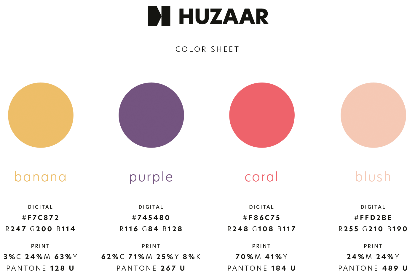
Huzaar color palette, showing banana, purple, coral and blush with color values
Selecting colors is one thing, but achieving harmony in their application is something else. The true challenge arises when you begin the actual design process. In a subsequent stage of the process, I opted to incorporate two additional hues: a soft blue and a gentle green. The soft blue had already been introduced in a design for a giveaway box with postcard sent by my client to their top customers, as part of the announcement and celebration of the launch.
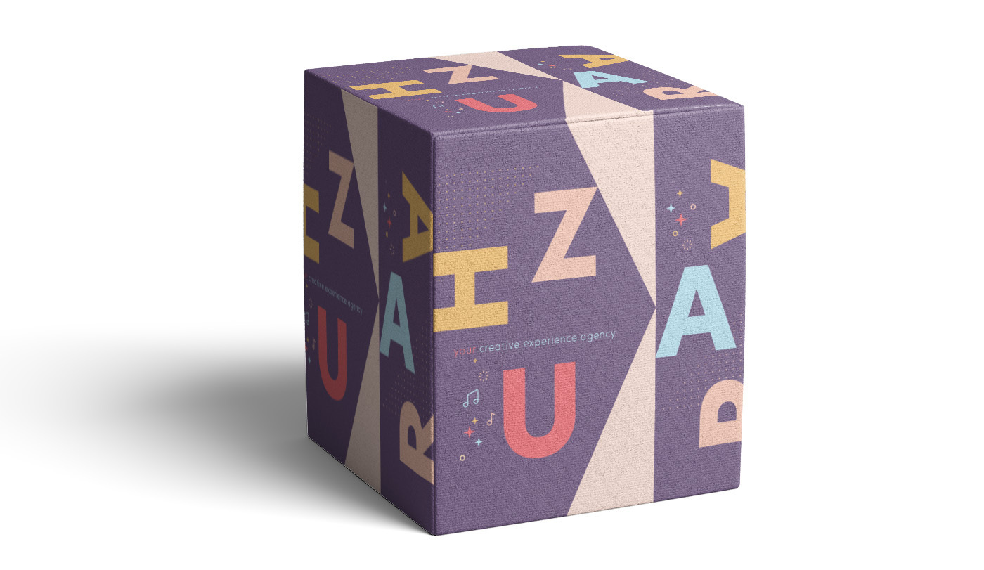
A give away box from Huzaar to announce the launch

A postcard from Huzaar that came along with the giveaway box.
Apart from the color palette, New Hero was chosen as the main typeface, the same typeface used for the logo. Once these two factors were defined, it was up to me to create the site’s design based on a quick brief about the sections and the vibe of the site should convey.
Design in Figma
From Adobe XD to Figma
For me the choice was obvious to use Figma for the design of the site in combination with illustrator for certain graphical elements. Luckily I could easily copy and paste icons, or other graphical objects from Illustrator directly into Figma. This was really a big plus for me. I’ve quickly became accustomed to Figma after having used Adobe XD for such a long time. I preferred prototyping in XD way more though, but I can’t deny Figma's advantages. My first experience involved collaborating with a team located at the other side of the globe. I was amazed by the ability to track each other's cursor movements, which undoubtedly enhanced efficiency in working with developers and other team members.
What bothers me most about Figma is the confusion surrounding how projects, pages, or documents function. Even with just a handful of projects in Figma, I often struggle to navigate smoothly in this application. That's why I've stuck to the free plan for now; however, I anticipate eventually upgrading to a paid plan. Yet, deciding which plan suits me best seems like a daunting task, as I've gathered from the experiences of other users.
Basic Set Up
For small projects like this website I don’t bother much in using Components and such, especially not during the initial phase when I'm sketching out the first draft of the homepage design. The only step I took was incorporating the brand colors into the Library for quick access and to ensure I was applying the correct color values. In a subsequent phase, I also introduced a few text styles and several components like the top bar, footer, a CTA button, and a quote—elements I anticipated reusing later on.
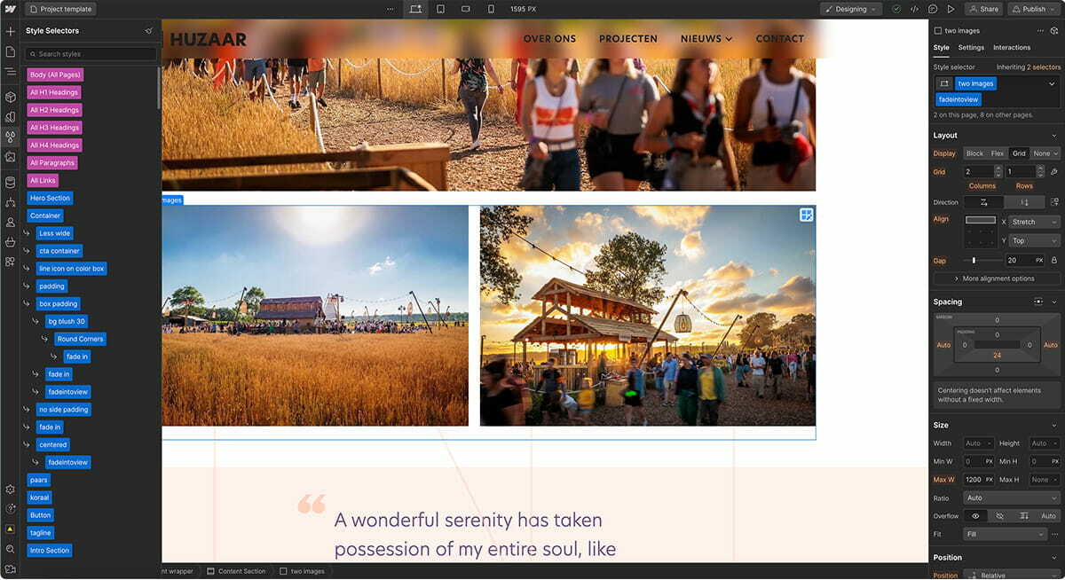
Huzaar website design in Figma, showing the page designs in prototype view
As for the topbar I incorporated hover effects for each menu button link. For my design, the only necessary change was the font color. Reflecting on it now, I realize I didn't set this up in the most efficient manner. I created a separate top bar state version for each link, where I manually adjusted the text color for each item. While this was easy to accomplish in Adobe XD, I struggled with it in Figma at the time. With a looming deadline, I didn't take any time for some research. If I were to tackle this again, I would have created a Component for a single link, utilizing the Auto-layout feature, and then generated a second instance for the hover state. This way, I could have reused the Component for the other navigation links.
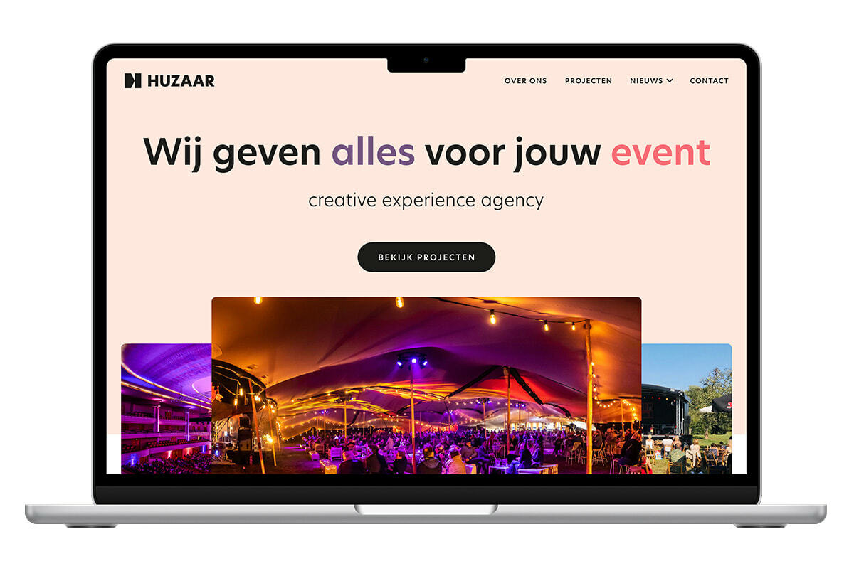
In a lot of cases I present the client first with a basic wireframe, however for this project I decided to jump right in. After all, I know this client for years and after our short face-to-face meeting and briefing I knew which direction to go to. I presented 2 designs for the homepage and my gut feeling already told me which one they would choose, the version with the colored background, which happened to align with my own preference as well.
For the mobile version I only created a quick prototype in Figma showing the interaction of the menu and that's it. The rest was completely created directly in Webflow.
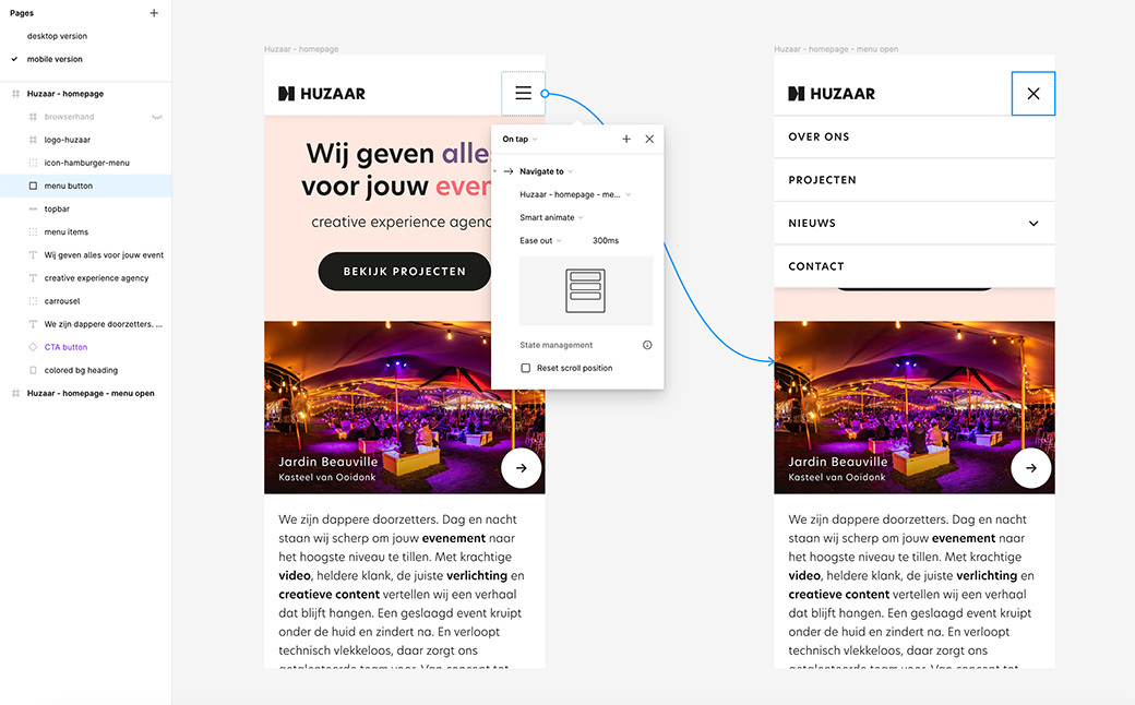
Huzaar website design in Figma, showing the menu on mobile in prototype view
Coding in Webflow
The above title is actually misleading. It’s exactly because the coding is been taking care of for you that I choose Webflow. However, don’t get me wrong, you're still in control of the code, and you need to know and fully understand the HTML & CSS markup language to create good and well structured webpages. It’s just that the heavy lifting is done for you. In Webflow you create your page visually, almost similar as creating a layout in InDesign. Webflow's GUI is beautiful, really well-thought and very user-friendly. IMHO, if you know a bit of HTML & CSS, you can only love working with it.
I don't have to trouble myself anymore over the complexity of Flexbox and Grid.
There are many reasons why I prefer using Webflow over anything else. Yes, even compared to starting from scratch like I used to do. The main reason is its efficiency and time-saving factor. I can accomplish things way quicker, perhaps five or even ten times as fast. Of course I'm only guessing here, but it must be a lot. I love the fact that I can create a lot of interactivity and animation without having to write one single line of code since all the javascript is fully written for you. Additionally, the platform's user-friendliness in achieving responsiveness, along with the abundance of excellent video tutorials and comprehensive documentation to learn from. Oh, and what's truly a joy now is that I don't have to trouble myself anymore over the complexity of Flexbox and Grid. Oh my goodness! With the perfect visual aid I have things setup in no time without the usual headache and frustration of confusing things. I'm telling you, it is a breeze.
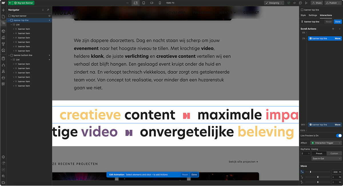
Webflow has many great features. One feature I truly use a lot is the option to create 1 reusable Components. It is a very powerful feature and you can go really crazy with this. You can nest them, have dynamic parts in it... It is just one of these things that makes Webflow so efficient IMHO. Since it's been a bit of a while since I last coded a site, I was a bit behind with Webflow's new features and updates. For this project I've also used 2 Variables for the first time. I didn't exploit it to its very limits though, as you can do a lot more then just saving a bunch of colors. The cool thing I also discovered is, that when I opened an older project, I noticed that Webflow gathered already color variables automatically for me.
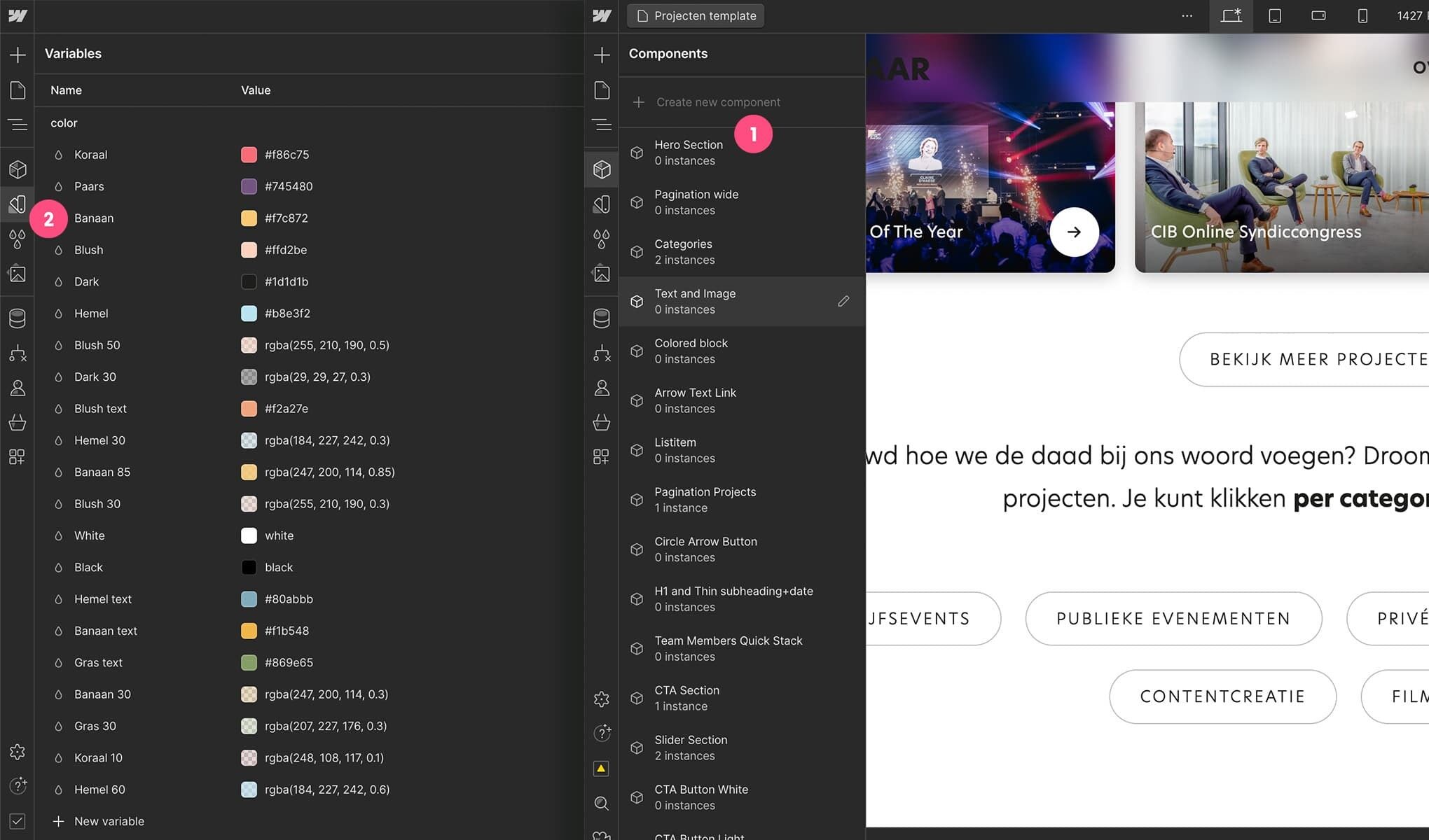
Huzaar website in Webflow showing some of the Variables and Components
The nice thing about using Weblfow is also that you can download your complete project including all the HTML, CSS and Javascript files and go from there. That’s exactly what I did for this project. Although webflow offers the full package deal including hosting, CMS, e-commerce platform... in the end you decide. It is perfectly fine to use Webflow only for the front-end. For this project I also chose to temporarily publish my static template pages under a Webflow subdomain and with a password protection just to demo things to my client. Then once everything was approved, I just unpublished the site while keeping my project. My next step was moving everything into Nova and start preparing the templates for Craft CMS. Talking of which... I'm written an article about this part as well! 😉