My Design Process for the Adobe Fonts Project
HERBi a Fictional App Design in Adobe XD
Article written on Friday, 03 May 2019
The past few weeks I've been asked to create a fictional app design in Adobe XD using a set of Adobe fonts of my choice as a way to promote Adobe Fonts. This needed a bit of reverse thinking really as I had to pick my set of fonts first before starting thinking about the design. The process is usually the other way around, I choose my fonts based on the project.
Brainstorming
So while choosing the fonts I was brainstorming on the subject of my design project. While browsing my huge Designcuts collection of mockup templates, I bumped into these lovely pots and jars mockups from Mockup Zone which immediately triggered the idea to create an app about herbs & spices.
My Fonts Pack
I decided to go with the power combo of slab serif Yrsa with Basic Sans Bold in an all-caps arrangement that highlights the stylistic contrast between the two. I figured this would look perfect to use as headings in the app. Continuo is the mesmerizing display typeface I chose to use for the logo. Bree was also added in the mix for its compatible nature with the other fonts in the pack. I envisioned this would look beautiful for the packaging design.
Color Palette
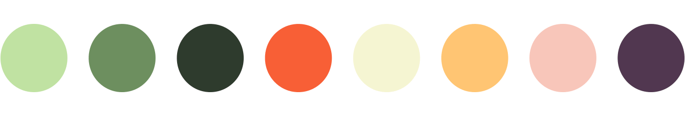
HERBi color palette, inspired by an illustration from my Inspiration Gallery
One of the first things I did after the fonts were decided upon was thinking of the set of colors I would use for my design. Somehow I envisioned soft colors, preferable greens in combination with some pastels. I was very much inspired by this illustration from my Inspiration Gallery. In the end I didn't use the bright orange which I originally thought I would use for elements that need extra attention, but the other colors all served their purpose in the app.
The Logo Design
With the color palette ready to be used, I started creating the logo brand, together with the packaging design. As for the logo itself, this was actually quickly decided upon once I knew which name to use.
HERBi logo on different backgrounds
As for the name, my choice was actually mostly based on the characters of the Continuo typeface. I particularly wanted to avoid using the O and C as they looked a bit too chunky for my personal taste, but the straight ones were just perfect, and the B is beautiful too. So the name HERBi was specifically chosen because of the letters it uses. As for the design, I knew this font would be ideal to break apart to apply different colors on.
Once I typed out the name I started to add diagonal 'incisions' on particular places of each letter, and used the Pathfinder's Divide option in Illustrator to break the letters into segments. Then it was just a matter of applying colors to each segment, and trying the logo out on a couple of different backgrounds to check the contrast. The whole process went very intuitively and to be honest pretty quickly as I had this clear idea in my head already. It was just a matter of execution, and checking the result.
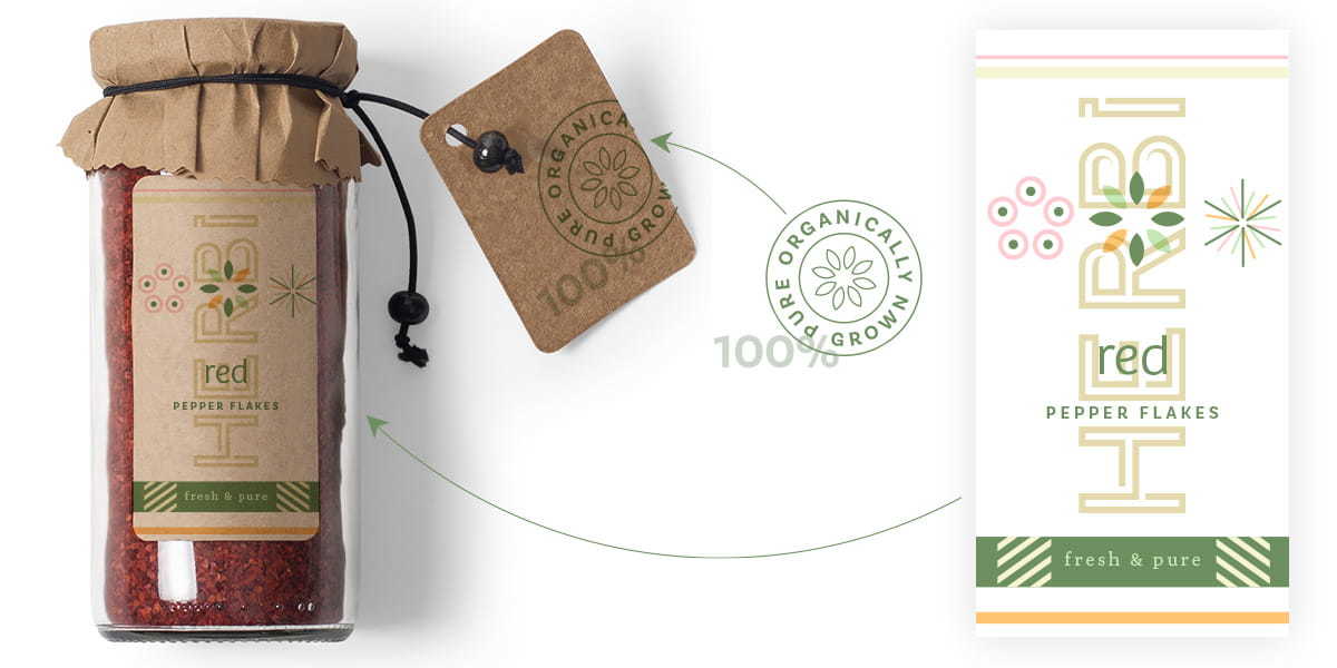
The Packaging Label Design
Next, I designed the packaging labels. The process for this design was very randomly actually. After having browsed around a bit on dribbble using the search term packaging, I picked up bits and pieces that I thought I had to try out:
- overlaying elements: I envisioned the brand name in the background with graphics and product name on top
- line patterns: maybe a diagonal line pattern
- a circular label: maybe to be used on the side on the product page instead of on the packaging itself
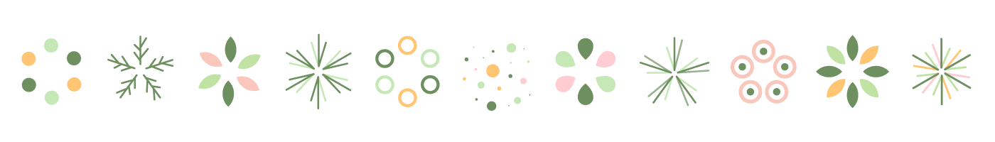
Some of my icon experimentations for the HERBi packaging and app design.
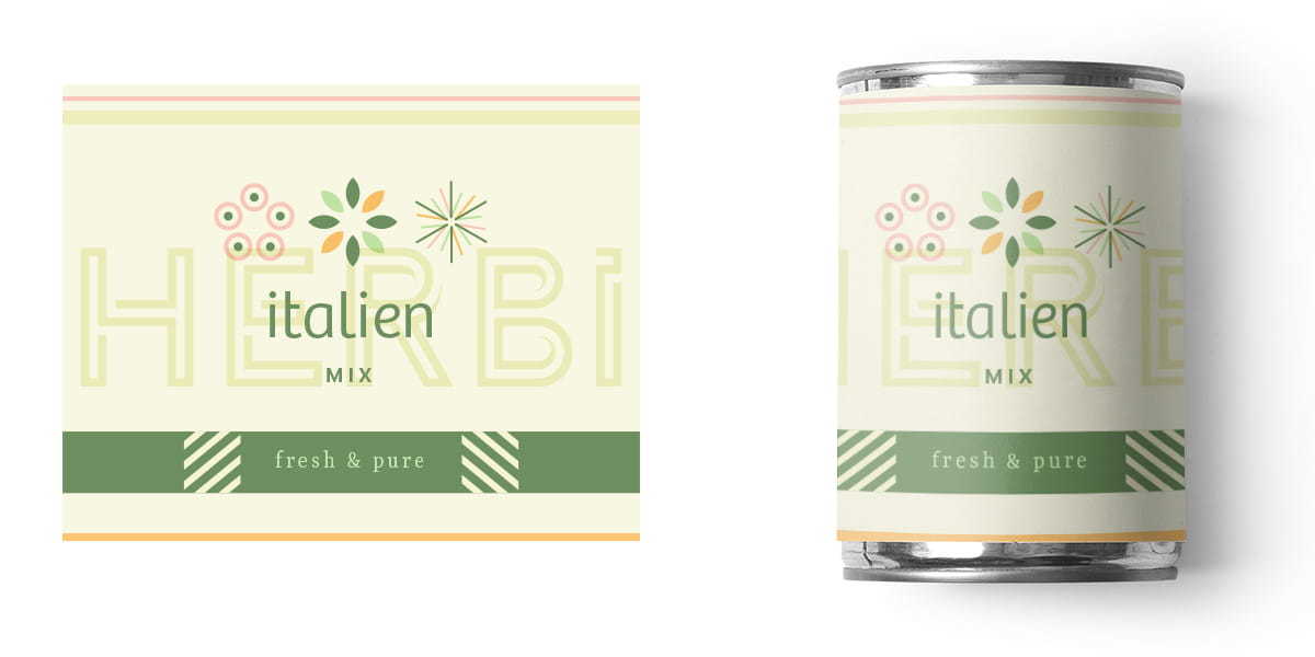
To be completely honest here, I didn't have much time to complete the entire design of this since the main job was actually to design the app in Adobe XD. With another pile of client work going on at that moment, I had to finish this project in a day or 2 to 3 max. Not that this was a rush job, or that I want to excuse myself here. It actually happens more than often that clients need it by yesterday, and creative jobs like this are never guaranteed to go as planned. Inspiration is such a weird unpredictable thing. I guess it was one of those days where things went like I wish they always did. I just gradually added element by element and ended up with this packaging label. I didn't try out a whole lot to be honest. What I ended up with just looked prefect to me. The only thing I changed while creating the different labels was the position and orientation of the logo.
Working with these beautiful and practical mockups made it easy for me to create these realistic products. It was just a matter of copy & pasting my designs from Illustrator into Photoshop Smart Object layers. All the rest is already been taken care of, because the wrapping, and shadow & light effects are all already in place once you've replaced the Smart Object.
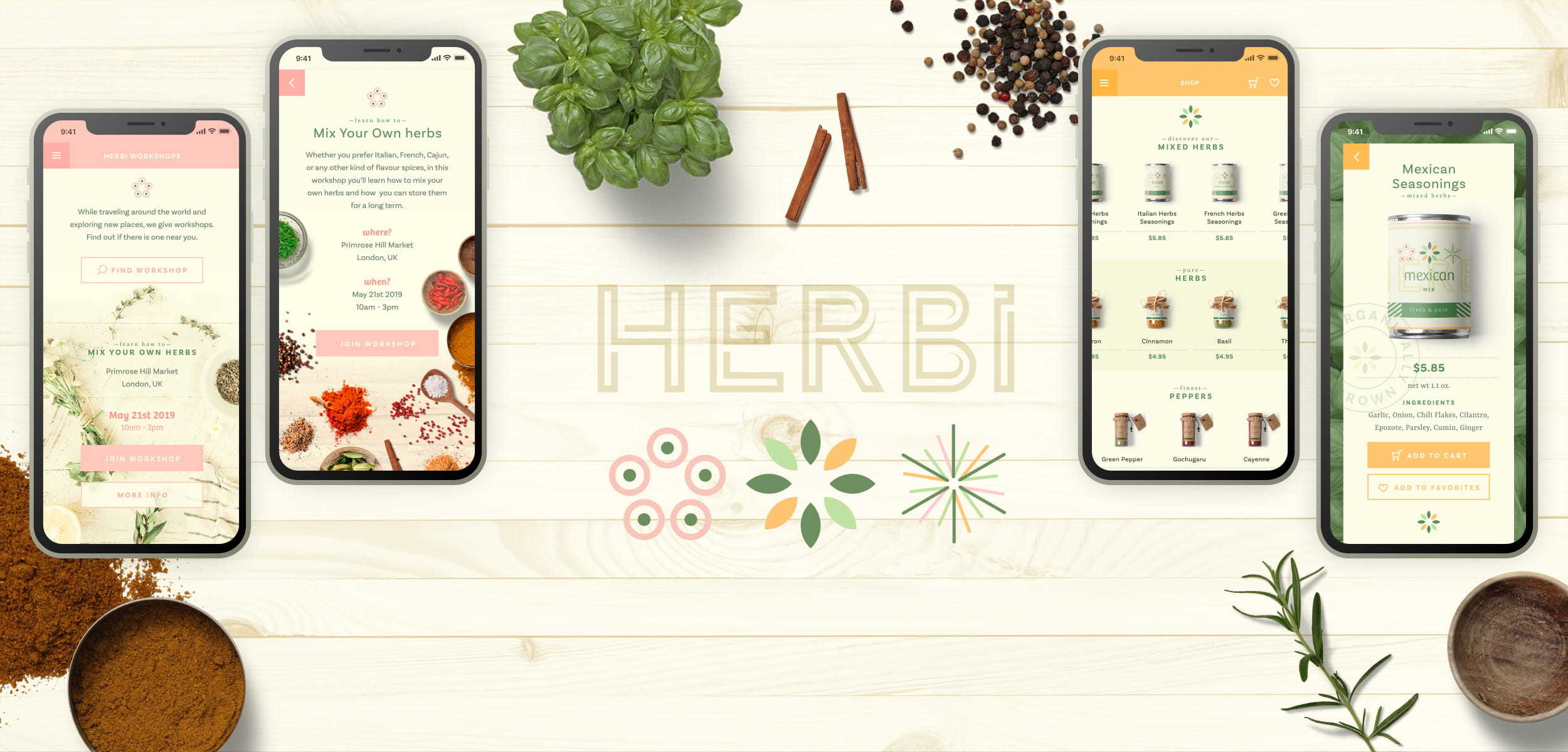
The App Design
Once the packaging design of the products was finished I started on the creation of the app directly in Adobe XD. Normally I would sketch out the entire prototype of the app before I jump right into the design, but honestly, there was no time for me to do this. The design and also the purpose of the app was completely improvised along the way. It's of course not a complex app, and I had the basic idea already in my head.
I just started with a splash screen, and while designing that screen I envisioned just a shop where you can buy herbs and spices. My starting screen had only one button: "shop for herbs". Tapping that button would show a screen with the overview of products. Where you could tap on a product to view it in detail, and and buy.
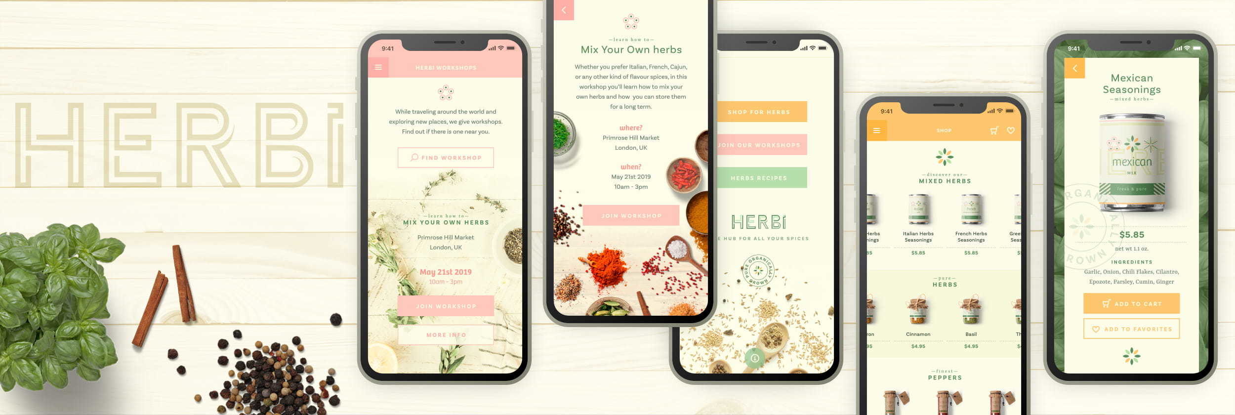
For this project I had to design about 10 screens, so I was thinking about broaden purpose for the app. Another option was to work out the buying process and checkout screens, but that didn't really appeal to me.
While I added the tagline 'the hub for all your spices' I figured HERBi should be more than a just shop, it should also be a place where you can find recipes, and other practical resources about herbs & spices, learn about it... So I decided to add 'workshops' and 'recipes'. This was added after I worked out the screens for the shop, where I used the papaya yellow and the colored leaf icon. When exploring ideas for these two new sections I decided to use the pastel soft pink and pastel green for these in combination with the other two icons: the line one for the recipes and the circular one for the workshops.
Images & Photos
The images used for the herbs & spices came from Mockup-Cloud, the other photos were found on Unsplash. The basil background image is by Rob Pumphrey, the photo on the workshop screen is by Brook Lark, and the photo on the start & menu screen is by Alexander Ow. Most of them are tweaked by myself to fit into the color palette and composition.
Adding Interactions
Next, it was time for me to add the interactions to my screens to finish of the prototype app. In Adobe XD it's very easy to add interactions to your artboards.
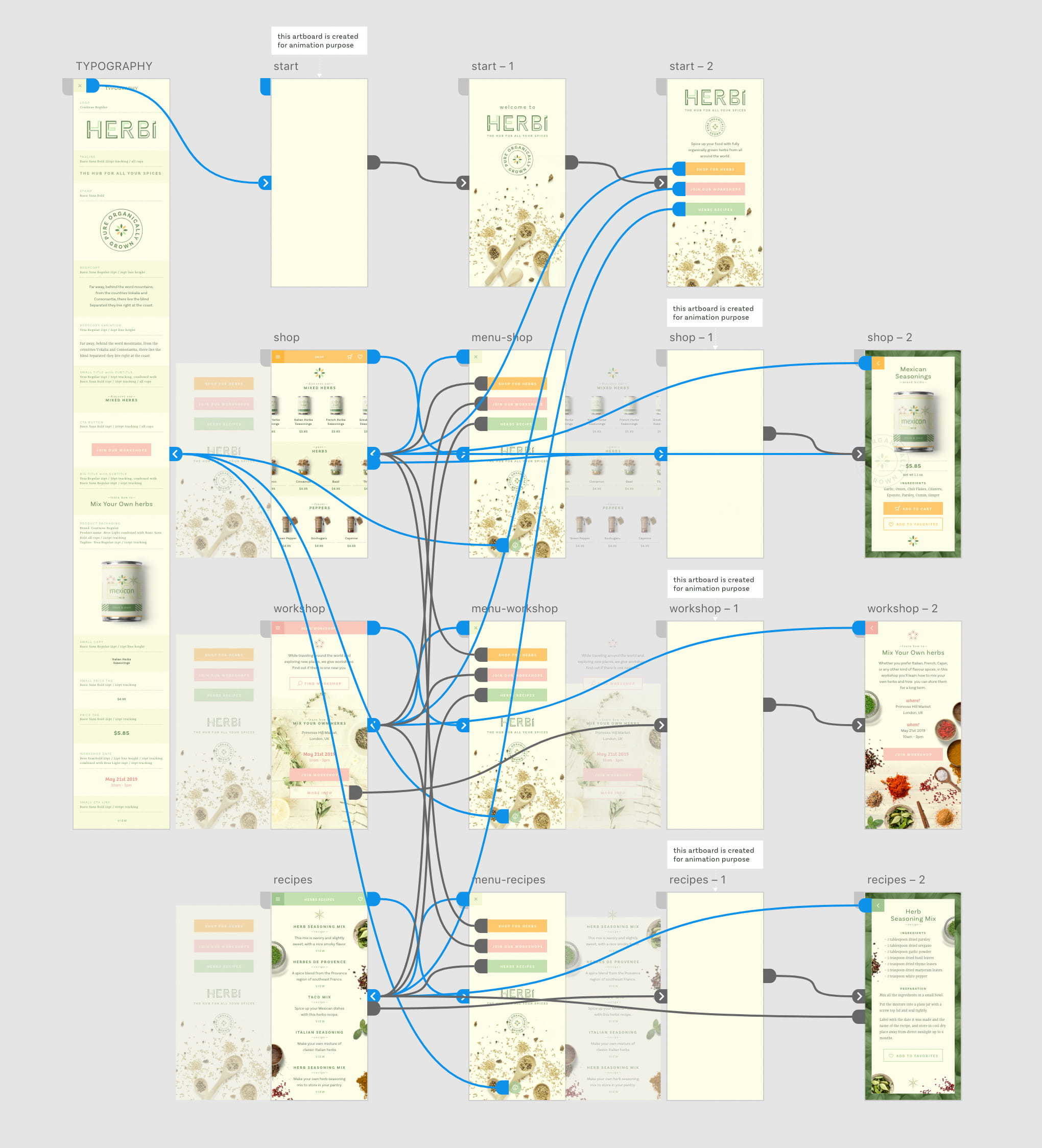
The Prototype view of the HERBi app in Adobe XD with all linked interactions shown
One of the recently added features is the option to Auto-Animate. It allows you to easily add immersive animated transitions. You simply duplicate an artboard, modify the object's properties, like size, position, opacity, rotation, etc. However, you have to be sure that the objects have the same layer name between each of the artboards. Then you switch to Prototype Mode and apply the Auto-Animate transition action. You first define the animation trigger, which could be Tap, Drag, Voice but also just Time with the option to set a delay, which means immediately after the screen has loaded. Then you also define a destination which is the next screen you want everything to animate to, the Easing option and the duration of the animation.
Check out the animation of the interactions created in Adobe XD on my Dribbble.
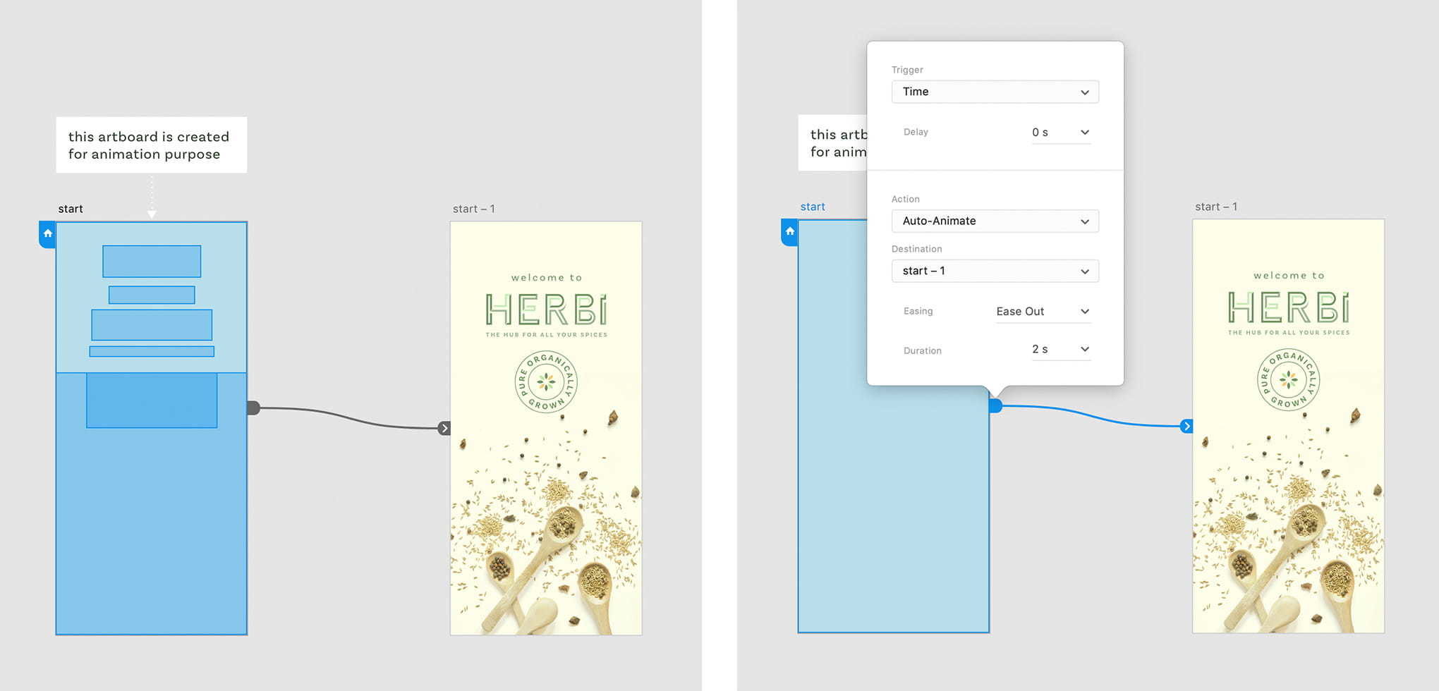
Using the Auto-Animate feature in Adobe XD
Being able to create a prototype that comes close to the final product is one of the things I really like in XD.
Being able to create a prototype that comes close to the final product is one of the things I really like in XD, plus the way it works together with Adobe Illustrator and also Photoshop is a big plus for me. As a (+20 years) long time Illustrator user, I am hooked to this application and so I couldn't think of any way to keep my work flow for this kind of projects more efficient.
You can also view the HERBi project on my Béhance page. Download this Font Pack, and my Adobe XD prototype to build your own creation.