My First Steps & Experiences in Adobe XD
How I Shifted from Photoshop to XD for UI & Web Design
Article written on Monday, 14 Jan 2019
With all those user experience design applications out there such as Sketch, Figma, InVision Studio etc. it seems illogical to stick with Adobe as it seems popular to state that you leave Adobe behind...
The thing is, I'm not like most, and so I couldn't care less what everybody else is using. I stick to what I know, and Illustrator is still my preferred vector-art app to design my icons, logos & illustrations. Since Adobe XD and Illustrator go hand-in-hand it just seems like the obvious choice. After reading Meagan Fisher's post Designing with Adobe XD (a whole while ago), it got me triggered, and I was determined to give this application a try for my next UX design project. Though, this is already a while ago, so I'm talking of the somewhere in March of last year.
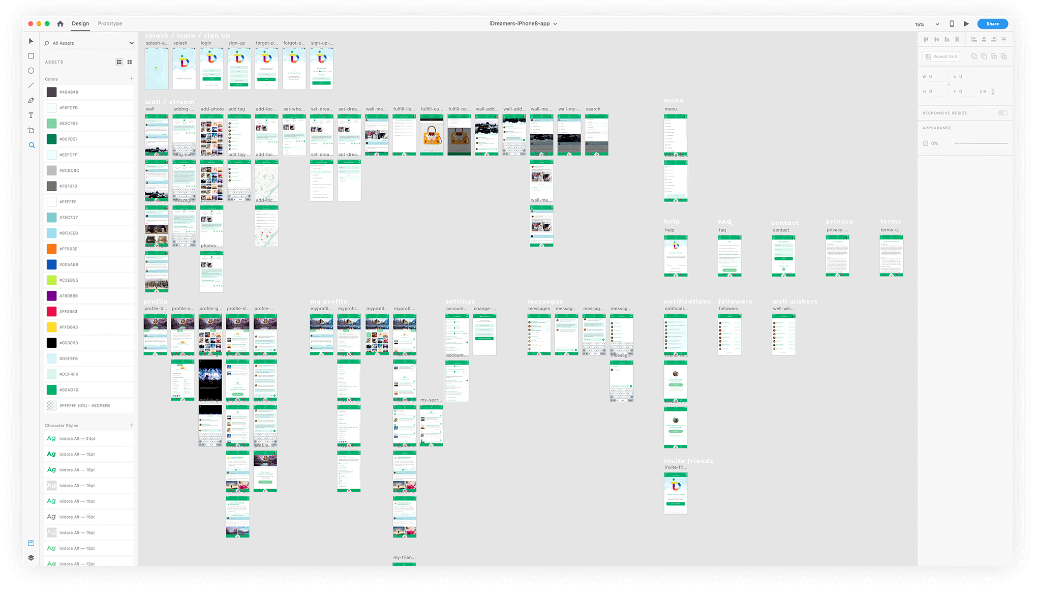
A zoomed out screenshot of all the screens of my very 1st mobile app project in Adobe XD
I had this impossible deadline for a mobile app design where I had to figure out the complete UX from scratch. The information with prototype mockups I received from the developer team was lacking valuable user interaction screens and some were even missing complete logic. While I already designed the logo and knew what the application was all about, I just didn't receive a complete outline, only fragments and bits and pieces of 'what it should do'. The rest was up to me to 'design' it. In other words it needed a lot of reworking.
When I was still in the estimate phase of this project, the developers were already asking me when I could deliver them the design. It was an almost impossible situation really. I knew this was going to be a rush job, even though I only wanted to deliver a quality job or there would be no job at all. The project itself felt like a cool creative challenge and the financial side plus the contact with my client was all good, so I definitely wanted to go for it. Luckily Adobe XD helped me accomplishing this rather challenging task. Thanks to Adobe XD, I was able to complete this task in almost less than a week, followed by a couple of days extra for some small iterations.
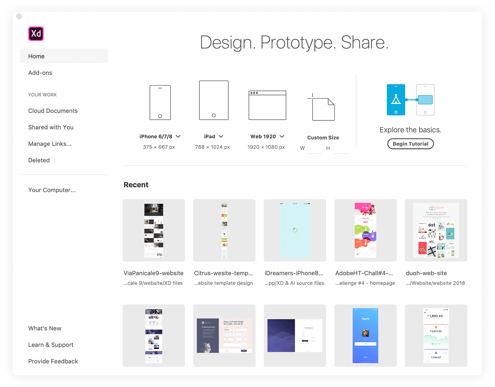
Adobe XD startup splash screen showing a set of popular mobile and web document dimensions, a button to a quick tutorial and a few of your recently opened projects
Never had I done such job of this size at this speed really. Honestly? I was truly amazed. All I did, before jumping right into it, was taking the 15 minutes 'Explore the basics' tutorial (which is now called 'Begin Tutorial' and is a bit more extended) on the application's splash screen. Seems, this was actually all I needed to know to get started. A little bit later I was playing around with Styles, Symbols and Grid Repeaters like a pro. It felt like I was using this application as if I already knew it for ages. Everything felt just the way it should be, logic, light and fast.
Starting with Adobe XD is easy
You can download Adobe XD on Adobe's website and you don't have to worry about paying because it has a free starter plan. Once downloaded and launched, it's recommended to click the 'Begin Tutorial' button on the splash screen. This will show you the basics of the application and lets you finish the design of a small mobile application project. It will show you how you can create basic prototype user interactions and how you can preview what you've created.
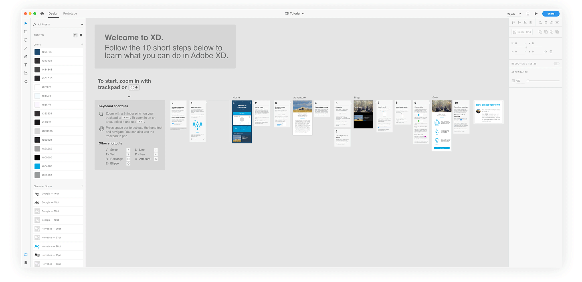
Adobe XD quick tutorial that will get you to learn how to use this application in less than 1 hour
In this Medium article you'll find a nice detailed outline of this tutorial, step-by-step, with extra explanation. After completing this you're basically all set to get started yourself. It's what I did for the project I finished so fast.
The good thing about XD is that the application is in constant development, and every update brings new useful features. It's a very intuitive and light tool with some powerful capabilities to create interfaces, and for UX prototyping. The two features I value most, apart from being able to add interactions to your design via the Prototype mode, are the Repeat Grid and the capability of sharing files and colors via a CC Library. This is my way of exchanging all my vector-based files from Illustrator, or other elements from Photoshop in my Adobe XD project.
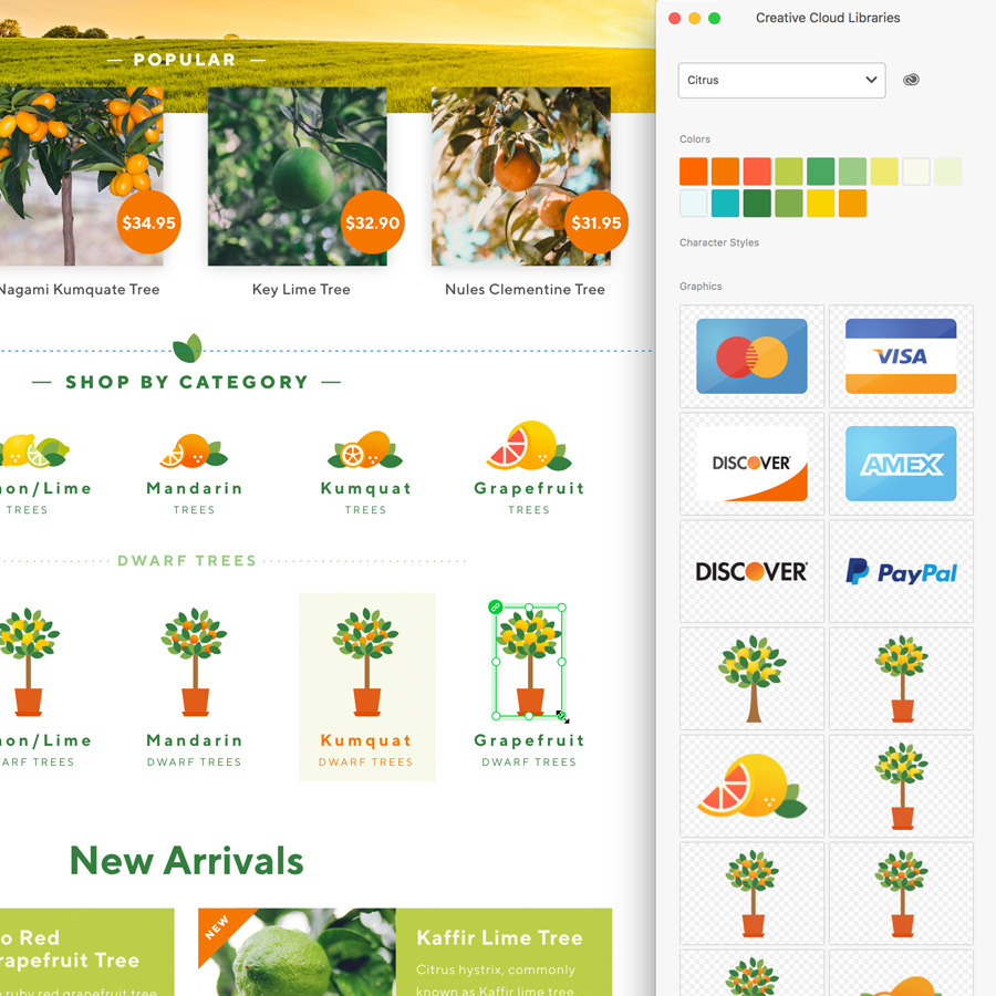
Using the CC Library in Adobe XD
I create all my icons and illustrations in Illustrator which I store into a CC Library of the project. I just have to drag & drop them into my XD file. When I update such item in Illustrator, it gets automatically updated in my XD file. It works the same way with any Photoshop CC Library items. What I also like about this method is that you still can resize the item in XD, where as with XD Symbols you can't. At least not at this moment, but Adobe promised this will be possible in a later version.
Repeat Grid
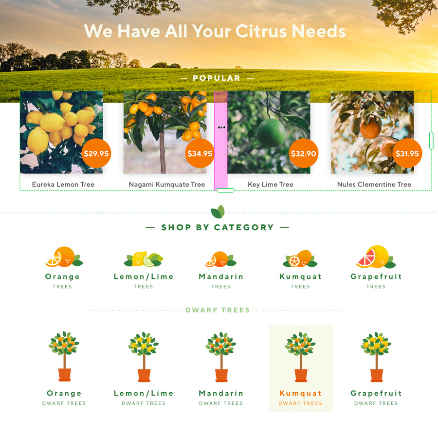
One of the features I love most in this application is the Repeat Grid. It's something I use quite often throughout my design. The nice thing is that you repeat an item or group of items vertically and/or horizontally by dragging a handle on the side. Then you can modify each item by using different text or photo, and you can set the (equal) space in between. No need to calculate. It works very intuitively and saves so much time. You can always Ungroup such grid item in case you need to.
