Click! Book Cover Design
My Design Process
Article written on Thursday, 03 Dec 2020
A while ago I was asked by Vitaly Friedman from Smashing Magazine to design the cover of Paul Boag's new book titled 'Click! How To Encourage Clicks Without Shady Tricks' (published in June 2020). Today I want to share the process of this design.
After having designed Paul Boag's two previous books, 'Digital Adaptation' and 'UX Revolution', I was truly honored to get this request once again.
Read about the design process of the 'UX Revolution' book here.
About the Book
This book is about the fact that the web has become full of manipulative copy, annoying overlays and intrusive dark patterns. Yes, every website needs to encourage users to take action, but surely there has to be a better way.
The final book cover design shown on a hard cover book mock-up template.
That's the reason why this book has been written. Click! is a handbook to encouraging action without resorting to manipulative techniques. Techniques that provide short-term gains at the cost of long-term business success.
Whether you are a marketer under pressure to improve your conversion rate, or a designer seeking to put the user first, this book will help. This book is about exploring user-friendly design patterns and strategy for building applications that are respectful for the user, but also involve business and decision-making based on conversion.
The Briefing
The briefing I received for the design of this book cover was to try to emphasize decent, friendly qualities above all the pop-ups, push notifications, install app prompts and dark patterns, while also trying to somehow align this design with the other books that Paul has published with Smashing Magazine so far.
Inspiration
While browsing around a bit on Dribbble, Pinterest and of course my own Inspiration Stream I found these inspiring illustrations:
- Space is the Place by Matt Carlson
- an illustration from Jesse Lefkowitz.com
- and a cool pattern illustration by Rogie
Inspired by 'Space is the Place' by Matt Carlson, an illustration from Jesse Lefkowitz.com, and a cool pattern illustration by Rogie
Experimenting
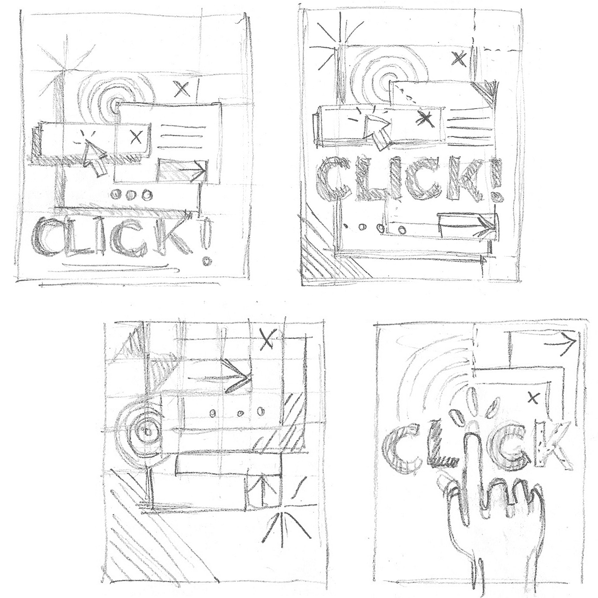
Doodles & Sketches
I was thinking of creating popup boxes/windows stacked on top of each other. The style would be very simple, clean, geometrical, and very colourful as this would fit perfectly with the other books I designed before for Paul. I would add in some colorful shapes, a bit like it's shouting for attention. So the color palette would also be rather high contrast.
Another idea I had in mind was to incorporate a browser hand into the title, making the i the clicking finger. Although I wasn't 100% sure about this idea as it looked a bit difficult to pull off nicely. Plus, what if the title isn’t final (because it was at the time of the briefing) and what about the placement of the subtitle? The hand would probably get in the way for the subtitle.
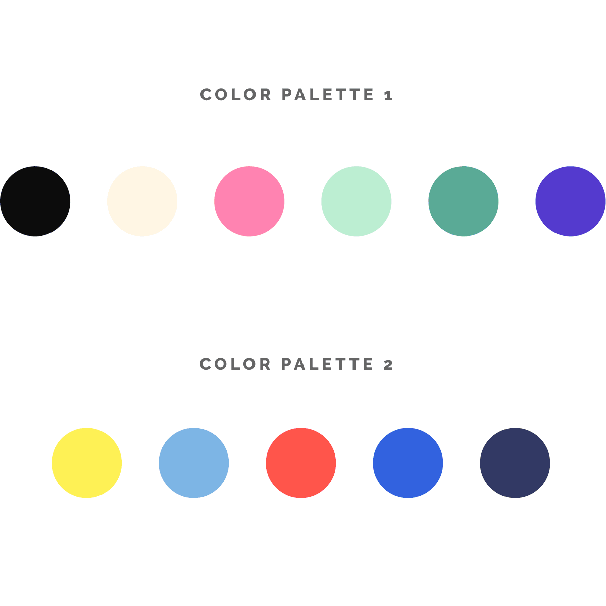
Choosing Colors
Inspired by the color palette of the illustrations I found in my Inspiration Stream, on Dribbble and Pinterest, I came to these 2 color palettes. Of course just picking colors is one thing, applying them is another. It happened more than once that I choose a set of colors where I'm convinced they will work great, but where I struggle to have them properly applied. Sometimes I have to come to the conclusion that I need to tweak them further. Make the red more orange, have the green softer, the blend darker etc. stuff like that. In other cases I end up with one color too many and I have to reduce the hues. It's not always good to have too many colors. Usually it's better to work with less colors than with a wide range of hues, but then again it all depends on the project and which result you're after. This can not be generalised, at least that's my humble opinion. At this point I thought I first present these 2 color palettes together with my sketches and see what the feedback is.
First Draft
Both concepts were well received by Paul and Vitaly and they also liked the colors I selected. Although Vitaly wondered if I should't pick a color palette that is closer or more similar to the colors used in the 2 previous books. This was something I had to keep in mind and try out.
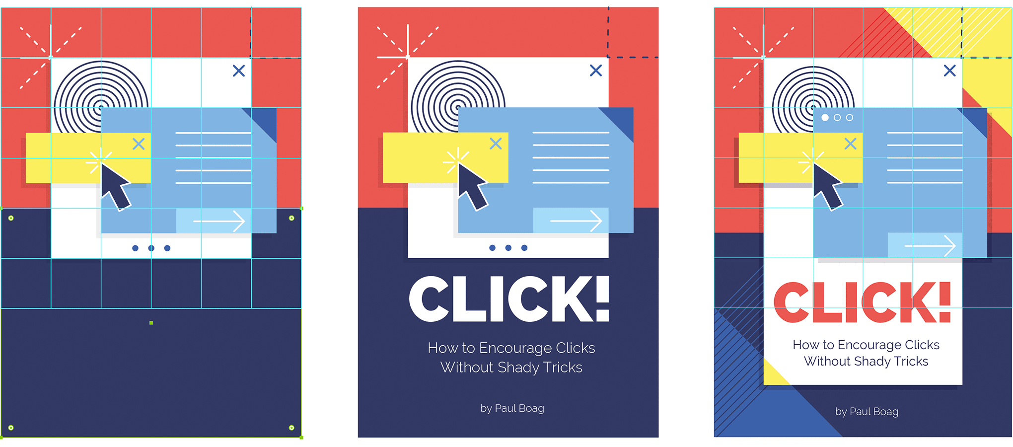
Click! book cover first steps of the 1st concept
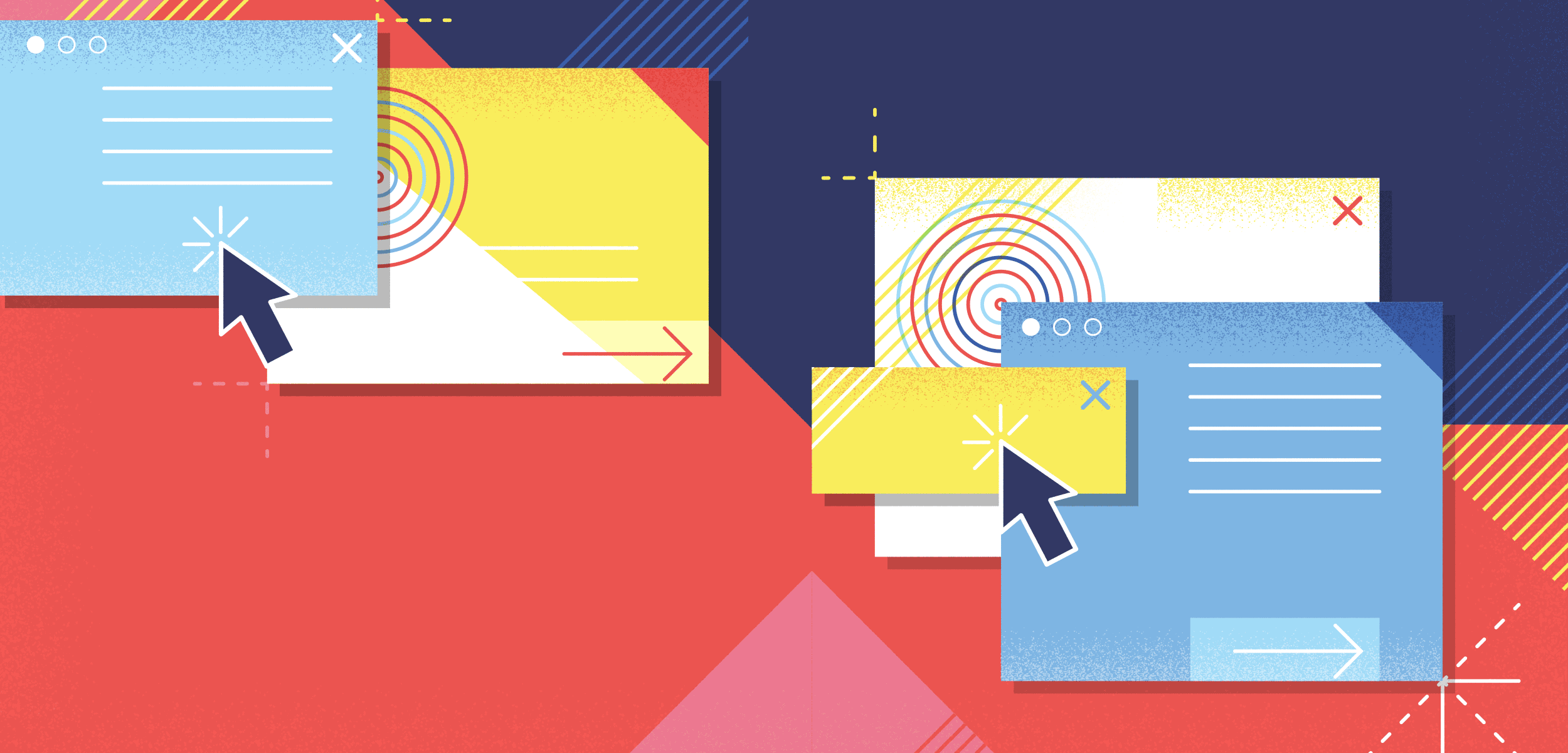
Just like I did for the 2 previous book covers, I started by setting up a basic grid using the Grid tool and turning the object into guides. Next, I started to draw different fictional window shapes and boxes on top of the grid layer using different colors. By applying a certain stacking order, I tried to create some kind of chaos of popup boxes while keeping things clean to keep a perfect balance in my composition. I started to work with the color palette of my preference, which was the 2nd one. Since these colors just felt perfect, I stuck with them for now.
Click! book cover first drafts
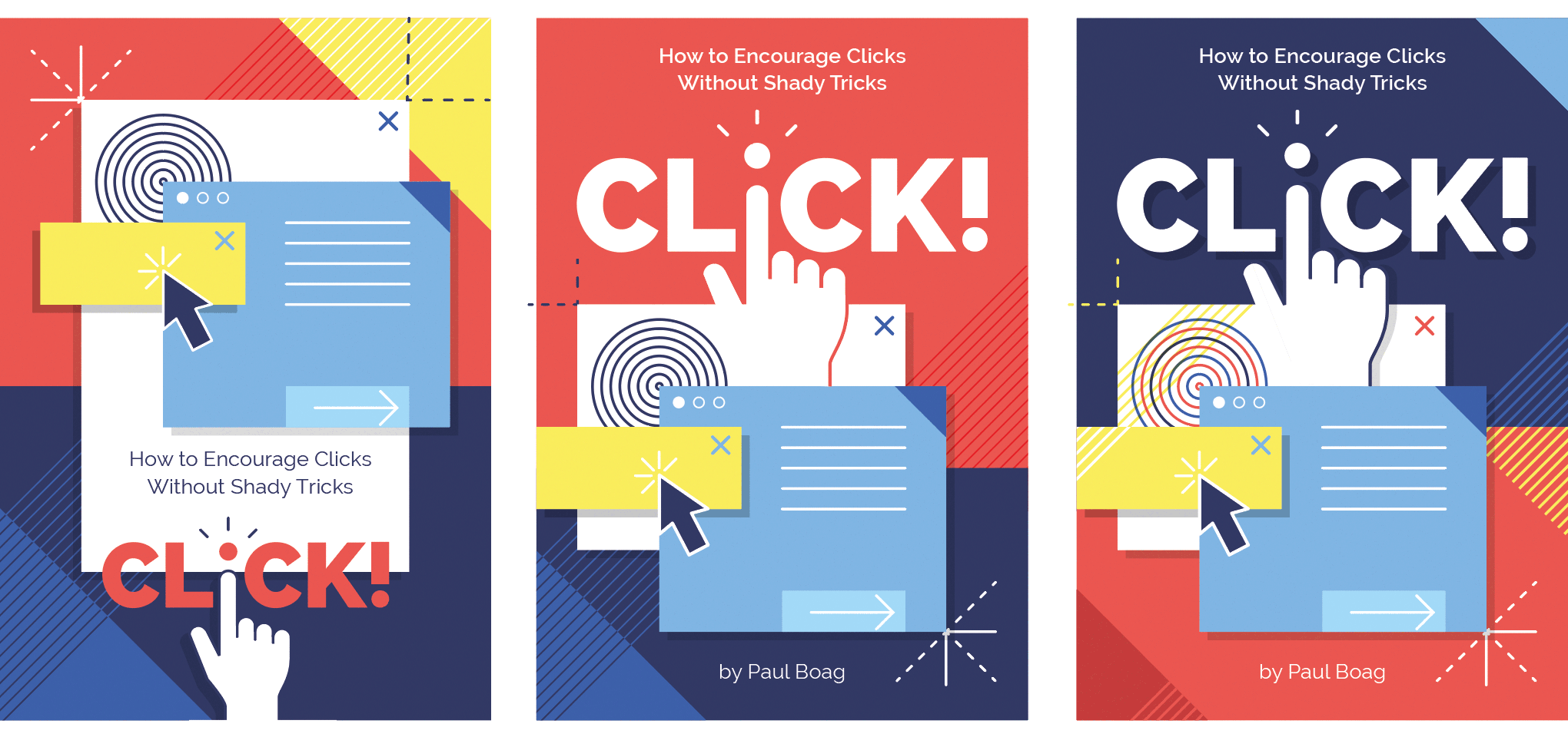
Another concept I thought could be great to adapt from Paul's first book cover was the division between top and bottom part using 2 contrasting background colors. Here, I thought the dark blue would give this extra contrast combined with a white bold title in all caps. This would give the cover, and especially the title this extra visual impact. Though I wasn't sure what would look best: red at the top, blue at the bottom or vice versa.
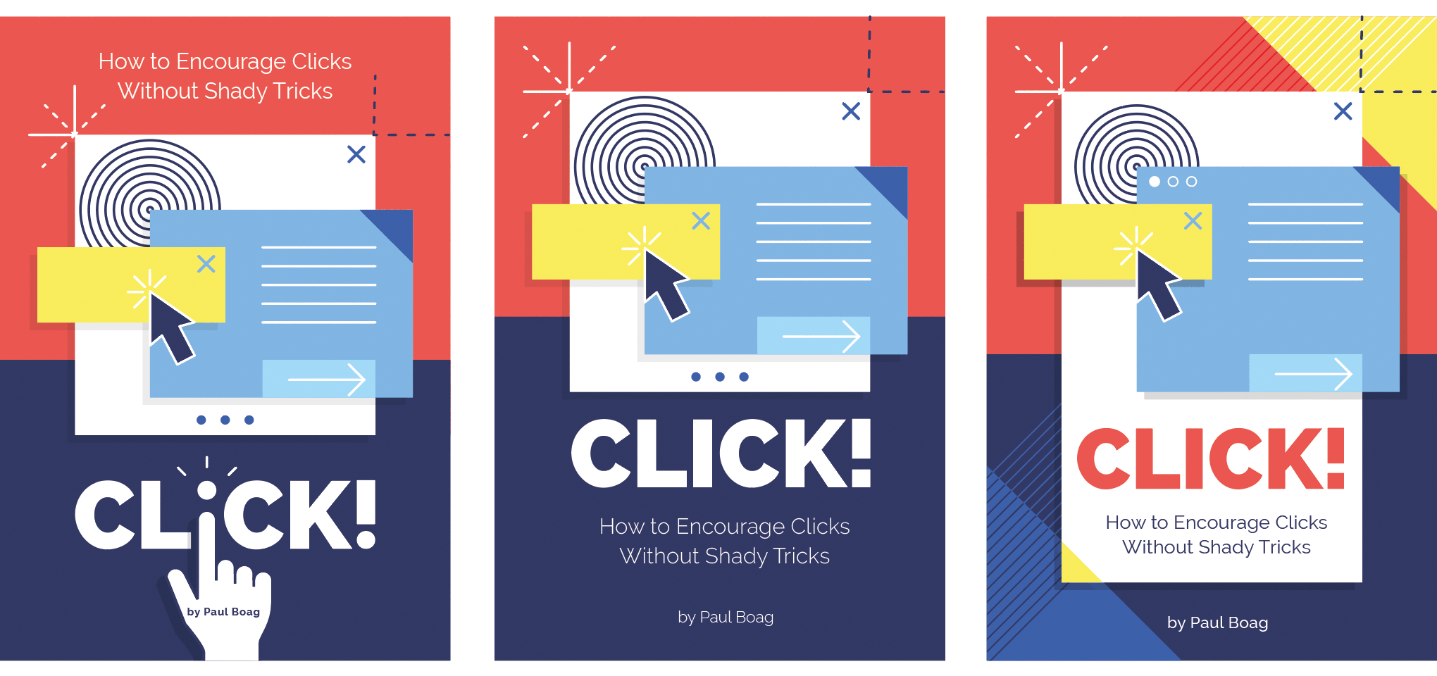
As for the title I knew it really needed some extra work so it would grab all the attention. For previous books I always played around with the letters of the title. This time there was the idea of using the browser hand somehow. I figured I had to try incorporating the clicking finger into the i of the word, because I knew that if I could pull this off it would make the cover extra eye-catching. A trial and error challenge...
Click! book cover first drafts
Though, the issue with the hand was mostly its placement. First I tried placing it at the bottom, but as I already assumed, I ran into trouble for the author and subtitle. At first I didn't see a way to place it at the top, but I had to try this somehow because I knew this would be the only way to make it work. That's how I ended up with the hand blending into the white box.
Playing around with a lot of different variations, experimenting and comparing to see which version gives the best result is always important. In a lot of cases you might end up with a better result than you initially thought, even though in your head you think it might probably not work or look any better.
First Proposal
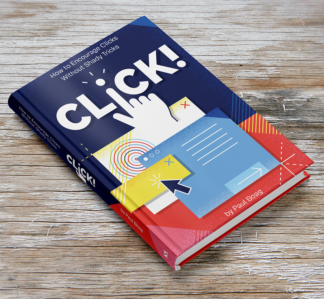
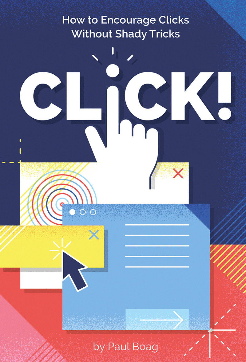
When comparing the versions I tried out so far, I was convinced I had to stick with the one using the browser hand with the blue at the top. Though I felt it could use some extra touch still. Subtle textures would finish this design off. While browsing around a bit in my arsenal of textures and brushes from the many Design Cuts bundles, I decided to try out the Memento Shader Brushes For Illustrator. They would work well with this design. By applying these in different widths and layer modes I ended up with a result to my liking, ready to present to my client.
Like with any other design it's always my intention to show something ‘in between’ first, meaning not finished yet and sometimes even in the middle of my process, just to give my client a bit of an idea of the direction of the final outcome. With this design however, I was so in the flow of things. When this happens I just have trouble stopping. For new clients I tend to stop, because I don't want to risk spending time for nothing in case the direction I'm heading was totally not what my client envisioned. However, in this case I could somehow estimate the outcome a bit. Yes, maybe that's still a bit of a gamble, but I evaluate the time spent and result compared to showing an unfinished version. Plus, I also evaluate the fun factor. If the design got rejected and so it happend to be pure wasted time from a business point of view, well at least I had fun :) So my client got to see the finished version where I show the front cover, and also a version with the spine and back included.

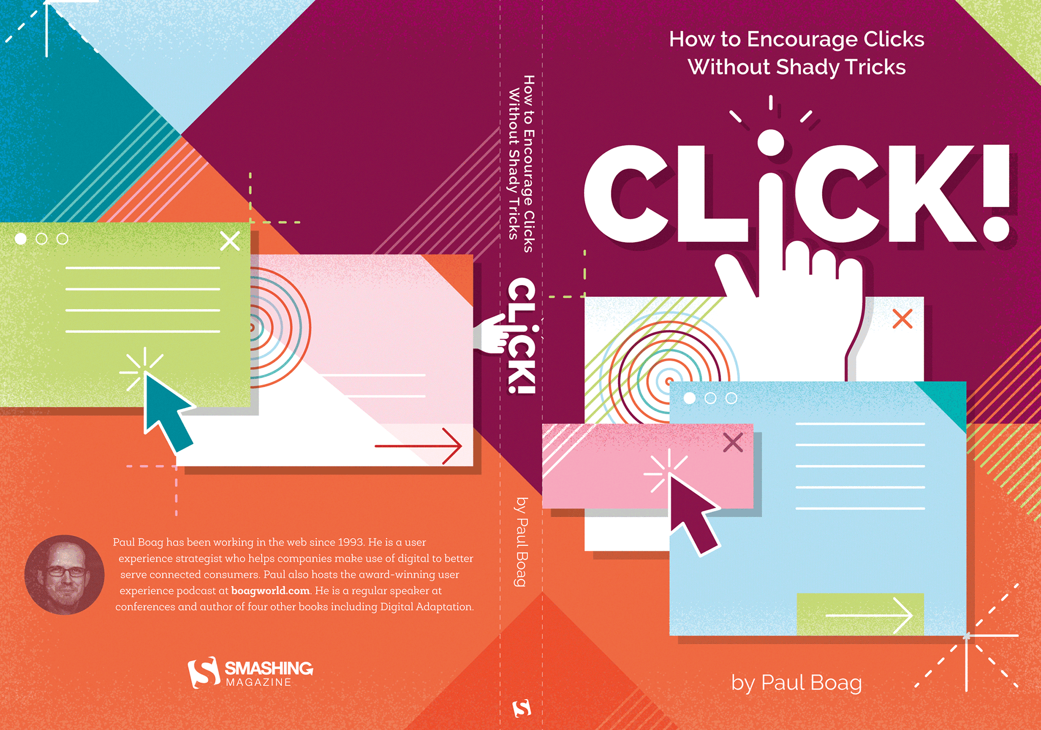
First design proposal of the Click! book's full cover including spine and back
Alternate Proposal
The design proposal was very well received, only my client wondered how it would look if I try out a color palette closer to Paul's previous book covers. I thought I give it go by using Adobe Illustrator's neath Recolor Artwork feature.
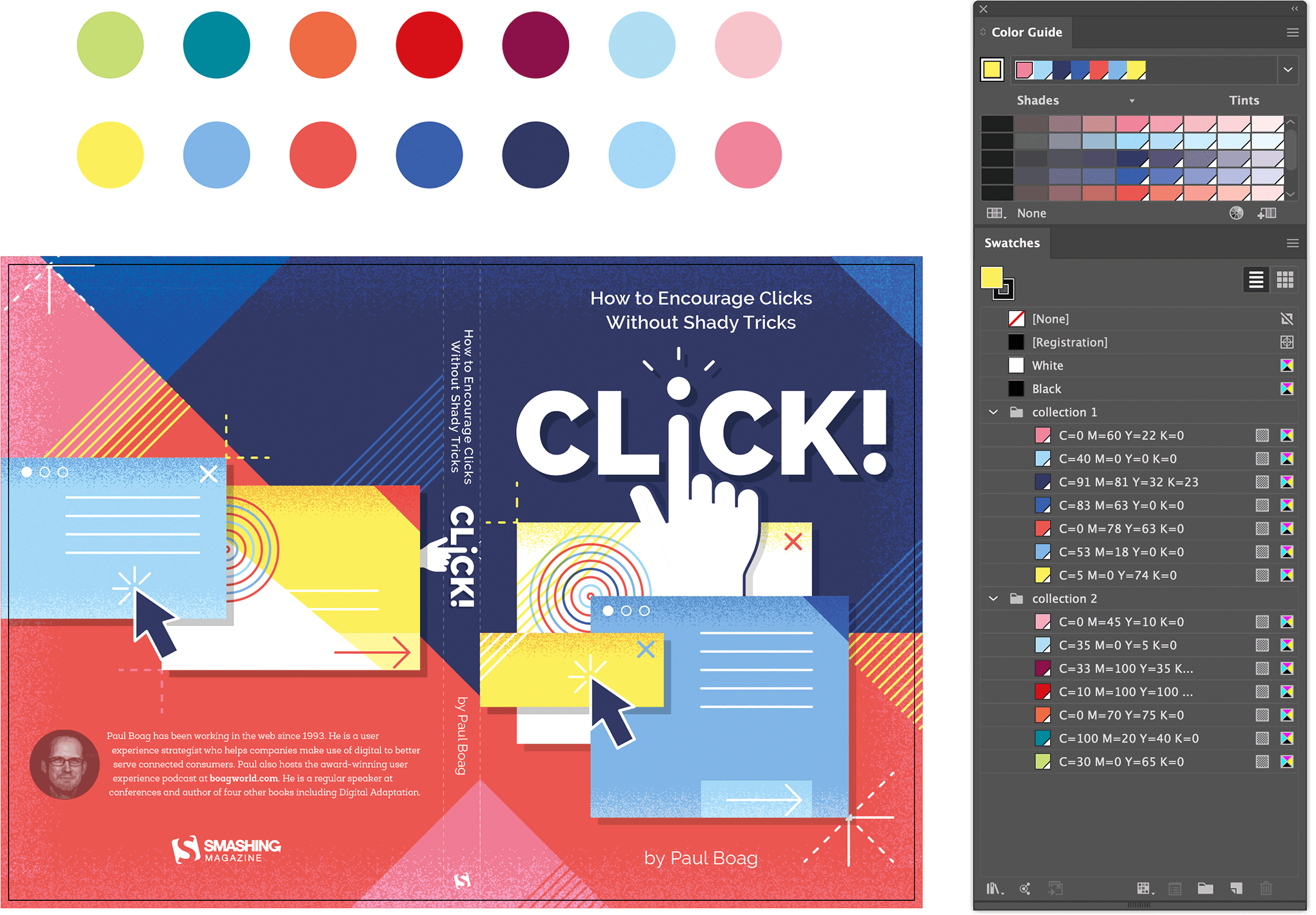
Defining a new color for each color swatch.
First I defined a different color for each Global Color Swatch. I figured if I replace each swatch with a new one I would maybe end up with a great result.
Next, after selecting my artwork I opened up the Recolor Artwork feature via Edit > Edit Colors > Recolor Artwork.. and clicked the Advanced Options button. However the end result was totally not to my liking as the colors weren't applied the way I envisioned it. The color balance was totally off.
This cool feature works well in a lot of cases, but sometimes not so much. Fast is not always best, but it's definitely worth trying out. Another way is to edit each Global Swatch, one by one. That's what I tried out next, but this also didn't gave me a satisfying result. However I kept the updated swatches since I had to use these anyway. I just had to change the way they were applied. Once I started re-applying the new colors to different objects one by one by, I ended up with a way better result ready enough to present to my client.
Trying out a different color palette by tweaking each color manually
Final Design
Although when I compared it to my initial design, I truly hoped my client would agree that the 1st proposal is way better. Luckily he did :) The last change needed was to adapt the typography a little and use the Smashing Magazine typefaces Mija and Elena instead of Raleway and Roble Alt. So I changed the subtitle and author into Mija, and used Elena for the info text on the back. The big title stayed untouched. The impact of changing this into Mija as well would be too much as it would totally change the overall look. This modern heavy typeface works so well in combination with the illustration of the sharp edged stacking boxes. So it was decided to leave this untouched.

Final design of the Click! Book full cover (front, back & spine)
Stay tuned for the a follow up article on how I created the 11 chapter illustrations, and template layout of the book. Choose the book tag button below to find more design process articles on book cover designs.