The 'User Experience Revolution' Book Cover Design
Illustration Book Cover Design Process
Article written on Saturday, 20 Oct 2018
Some time ago I've worked on another book layout. It's one of my favorite things since they're always very rewarding challenges. They give me the opportunity to express my creativity at its full potential…
I recently designed two book covers, and for one of the books I also did the entire layout. The other one is Paul Boag's second Smashing Book 'User Experience Revolution'. Today I would like to share a bit of the process behind this design.
The briefing
Some of you might remember I designed the cover, and illustrations & template layout of Paul's 'Digital Adaptation'book as well. So the briefing for this 2nd book was pretty straightforward. In terms of design style, it should be clear that these two books belong together, but without both looking too similar either. In other words they should have a similar design and illustration style, but a different colour palette. This cover design should have a more user focused iconography, with a bigger emphasis on people.
Inspiration
As usual the first thing I do is pick my brain by writing down some keywords, while trying to think of a couple of design concepts. At the same time I also browse around to trigger some inspiration for both colors and concepts.
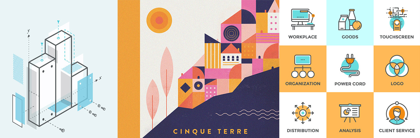
Inspirational images: inspiring design style, color palette and icon concepts
The one place I never skip is of course my own Inspiration Gallery. The first illustration in the image above caught my eye. I liked its style: using a line in combination with a fill and leaving a bit of space around the fill. Same goes for the icons on the right. They're even more close to what I had in mind, because I figured keeping everything 2D would be the best option to suit with the design style of the first book.
As for colors, I really like the color palette in the 2nd illustration of the image. I was certain of using that kind of pink in my design.

Inspiring dropcaps
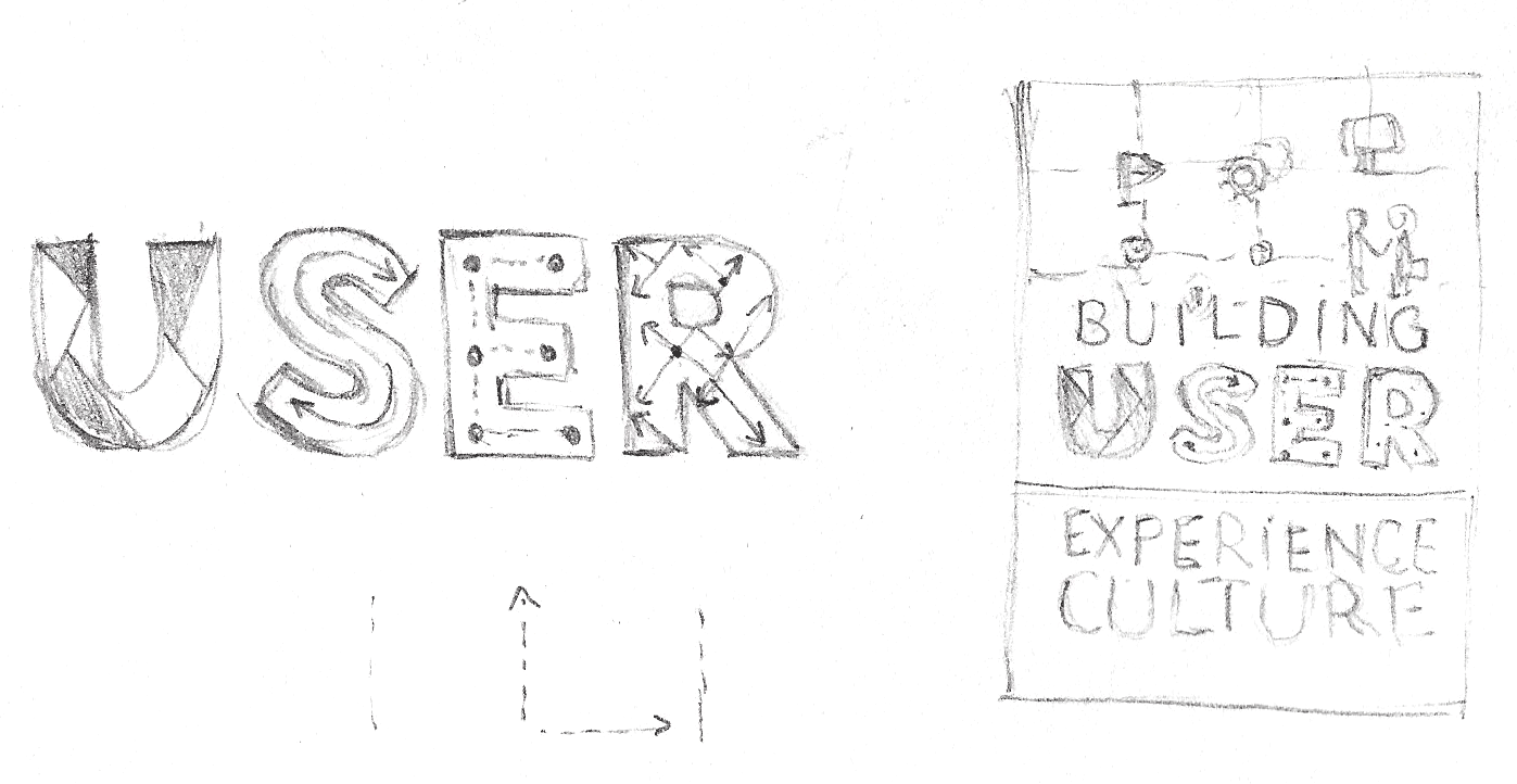
While being inspired by some beautiful drop caps over at dribbble, another idea that came to mind: maybe I can do something creative with the letters of the word USER. My idea was to make this word stand out on the cover. It is a short word, and the 4 letters have perfect shapes to work with. It could be the perfect eye-catcher.
Experimenting
Choosing colors
After doodling for a bit, I tried out a couple of color combinations. I thought the 'Smashing' orange could not be missed so I made sure this color was included. As mentioned before, I was very much inspired by this illustration by the talented Bailey Sullivan. The pink suits so well with this type of orange, and so I decided to go for this in my design.
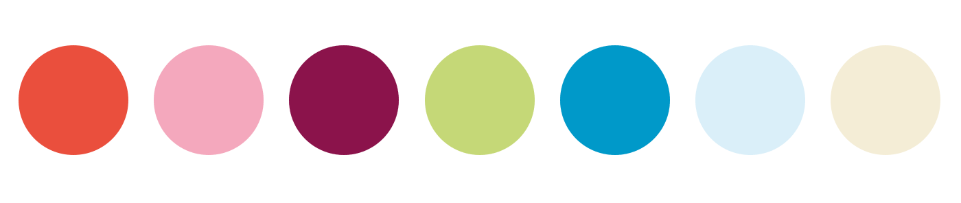
The chosen color palette
Of course choosing colors is one thing, but applying them correctly so everything is in harmony and well-balanced is something else. That’s always a bigger challenge.
Sketching
Usually I do a lot of sketching for this type of projects. However, for this project I didn't do much. Sometimes I like to play around directly in Illustrator if something is in my head already. Can't say this happens every time though. It's actually a question I often struggle with. Then I usually ends up with just a couple of 'fast' doodles.
Designers block
Jumping directly into Adobe Illustrator has resulted in a designers block a couple of times before. That’s why I decided to doodle anyway to avoid this risk. I find that I sometimes ‘loose’ too much time on this sketching phase, but it often bites me in the ass afterwards :) This designers block usually happens when an idea in my head is merely a concept, but I’m convinced that this idea is ‘it’. Then when I start trying it out it appears to result in a big disappointment. Somehow I can’t seem to get it right, and whatever I try it’s just not working. So I’m totally stuck, but somehow I can’t let it go, and I keep on trying, until frustration takes over, and then… Then it’s time to go ride my bike :) Not that I’m always able to do that just in an instance, but if I can I know it’ll help. The best thing to do is to get out, do something you love, or where you can put your energy in so your head can be empty again. Clearing your head is the best option anyhow. Whether is yoga , sport, listening to music… Reboot and start all over is the only message that works.
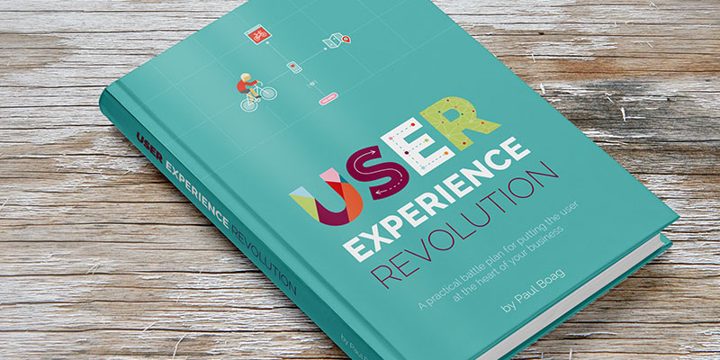
The final book shown on a hard cover book mock-up template
Luckily it didn't happen to me for this project. Of course some things were already defined in a way. The design style should fit the first cover and I figured I could re-use some of the characters I've created on the first cover. Some projects just go smoother than others, and it depends on a lot of factors. Most of them you don't have control over. That's why I always find it hard to give specific timelines to a client. It's almost like picking a number and hoping you get lucky. The creative mind isn't a machine. It's not like you're baking bread and you'll know when it comes out the oven and be ready. It's just tricky as there are too may factors you just don't have control over. I do understand the question of course, and for small stuff it can work. I always try to answer this question with a margin: between this and this.
First draft
At first, the title of the book was different: 'Building a User Experience Culture' as you can see from the design below.
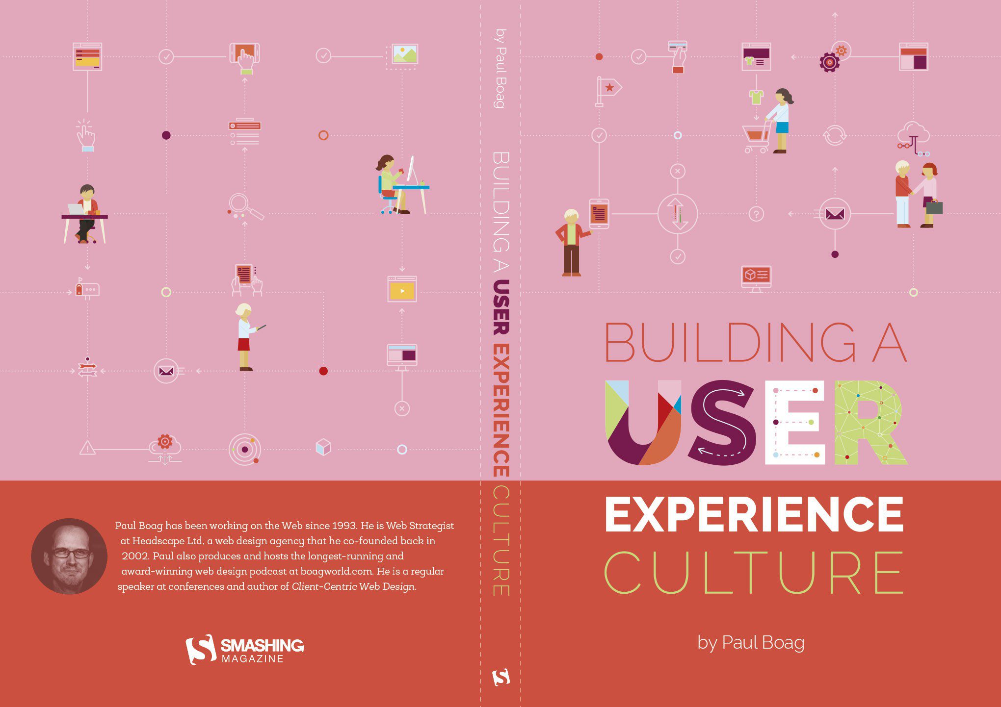
The 1st draft of the book cover design (with initial title)
Looking at it again, I now clearly see that I went totally overboard with the pink. I must have been a little too enthusiast about the combo orange & pink. I also thought it would be nice to use this same color division like I used on the 1st book, this time with orange at the bottom.
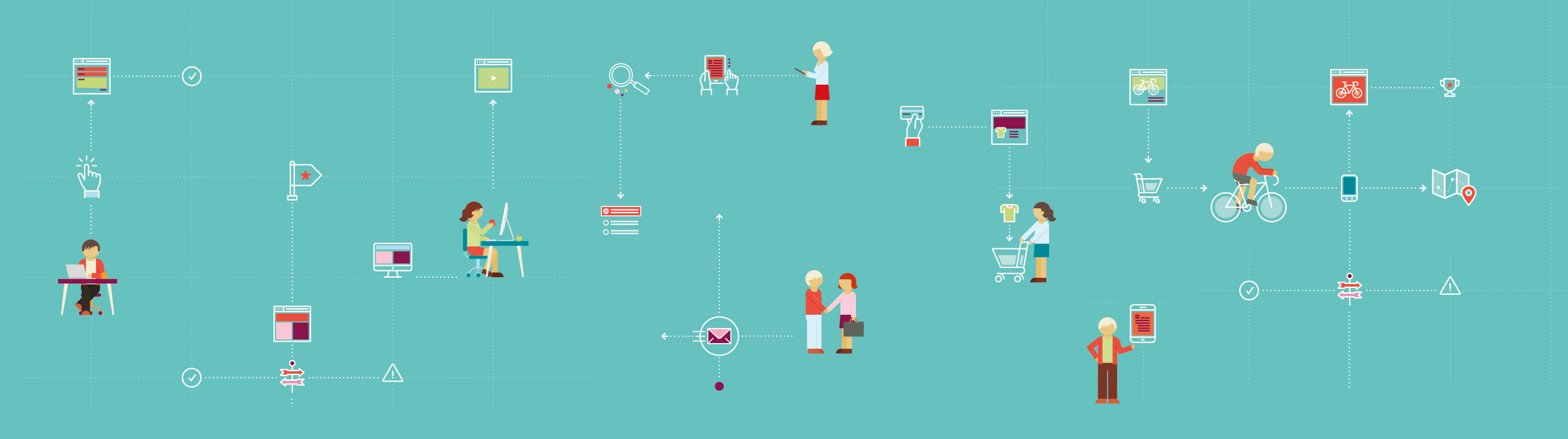
The general idea I had in my head for the illustration was showing all sorts of user interactions like: shopping online, searching, using the combination of a user on a desktop computer, and others using a mobile device etc. Just like with the other book I also wanted to put things on a grid. So I divided the cover into small squares.
While I was looking for some ideas I browsed through this collection named Futuro that I bought through one of the cool bundle offers at Designcuts. The style of these icon illustrations had inspired and influenced me, and I've used some of the elements of this collection in my design. I figured this style could be a prefect fit, and so I adapted them so they fitted perfectly in my design.
Feedback
The overal feedback was very positive. I was definitely on the right track with this approach. Although my client suggested to reduce the complexity of the ‘illustration grid’. It all felt a little bit too overloaded. Then secondly the pink was not really to my client’s liking. As I mentioned before I was a little bit too enthusiast about the color combination orange & pink. It’s exactly what I mentioned before: picking colors is one thing, applying them correctly is another. Using the pink in only small portions will work just fine. I just didn’t see it at that moment. It’s weird to say, but I was just too blind to see it. Sometimes I’m so focussed on an idea that I don’t realise I’m about to bump my head on a wall if you know what I mean.
Second Draft
I decided to work on modifying the color first. I tried out a couple of colors, but it was quickly clear to me that I had to try out blue teal-ish like colors. They seem to suit best. You can see the result in the image below. The new color suits perfect and is way better than the pink. Instead of using the pink all over, I used it very mildly in just a couple of places. Much better!
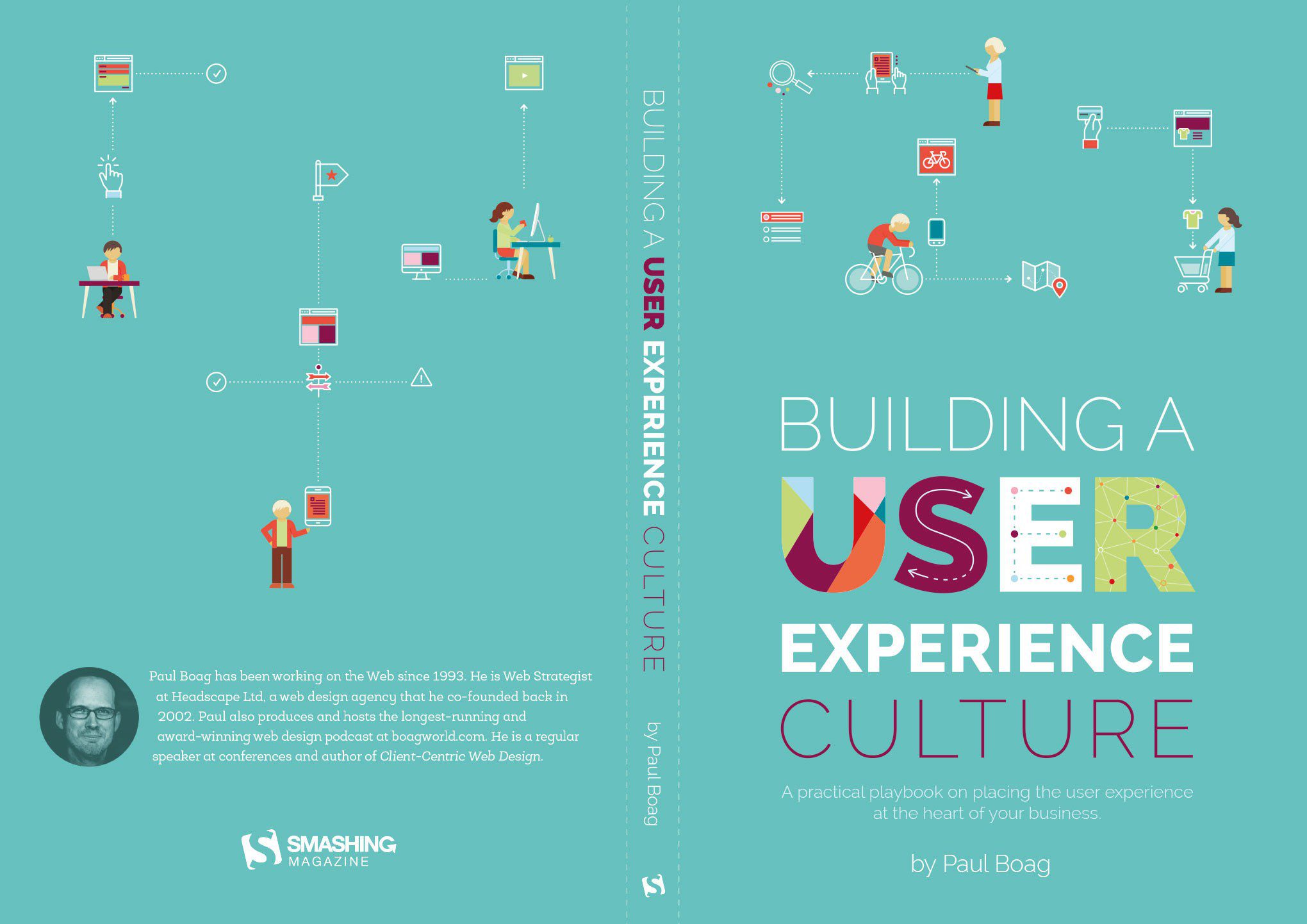
2nd draft of the book cover design
Changing the color
Talking about trying out colors, one cool thing you can do in Illustrator is comparing color combinations on the fly if you have set up things in a smart way. By that I mean, if the colors you've used throughout your design are saved in the Swatches panel as 'Global Swatches'. Then when you double click such swatch from the Swatches panel, and you modify it, you can see the change live (when Preview is checked of course). That's what I often do when I've used the color in different places. However in this situation only the background needed to change. So I just changed the color via the color palette instead by playing with the sliders from there.
As you can see I also changed the small illustrations. On the front I decided to go for 3 interactions: shopping, search and… well, cycling :) On the back I kept the idea of using separate 'groups' so there was a little bit more breathing room.
Almost there
The feedback on the second draft was very positive. Though, there was one 'small' problem. The title of the book changed into 'User Experience Revolution', with subtitle 'A practical battle plan for putting the user at the heart of your business'. Ouch! There goes my design… but actually, no it was still fine because I could keep the word 'USER'. Big relief!
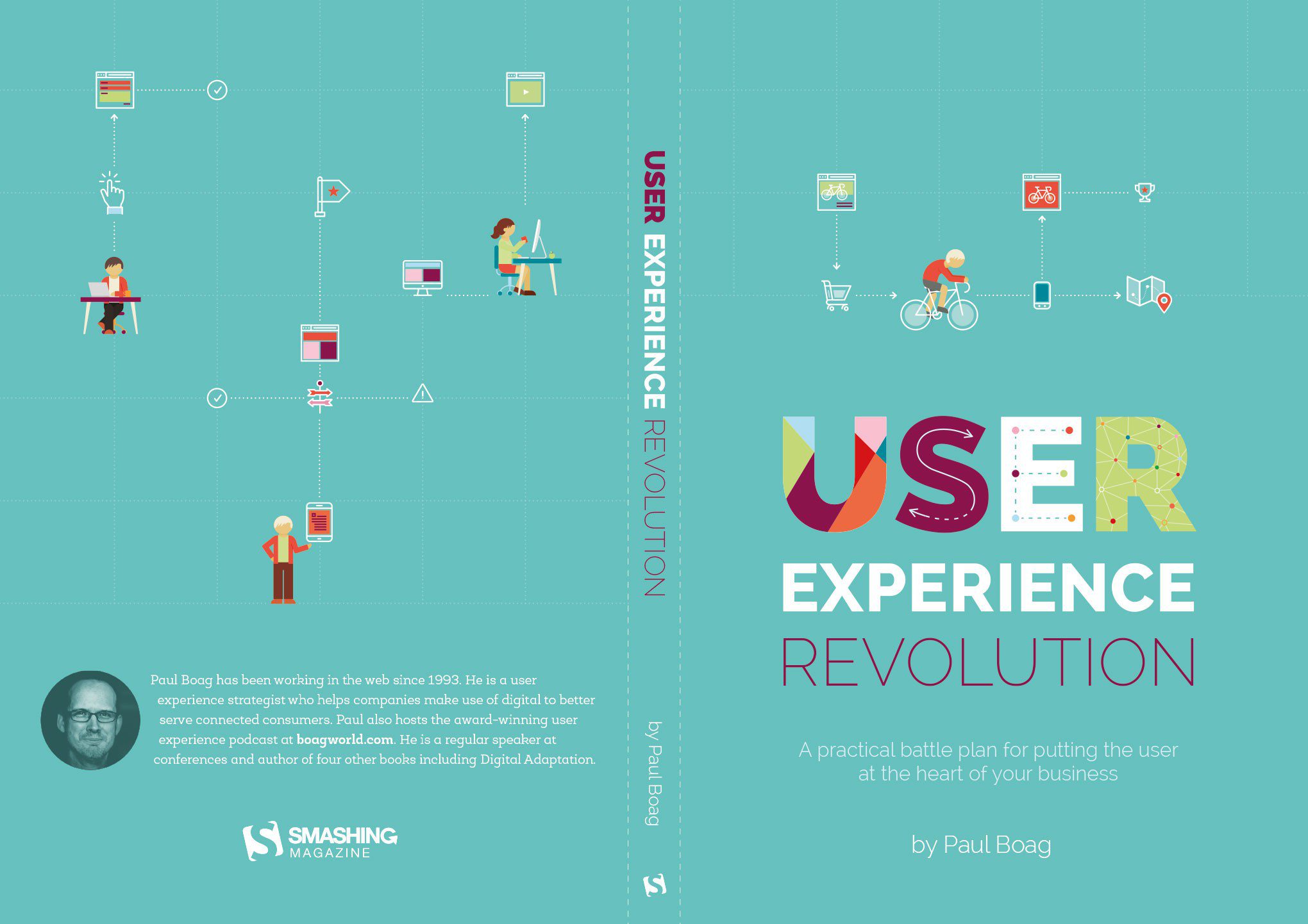
3rd draft of the book cover design
The only remark left to put some extra work on was the illustration part of the front cover. Somehow my client still liked it to be a bit clearer and simpler. So I decided to combine the shopping interaction into a sport interaction one instead.
We've got a winner!
Apart from the previous version, I also showed a lighter version that is only focussed on the sport interactions, and that one was the winner.
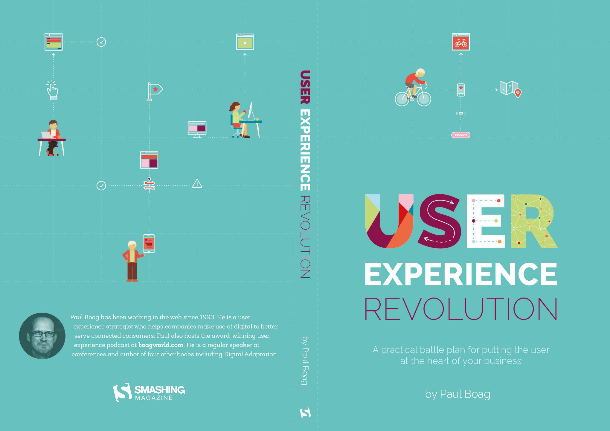
The final and approved book cover design