Cycling Escape the demands of daily life and find solace in the rhythm of pedaling, either in real life or through my discoveries here.
Hammerhead Karoo 2
Since you're subscribed to my Sidenotes, I assume you're aware of my deep passion for cycling. Around 2009, I acquired my first GPS cycling gadget, the Garmin Edge 500.
For years, my loyalty was exclusively to Garmin Edge GPS devices, including the 500, 800, and 1000 series. Despite my loyalty, I encountered several issues, such as software glitches and the power button wearing out over time. During that period, Garmin seemed to be the top choice with no real competitors. However, this landscape has changed for quite some time now. I've been using the Hammerhead Karoo 2 for the past few years, and I cannot express enough how satisfied I am with this device.

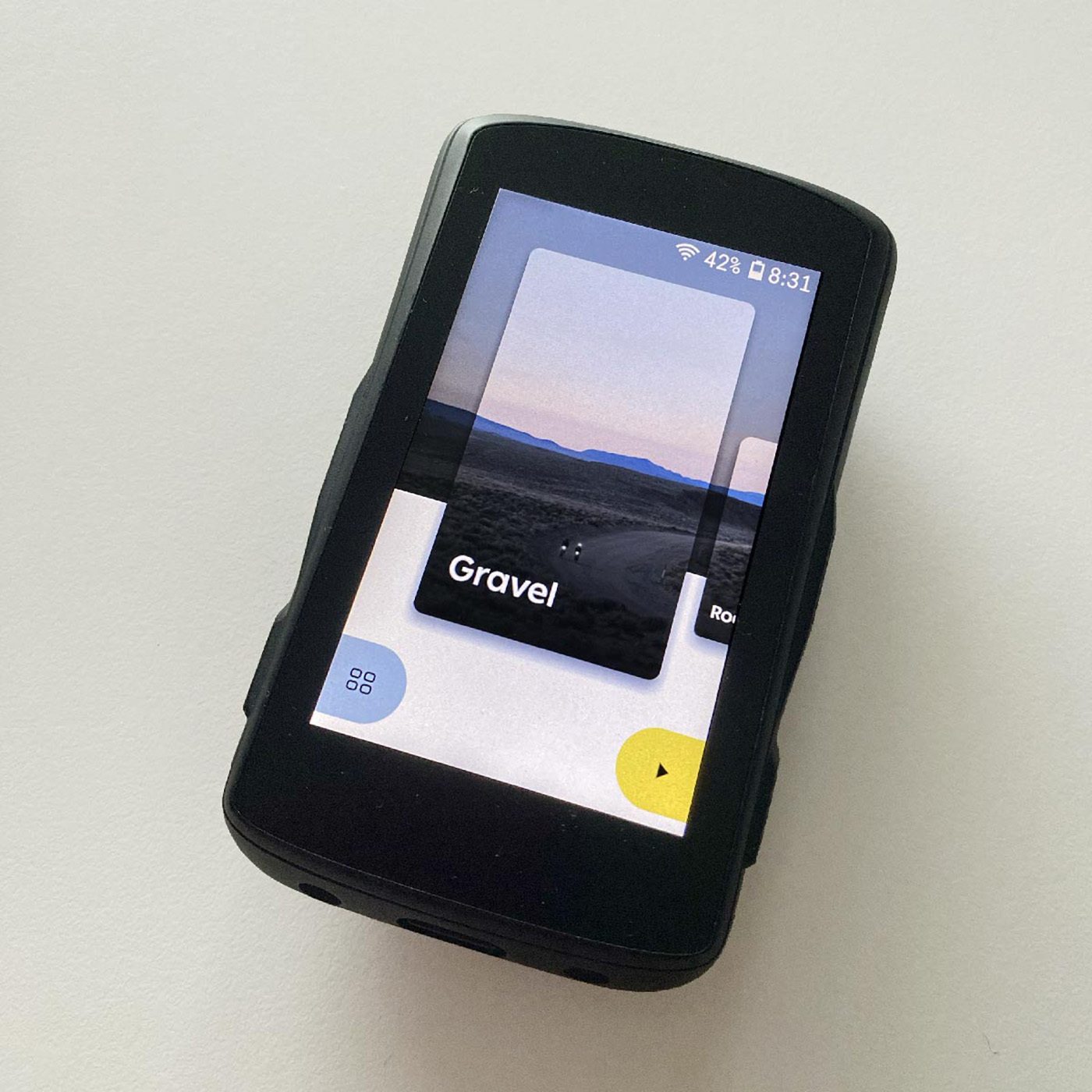
Hammerhead Karoo 2.
The contrast from the past is simply immense for me. Let me begin by highlighting the vast difference in navigation. When I was using Garmin devices, encountering overlaps in the route often led to confusion and uncertainty. The default "turn guidance" with prominent white arrows would appear as a turning point approached, causing distractions and a close-up view of the map. Personally, I disliked this feature, as I prefer maintaining a comprehensive overview of the roads.
In that state, the comprehensive overview of the route was lost, and to make matters worse, it was riddled with flaws, occasionally even directing you in the wrong direction. It was only after several months that a friend (Jered Gruber, to be exact) enlightened me about the possibility of switching off the turn guidance: "I always ride like that. I just see my line and I follow it." Great, problem solved, right? Well, not quite, because I have numerous routes with overlaps, especially the MTB ones. To cope with this, I used to memorize all the overlapping turns before starting and jotted them down on paper, keeping it in my back pocket as a backup. However, even with these precautions, things often took unexpected turns, leading us into adventurous experiences where roads would abruptly end in impassable fields or encounter roadblocks, forcing us to deviate from our planned route, resulting in a real mess to get back on our route.

Image by Alex Cohen.
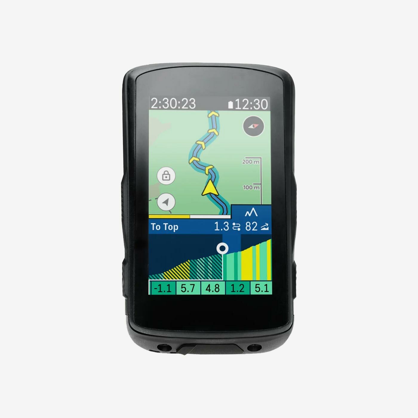
Since I began riding with my Karoo 2, all those previous issues have completely vanished. Now, I still follow a yellow line on the screen, but this line comes with helpful direction arrows. However, the real game-changer is the map itself, which is by far the best I've ever experienced. It beautifully differentiates between roads with bike lanes, off-road trails, paths, and major roads with bike lanes, each marked with distinct colors and clear indicators. Even our regional biking network (Knooppunten netwerk) has its own purple colored lines. And when you are about to ride on an off-road segment, you'll get a warning that the road will go off-road counting down the remaining distance until your back on the hard surface.
In addition to the exceptional map, another aspect I appreciate about the Karoo 2 is the regular software updates that bring continuous improvements and new features. One particular feature that I've grown to adore, available for quite some time now, is the option to ride a route in reverse. It's become a favorite of mine, as it gives the sensation of exploring an entirely new route. In stark contrast, I struggle to recall any notable feature updates on the Garmin Edge devices throughout all these years. Moreover, the outdated GUI look reminiscent of the 90s has been a constant bother for me as a designer. If the device operated according to my preferences, the outdated GUI look wouldn't bother me as much, but unfortunately, I was frequently annoyed by its performance.

Another problem I faced was the battery percentage issue. During long rides, it often became a concern, and I even encountered troubles when uploading my rides to Strava. However, since I started using the Karoo 2, I haven't experienced a single issue so far (knock on wood). The interface is aesthetically pleasing, user-friendly, and well-thought-out, and the touch screen functions seamlessly. I particularly appreciate the simple logic behind it, and the recent update that directly displays the sensor icons (speed, cadence, heart-rate, etc.) at the top of the screen is fantastic. It allows me to quickly see if they are properly connected, indicated by the icons turning green.
I apologize if it may come across as a rant towards Garmin, but I must be completely honest about my experience. The difference between my previous devices and the Karoo 2 is so immense that I can't help but rave about this remarkable device and the brand as a whole. Initially, I bought the Karoo 2 at a discounted price since my friend Geert had already purchased the Karoo 1. The Karoo 1 was a significant improvement over my Garmin Edge 1000, but it had some room for enhancement, mainly regarding its size. However, when the Karoo 2 was launched, it was the perfect solution, and we both decided to get one. To sweeten the deal, I received an extra heart-rate strap or a discount with my purchase (I can't exactly recall). When I faced issues with the strap as it stopped working, the support team promptly sent me an improved replacement for free. These new straps outperformed the Garmin ones by lasting much longer. Although it's a shame that one of them got misplaced somewhere in my house, I'm still on a quest to find it—a total mystery indeed.
If you are looking for an excellent GPS device, I can highly recommend the Karoo 2. Currently, you get a 50% OFF on a Heart Rate Monitor with your order if you use the code 'K2-HRM'. In case you wonder, I am not sponsored by Hammerhead for saying this.

