Graphic Design Link Picks
resources from newsletter #0097 & #0098
Article written on Wednesday, 31 Oct 2018
Rhythm in web typography is our first resource this week and it's a pretty extended look. We also take a look at another new design tool called 'Ratio'. A UX design best practice on how to make a ton of information scannable. Two Illustrator that teaches us to create something modern and something vintage and also two articles that look at Adobe's new brand illustrations plus Typographica's favourites of 2017. Enjoy!
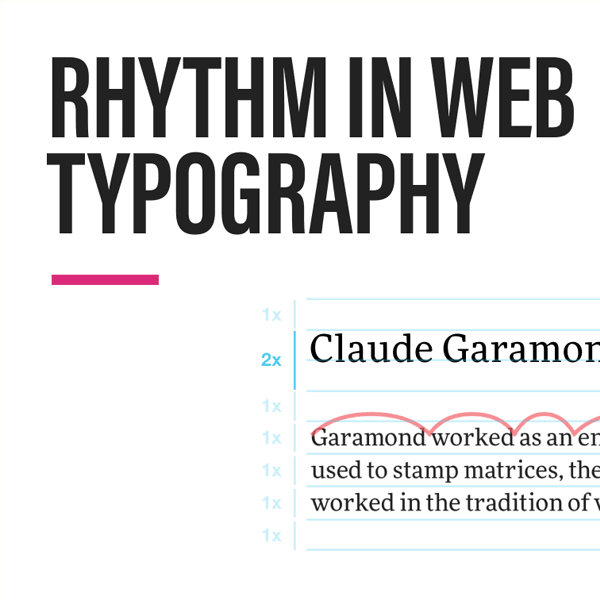
Rhythm in Web Typography
Rhythm in typography is just like rhythm in music. Pretty extended look at horizontal rhythm and vertical rhythm with example, free typography course and resources.
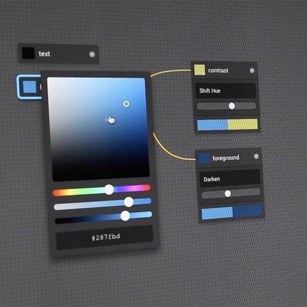
Designing with Ratio
New design tools seem to sprout like mushrooms. Most I take a passing glance at and move on. This one looks a bit different as it touches on problems I face. Something to keep an eye on.
UX Design Practices: How to Make Web Interface Scannable
Overwhelmed with a ton of information for your design? This article explores the phenomenon and gives tips on how to make it scannable.
Create a NAS Icon in Just 30 Minutes Using Adobe Illustrator
In this tutorial you are going to learn to create a NAS Icon using some simple geometric shapes and tools. No experience needed.
Designing Adobe’s Brand Illustration Style
The process of building an overarching graphic illustration style for Adobe products. This goes deeper into the new illustration style that I linked to below with a post by Emma Zhang, brand designer at Adobe. Great read!

How to Create a Floppy Disk Icon in Adobe Illustrator
In this tutorial you are going retro and learn how to create a floppy disk icon, using some of the basic shapes and tools. If you are beginner no worries it's beginner focused.
First look: Adobe’s new illustration style comes alive in Creative Cloud
When a big brand launches new illustrations I'm interested in finding out more especially when geometric shapes are involved. This article goes deeper into this.
Our Favorite Typefaces of 2017
Typographica's twelfth annual celebration of new type design. These are not necessarily the “best” typefaces, nor the most popular or top-selling. I always like to discover inspiring ones.