Be Cards & Trustmakers Book Cover Design
Get to Know a Little Bit More About How This Came to Live
Article written on Friday, 02 Nov 2018
Just a couple of weeks ago, another book that I designed got printed. The book is called Trustmakers, a business book about building trust to improve board effectiveness and performance in a company. With this book there is this card system, called Be Cards, consisting of 11 cards that are used as a tool.
Be Cards
This time, I had the honor to not only design the book's cover, but also the entire layout including all illustrations. So everything from A till Z. The Be Cards [1] were already designed way before I started with the layout of the book. Though at the time I designed these cards, I also needed to think about the cover design of the book. So everything would go nicely hand-in-hand. The already existing cards were in need of a design update. Each of these cards have a certain color and a graphic using this color. I had to keep these colors, and reuse the idea of a different graphic for each card. Though, I suggested to look into improving the colors just a little bit to make sure there was a perfect harmony.
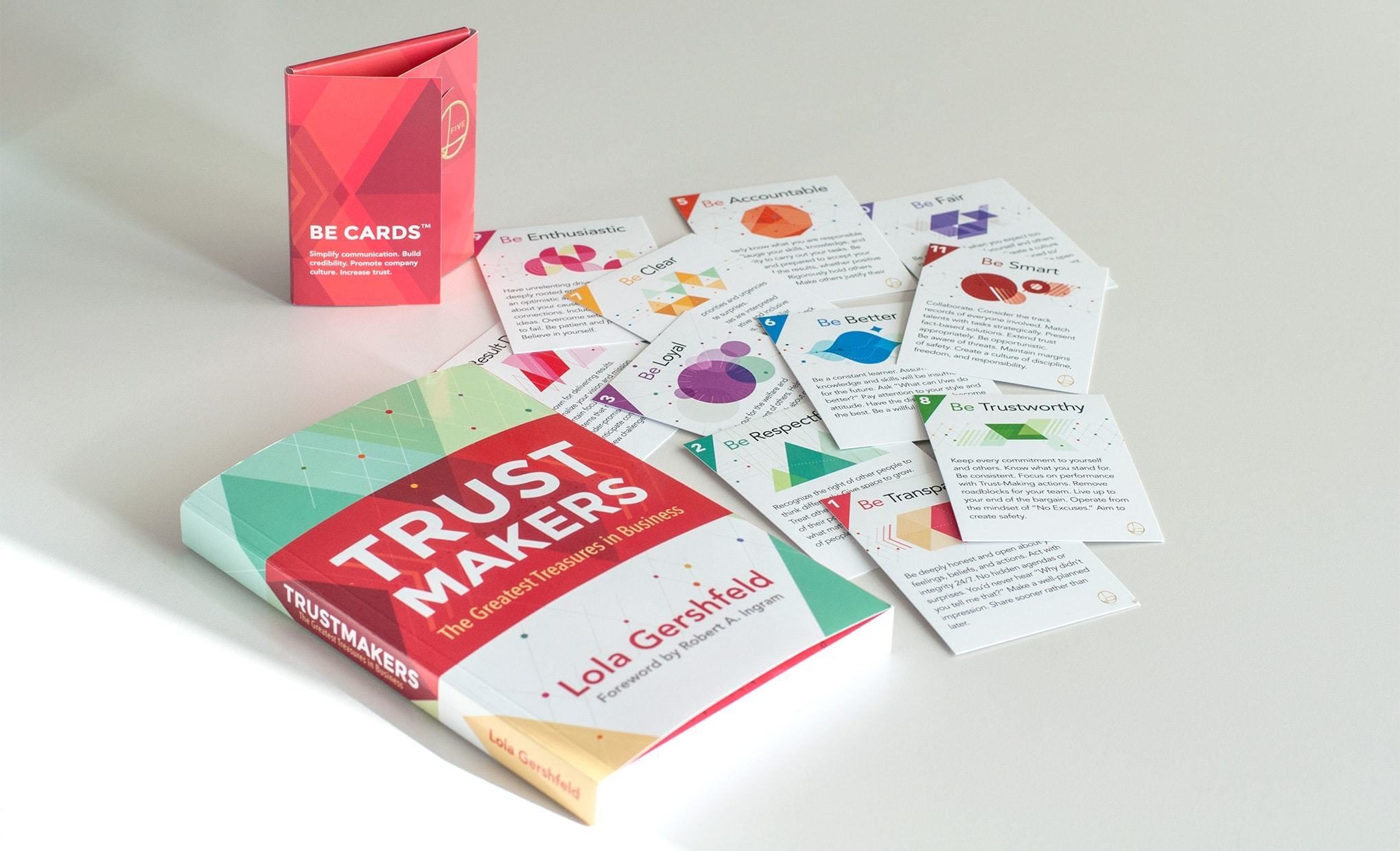
Trustmakers book with the set of Be Cards.
Colors & Concepts
The first thing I wanted to sort out was the color palette. Somehow this was the 1st step I wanted to take. It just makes me feel more comfortable to be able to play around with colors already in place to create ideas, compositions etc. My mind would be more at ease, which in my case (as a colorlover) somehow means more open for that inspiration spark.
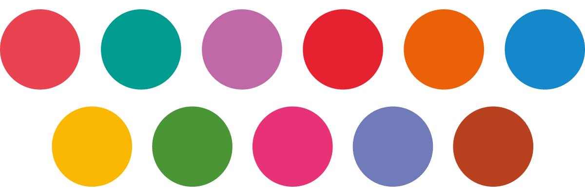
Be Card colors
The original colors are very bright and some of them a bit too close to each other. There wasn't a perfect harmony. At first I presented way different colors. Colors I really like, just to see what my client thought of it, but I quickly got an answer back that I should stick to the palette already in place. A bit of finetuning would be OK, but nothing too drastic. My client definitely wanted to keep the brightness, and didn't want pastels or muted soft colors, so I ended up with this set of colors.
Concept 1
First idea I had in mind was to use silhouettes of 11 people (each presenting a Be Card) in different poses, positioned on one line below the title and further on the back. Above their head is a vertical line which is interupted with all sorts of symbols or icons symbolising a Be Card. Then each silhouet would reappear on a card together with the icons.
Concept 2
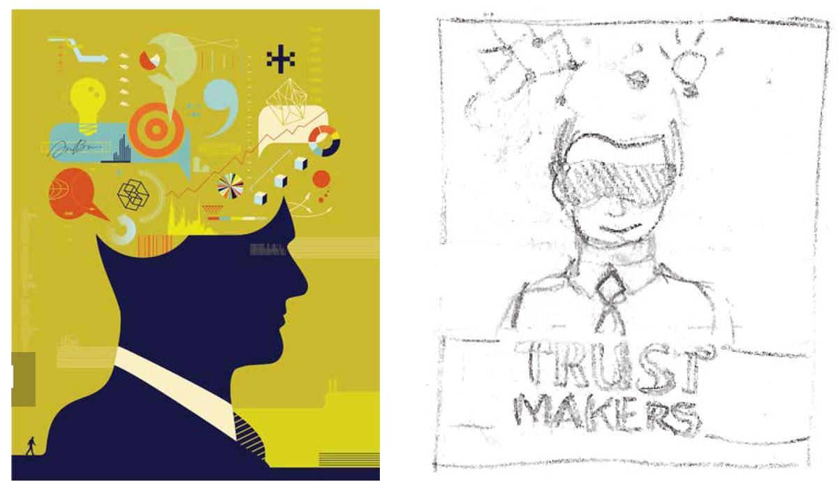
Another concept was something that referred more to the meaning of the word trust. I visualised a head in front view with the eyes blindfolded (trusting blindly). The top part of the head is ‘open’ and replaced with all sort of elements that symbolize the 11 Be Cards. These different elements would then reappear on each Be Card.
Concept 3
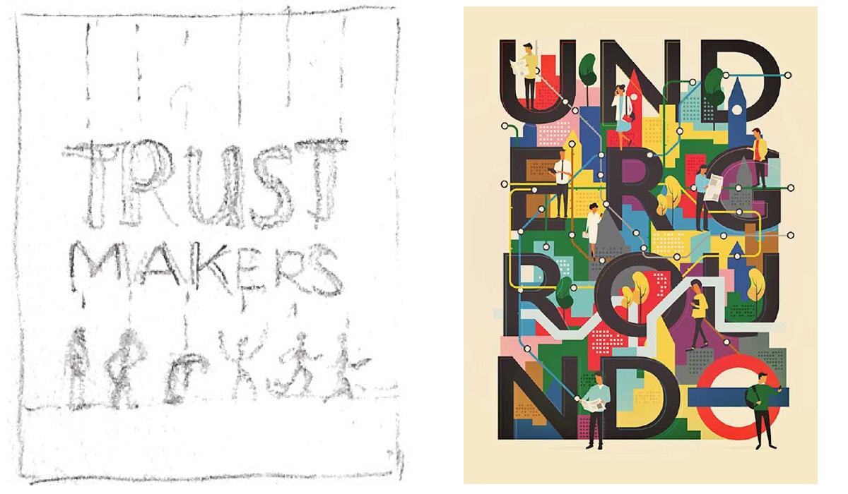
A third idea that I had in mind was to use 11 different silhouettes of people —or faces of people— who are all connected to each other, interacting, or communicating with each other… with lines interrupted with all sorts of symbols or icons referring to the cards. Each part and silhouette would then reappear on the corresponding Be Card.
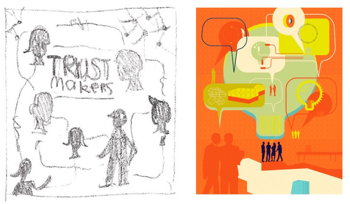
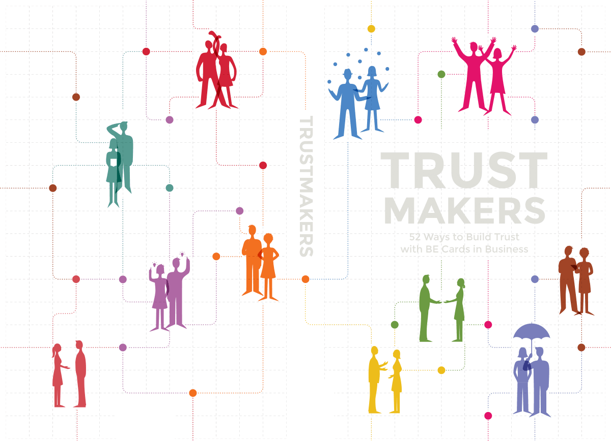
Cover Design Attempt
I decided to give the 3rd concept a try. I felt very strong about the idea of using figures. Trying to express what each Be Card stands for (Be Transparent, Be Loyal, Be Respectful…) would be a great idea to visualise each card. It would communicate what the cards and the book is all about. My client felt the same, but of course for her it was hard to actually visualise this. She wanted me to try this idea out to see how it looked. First I drew these flat sketches of people interacting with each other, each in their corresponding Be Card color. Then I placed them on some sort of a grid spread over the front and back of the cover.
Back to the drawing board
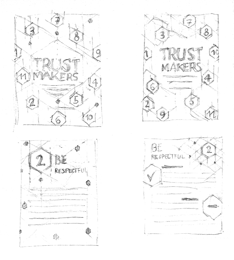
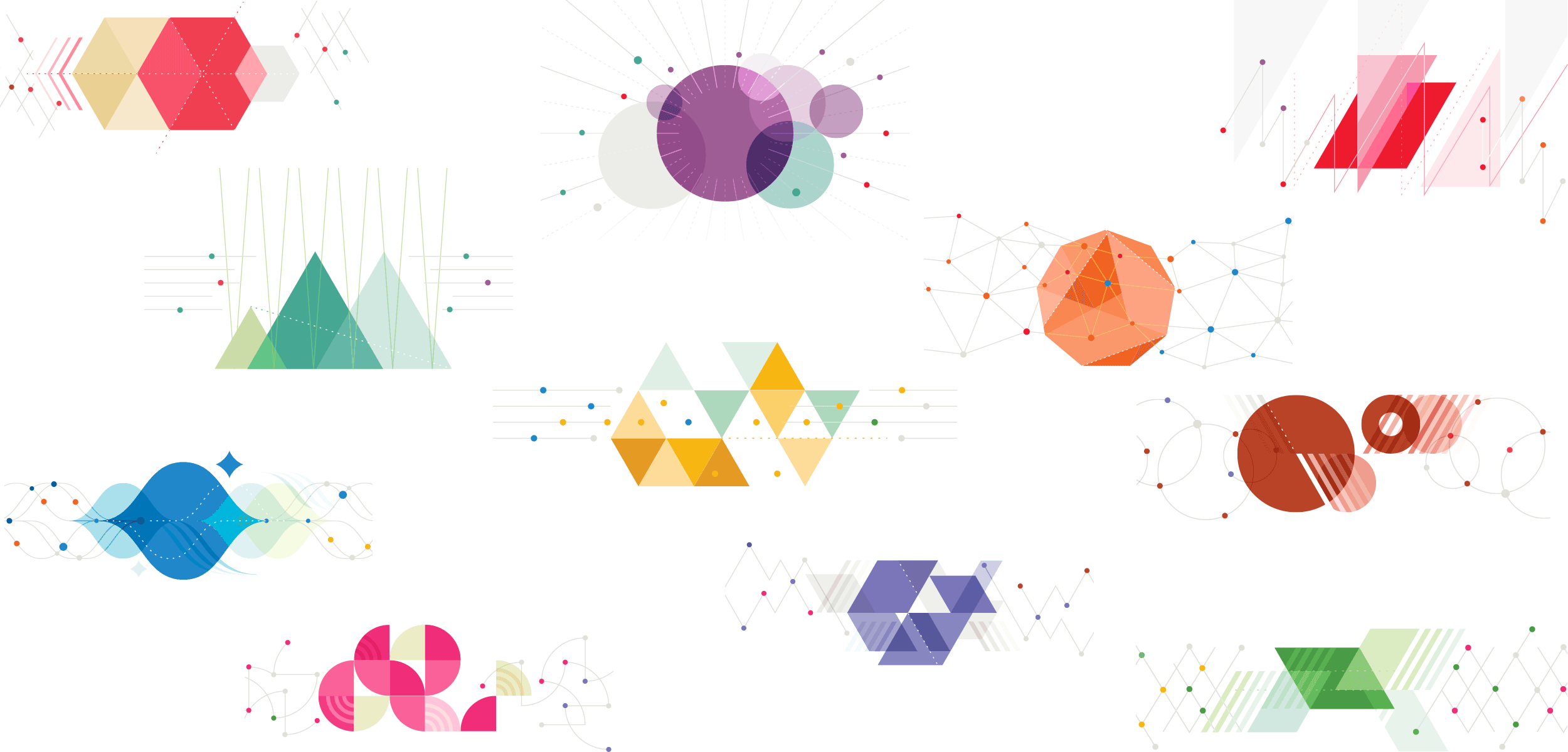
The idea of using figures got quickly dropped since my client wasn't really convinced of how it actually turned out. It needed to be more abstract, but most of all more professional looking. Maybe it was the overal style of the figures themselves that made it look a bit too cute and not professional enough. Anyhow, we decided to drop the whole idea and try out something totally different. I was thinking of creating something purely geometrical and abstract. At first I sketched this really simple idea of using the 11 Be Card numbers placed randomly on a grid made of diagonal lines and hexagon shapes. It was a good starting point, but maybe a bit too limited in a way. It needed something more. Then I tried out a couple of compositions of geometrical shapes, each card with its own type of shapes and color palette (based on the old existing colors). I showed my client two of my creations and she totally loved it. This was definitely the right direction.
The cover design
After working out all 11 of them, they've got approved, and so the style for the cards and the book cover was set. I could do a lot of creative things with this style and graphics in place.
Once starting on the cover design, I decided to I use the shapes of the 1st Be Card graphic as basis for the front, spine and back of the cover. Then I added in a couple of more colors, and some other graphics to end up with a composition that flows seamlessly from front to back, leaving enough room for some text on the back.
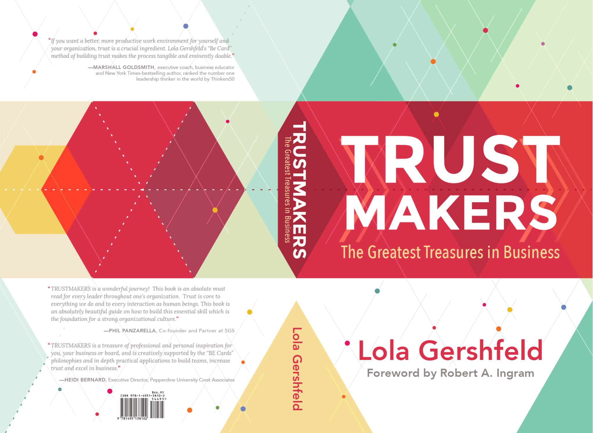
Final cover design of the book, shown as one open spread with the back, spin and front.
For the front of the book cover I used these overlapping triangles, which also became part of the company branding. It's also used on Be Card 7, but I've also been using circles and compositions of parallelograms a lot in all the design work. These colorful compositions of shapes in combination with the colored dots connected with lines are reoccurring in all of the designs I've been doing for Dr. Lola Gershfeld (Level Five Executive as the time of writing, now known as EmC Leaders). The coral red, which is the color of Be Card 1, became the primary color. It's also the color I've used for the chapter pages in the book.
By adding in a couple of 'other' subtle colors (the blue, aqua & green triangles) that work well with this coral red, I was able to push my will a little bit in the end after all. I'm combining the colors of the Be Cards (used in the small dots) with this new mix of aqua blue and green hues. These colors now also reappear on most of the designs I create for L5. Never give up trying to present what you think works best, but always respect what your client feels is important and should remain. Never push it too far either. It's a balance you learn to find by experience I guess, because each client is different. If you stay open for suggestions and use your creativity at best to solve these kind of challenges you can get very far.