A Coaster Design for Craft CMS
My Design Process
Article written on Friday, 26 Oct 2018
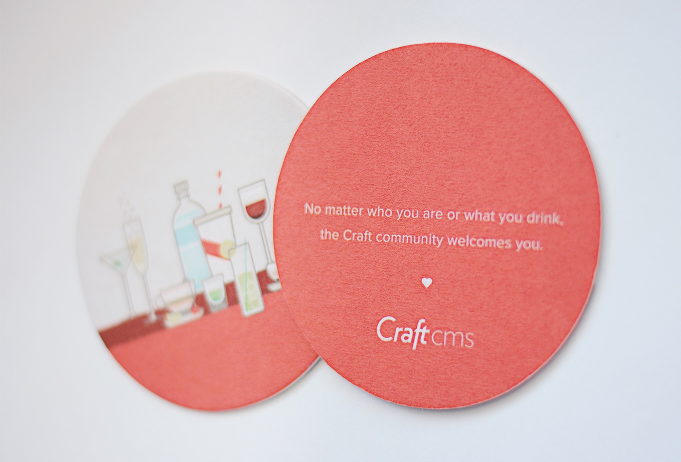
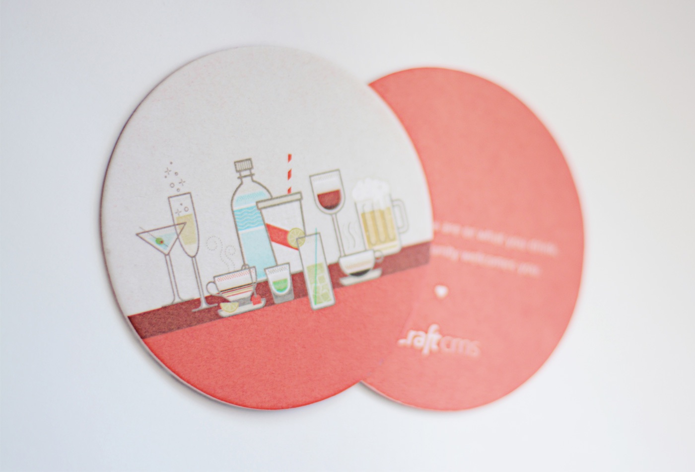
A while ago I had the pleasure to create a coaster design to promote Craft CMS. They sponsored the "PHP Diversity Rainbow Elephant" project on Kickstarter, which is there to help promote diversity in the PHP community. As a sponsor Craft had the opportunity to include marketing material in the package. To reflect this diversity theme on the coaster design, the idea was to create an illustration of different types of drinks.
Inspiration
To get started, I googled some images of the drinks, and browsed around on dribbble to collect some inspiration and guidance. Below you'll see the images that caught my eye, each with something that appealed to me or that I found interesting : the overal design style, and lines and simple patterns of the first one, the cup shape of the second one, details,… Sometimes I create a moodboard with these images, but mostly I place them around my Illustrator artboard while drawing.
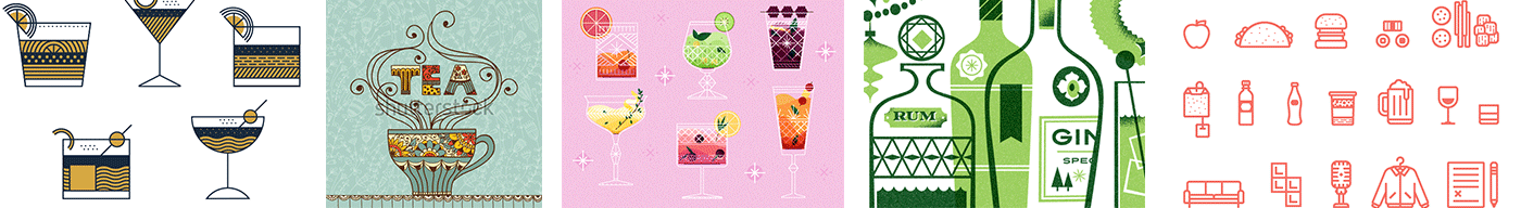
Inspiration found in patterns, the shape of the tea cup, the details & color overlays, the transparency, rounded strokes of the icon style…
Sketching
Next, I did some really quick sketching on paper, just to get a bit of an idea of the composition of the drinks. Once I got the pencil sketch scanned in and placed into a template layer in Adobe Illustrator, I started drawing the first drink. I figured it would be a good idea to work out only a couple of drinks first to have this approved together with sketch of the composition (see image above). Some of the drinks weren't completely finished yet and the composition wasn't final either since some of them where still missing, but if the style got approved I knew it would be safe to continue to finalise the illustration.
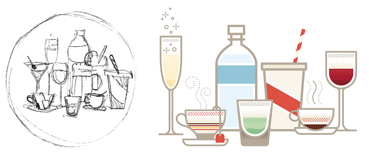
I decided to go for a clean 2D look, but first I sketched out my composition of the drinks on paper. Brandon, gave me a list of drinks he wanted to include in the illustration which was extra helpful.
First comp
I never work with a certain 'fixed' methodology that I follow step by step. During my process I always try out different things, different colors, different compositions etc. For example I only started to think about colors while I was finishing my first drink :)
Color palette
It was obvious to use the Craft orange color as primary color and with a couple of colors that go well with it. Not too many, and preferably soft tones, so the Craft color jumps out of it.
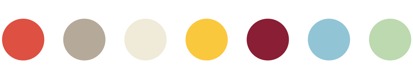
The chosen color palette
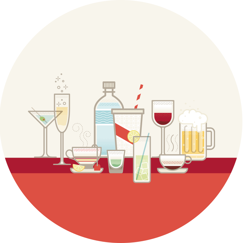
Final comp
Getting the right result the way I want it, is done via experimenting, trying out a lot of things and compare, and then move on to the next. That's a repeating pattern in all my creations really. While drawing the drinks one by one, I constantly rearranged them until I found the perfect composition. This experimenting is the most fun part of it all. It's what I love most. Feeling inspired and being able to translate that inspiration into my creations.
While playing with colors, I also played around trying out tick slightly rounded lines, some patterns, mainly dots and fills that leave a bit of a gap with the border. I applied this kind of fill only on the drink itself in case you could see the drink through the glass, or through the plastic, in case of a bottle.
Experimenting is the most fun part. Trying out a lot of things, compare, and move on to the next.
Printed result
The advantage of designing things for print is that you can hold it in your hands, touch it, feel it, smell it… I know I know, the sounds really silly, but that's one of the reasons I always love designing for print. Below is a photo of the final result.