Give Your Font Library a Boost
The Type Designer’s Luxury Font Library Can Be Yours for $29
Article written on Monday, 10 Aug 2020
Let's talk fonts again. There's this new bundle called The Type Designer’s Luxury Font Library that got my attention. I'm always looking to change things up a little when it comes to my font library. If you are thinking similarly, I'm pretty sure this one will interest you also. As a designer we all need a variety of typeface styles that we can play around with.
What's in it?
A lot, which is usually the case with these bundles. Some are better than others but this one is setting the bar pretty high in my humble opinion. What I especially appreciate about these bundles is that they also save you from doing all the leg work in researching where you find them discounted. Not only that, you have to actually discover them too. This saves me time and money so that I can get back to the fun bits of designing. Speaking about styles, you'll have a variety of options to choose from going from geometric sans-serifs, classy serifs, cool-looking display fonts, modern gothic families and elegant scripts. All you need to know is that there is a 98% cut from the original price point. So which ones are my favorites?
Quieta
Quieta is a humanist serif typeface, inspired by the aesthetics of Italian Renaissance and by the empowering history of the painter Artemisa Gentileschi, the first woman to be admitted to an Academy of Fine Arts in Italy. The designer, Maria Chiara Fantini, has used sharp flat-nib calligraphic strokes to add a vibrant contemporary vibe to the traditional humanist proportions.
Classical details (such as the beak of the “e” and the angled stress of the “o”), are balanced by a modern and readable low-contrast design, developed in a range of six weights with a matching set of true italics. A Display weight, with lighter shapes and stronger contrast has been developed excel in logos, headlines and captions.
The wide array of alternate, decorative and swash glyphs and the full coverage of over 200 extended latin languages make Quieta a solid, highly readable and elegant typeface perfect for body text both on the screen and on the printed page. Graceful and powerful at the same time, this typeface family is ready to help you when in need of the timeless appeal of a self-conscious feminine elegance. It's a family of 12 classy styles.
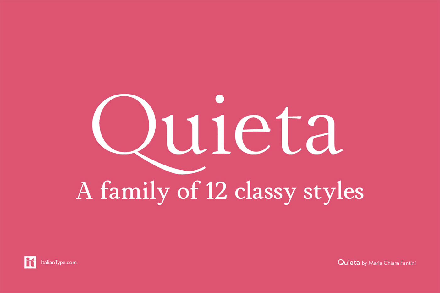
A family of 12 classy styles.
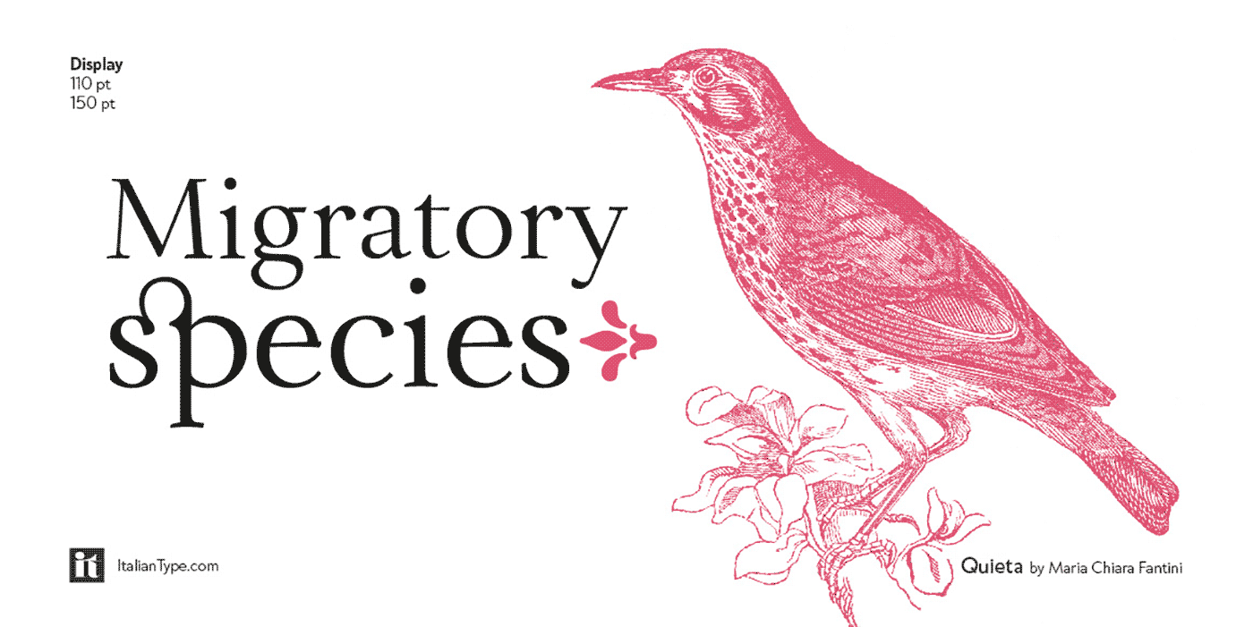
Highly readable and elegant typeface.
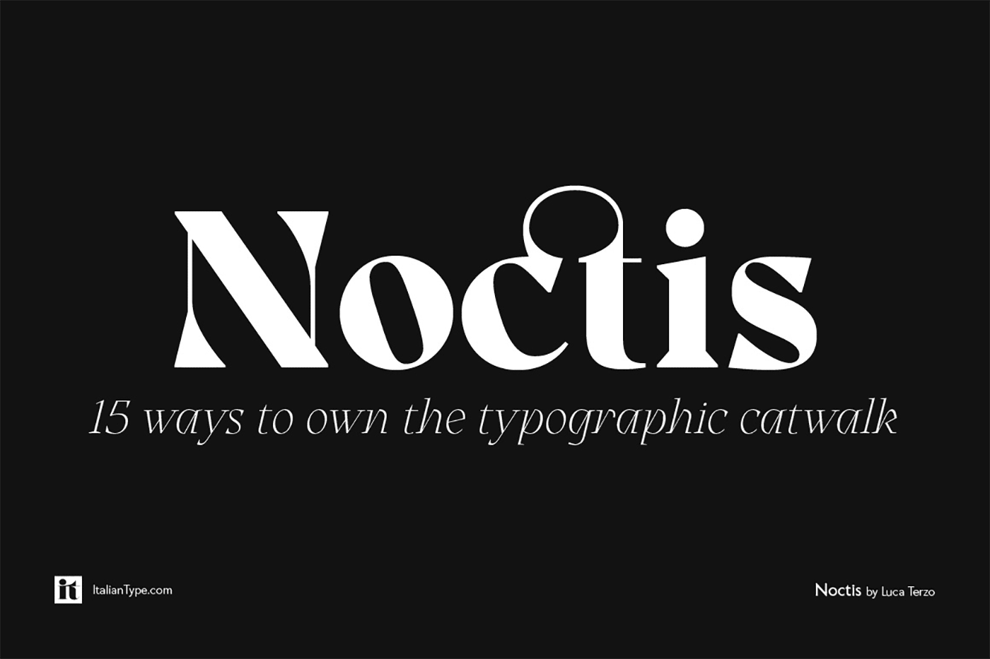
Noctis
Noctis was originally born as a single weight display typeface, designed by Luca Terzo who took inspiration by the unusual wedge serifs of Aldo Novarese’s 1972 typeface for H. Berthold A.G., Primate. The design was developed by the Italian Type team into a full family of five weights from thin, each with its own true italic, and with a complementary set of decorative patterns. That's what drew my attention.
The strong didonesque contrasts make this typeface both impressive at display sizes and easily readable in text size, while the sharp shapes of the triangular serifs and the distinctive letter shapes show their strength in logo design and impressive editorial use.
Inspired by the elegant, self conscious and over-the-top aesthetics of Italian fashion scene of the eighties and nineties, Noctis finds its strength in its strong textural nature, that is explored in the Noctis Texturae subfamily, where each letter is used as a tile to produce seamless patterns that can be used to extend the branding capabilities of Noctis.
Noctis features an extended latin character set of 481 glyphs covering over 190 languages, and includes advanced open type features like standard and discretionary ligatures, positional numerals, stylistic alternates and case sensitive brackets. Mixing versatility and personality, Noctis is ready to be like a top model on the design catwalk, making your projects looking classic but contemporary, finely tuned but assertive, and elegant as the best Italian luxury fashion.
Full family of five weights.
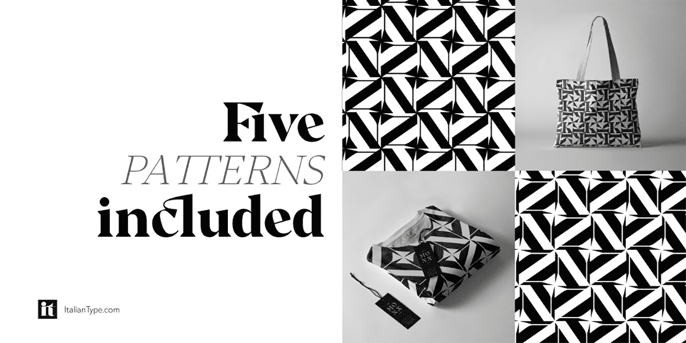
Comes with a complementary set of decorative patterns.
Bosca
Normally my personal preference always leans towards sans-serif. However this one sure is an elegant appearance! Bosca is an elegant serif font family which includes 4 weights. It is multi-purpose workhorse and can be used for a variety of tasks. It can look either conservative and restrained or modern and elegant thanks to ligatures and alternative substitutes, they will add variety to your project and make it more attractive and give many options for creating your design. Heavier weights are great for headlines, logos, and other important things. light will look elegant and more discharged. The regular weight is perfect for text tasks, it has a balanced dynamics and is easy to read. This font is easy to use, has OpenType features, and all characters in this font have PUA encoding.
This is an elegant serif font family which includes 4 weights.
Ideal for cosmetics indeed.
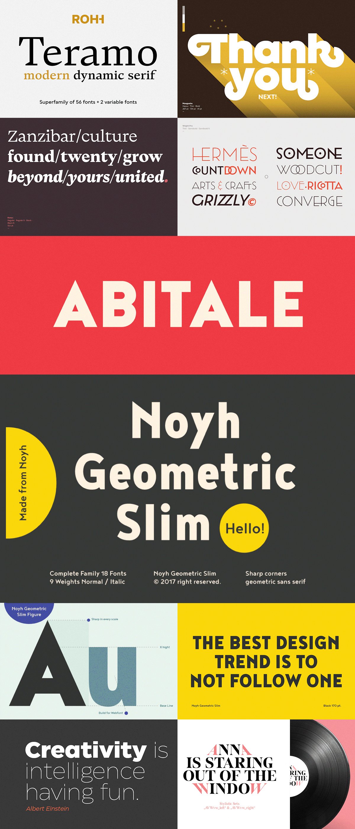
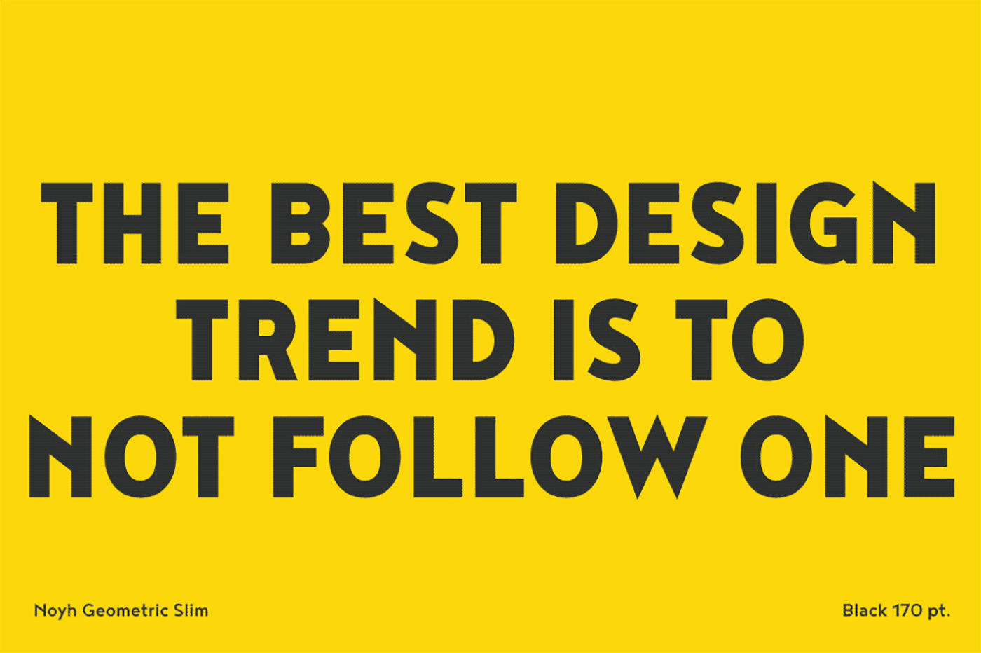
Noyh Geometric Slim
Noyh Geometric Slim is an altered form of the original “Noyh” (2015) typeface. They added sharp corners in the apex, including the structure of typeface. Important to be more Corporate, the font family has flat terminals that harmonise with sharp corners. With all of these features, “Noyh Geometric Slim” is a prominent, eye-catching and unique typeface. It comes with 9 weights and italic type in order to suit for multifunctional usage, especially for cooperative work, such as website, magazine, editorial, publishing, as well as packaging.
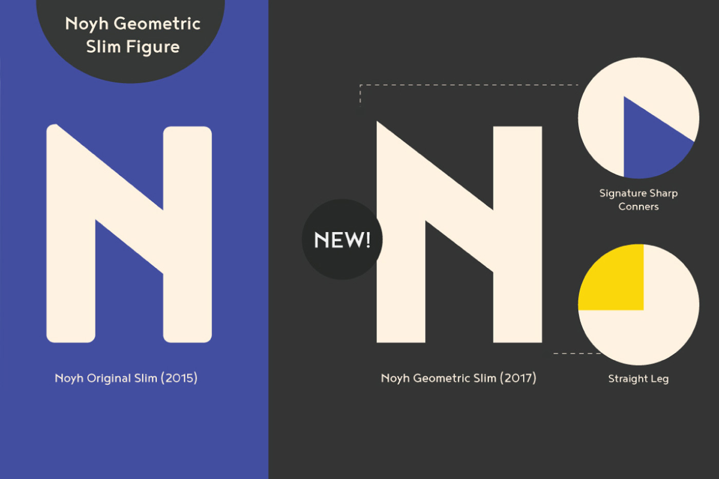
Noyh Geometric Slim contains 18 styles and family package options.
Solid advice!
Be sure to go check the rest of the bundle too as you get plenty. Teramo alone is a huge family consisting of 58 fonts. Like always with these type of bundle you also get the web fonts as well. That alone is a sweet deal. Available for just $29 for a limited time only. Don't procrastinate!
Unfortunately this deal is expired.
subscribe to my newsletter, so you won't miss out on any future design deals.