Designcollectors Website Redesign
My Design Process
Article written on Wednesday, 05 Jul 2023
Today, I'm excited to share with you one of the website redesigns I recently completed for one of my long-term clients, Designcollectors. They are an esteemed online design store specializing in selling timeless design classics furniture and accessories for both homes and workplaces. I had the privilege of redesigning their website, including the front-end coding, and I'm thrilled to showcase the results on my blog.
The Online Store's History
I've been working with Flanders Design House on the Designcollectors website since its inception way back in 2009. In 2015, I redesigned the site, and I would like to share with you a glimpse of the previous homepage design from that timeframe, which was in use until the end of August 2022. This snapshot showcases the evolution of the website's visual identity:
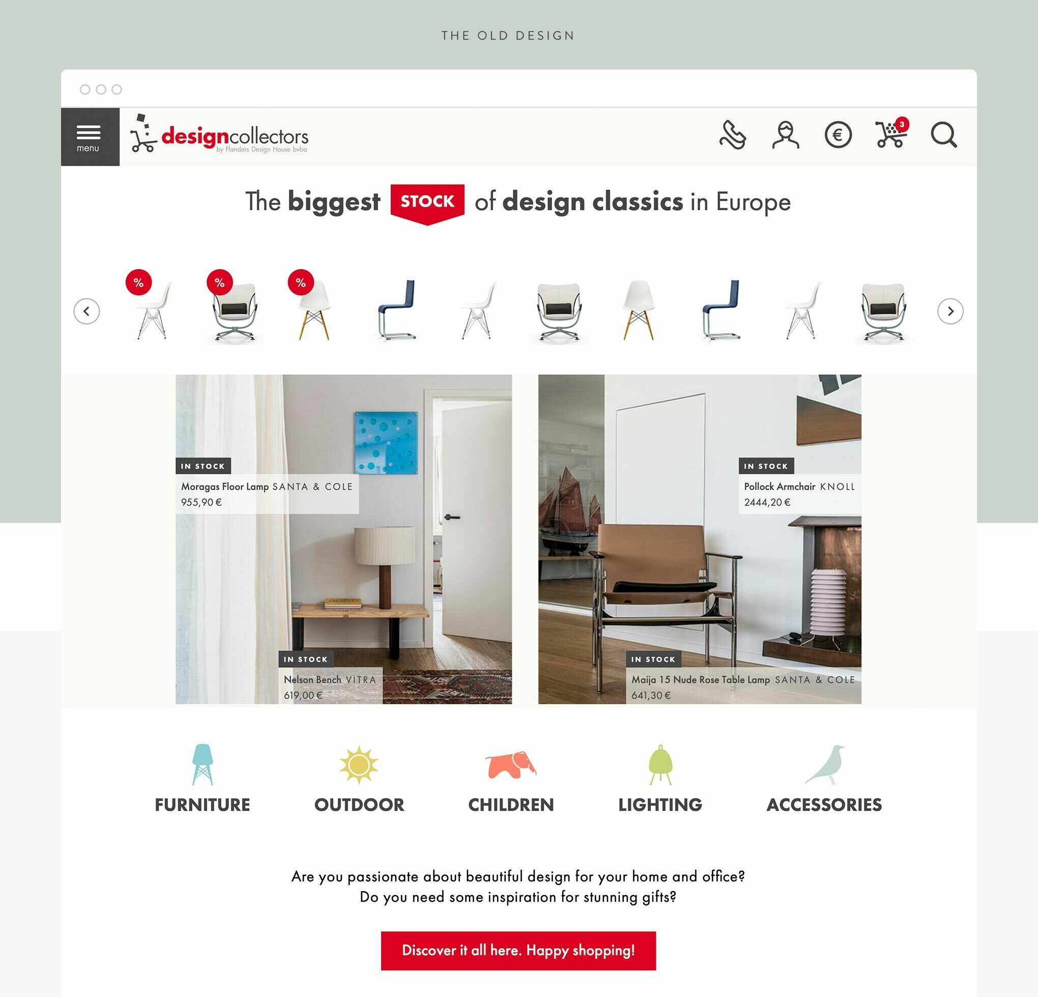
Designcollectors homepage, the old 2015 version
This is now the site's third design, showcasing its evolution over the years. Initially, the store only offered furniture from the design brand Vitra. Later on, additional brands like Artek and Thonet were incorporated. Today, the store has expanded its offerings to include numerous design brands and a wider range of products.
The Previous Design
In the previous design, I implemented a distinct color scheme for each section, accompanied by corresponding icons. This approach resulted in a vibrant and visually appealing website, giving it a unique look and feel. Further down I will delve into the improvements and visual transformations.
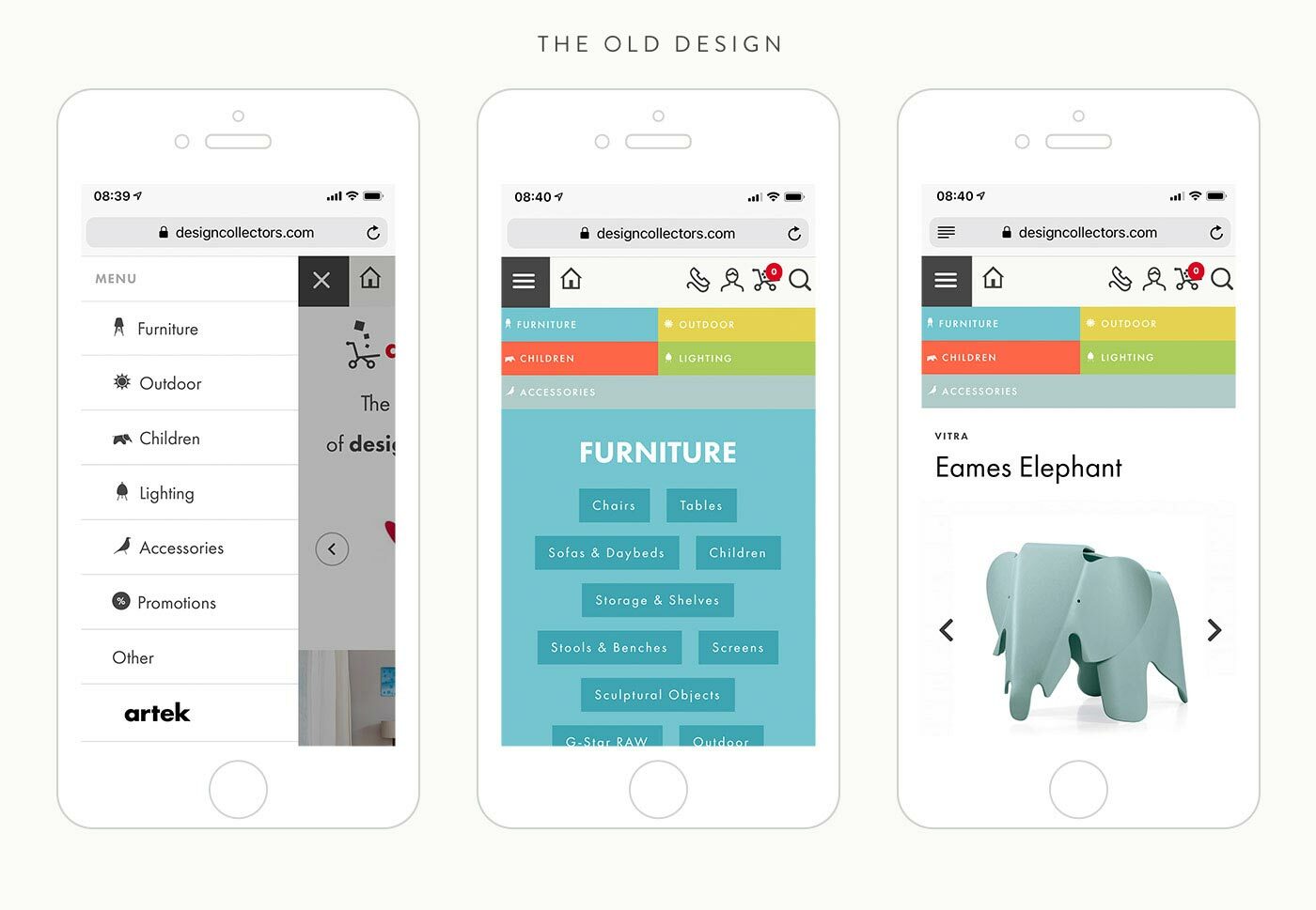
Designcollectors website on mobile, the old 2015 version
The Current Design
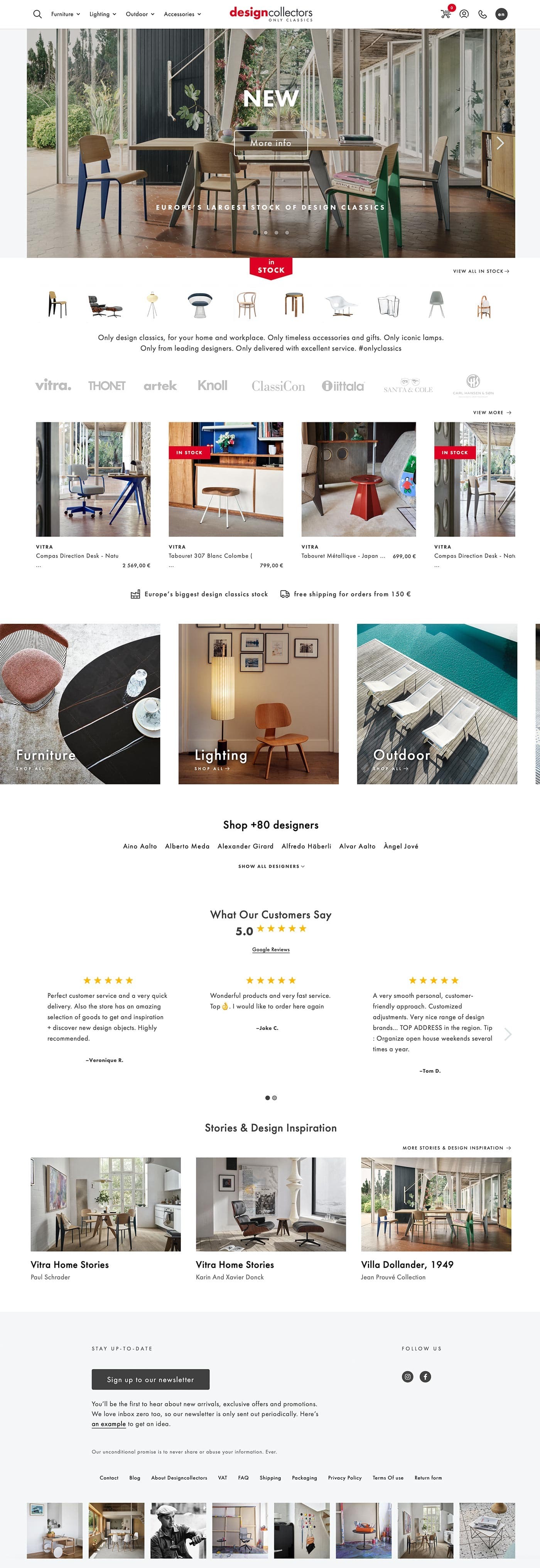
Designcollectors current website homepage design
Design Concept and Approach
Less Colors and Emphasize on Photos
In this new version, I made a deliberate decision to move away from using multiple colors and opted for a more minimalist approach. The color palette now consists of black, red, and a few light shades of gray. My intention was to let the product photos take center stage and truly shine. Beautiful interior visuals have a compelling power to convince people to make a purchase. With a plethora of stunning interior photos available, it only made sense to leverage them effectively.
When working on projects like this, one of my go-to tools is Milanote, an app that I find incredibly useful for creating moodboards. I rely on Milanote to gather inspiration, organize ideas, and keep track of my to-do lists. Milanote streamlines my workflow and allows me to create compelling moodboards that set the tone for successful projects.
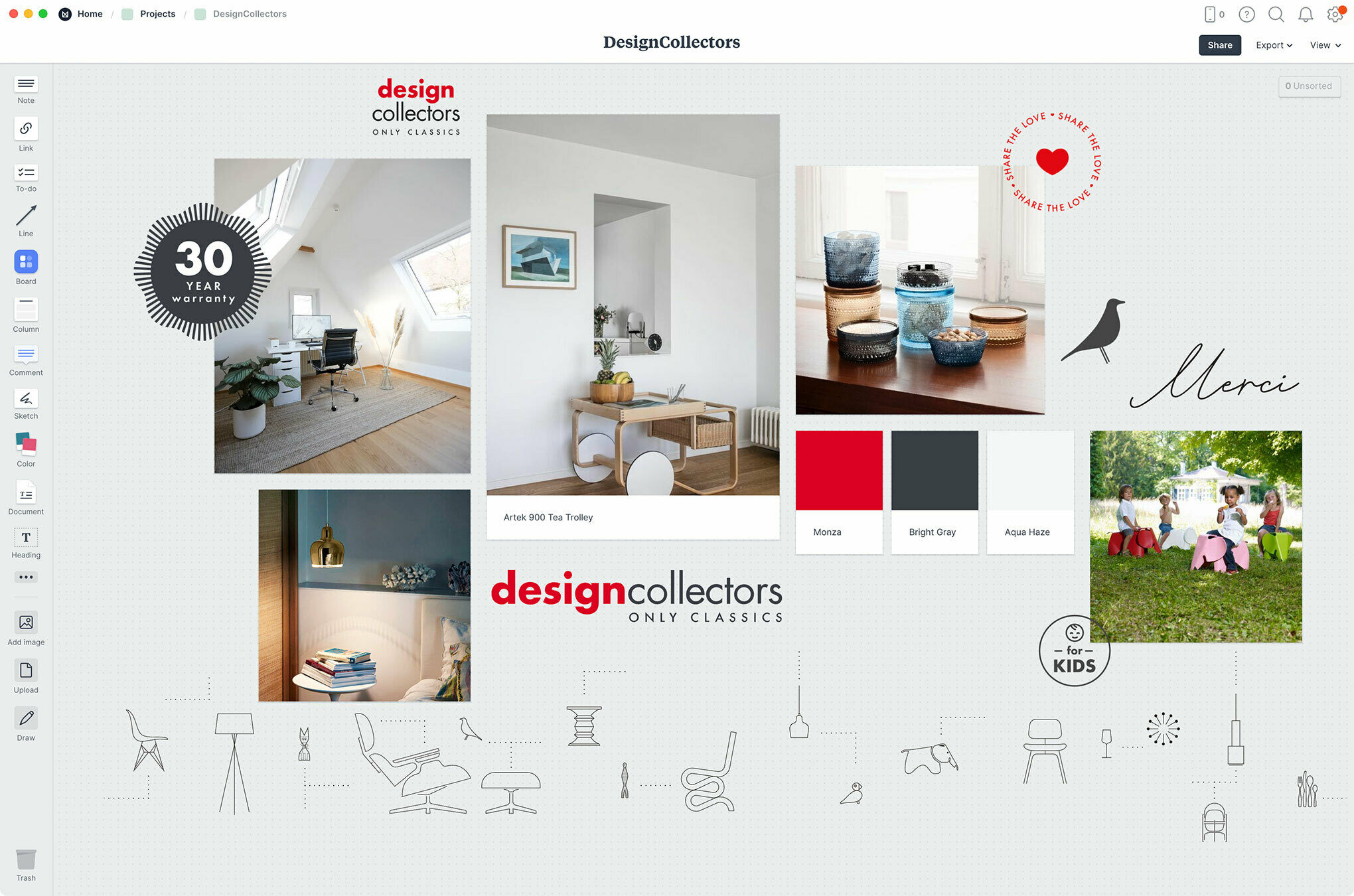
Milanote moodboard of the overal look & feel of the website
Enough Whitespace
In order to achieve the desired aesthetic and maintain a clean and minimal design, I focused on striking the perfect balance of whitespace. By embracing simplicity, I aimed to create a design layout that is not only visually pleasing but also flexible and scalable for both desktop and mobile devices. Additionally, considering the significant growth in the number of products and the addition of new design brands over the past few years, it was crucial to ensure that the design layout could accommodate and showcase the expanding content effectively.
Design Decisions
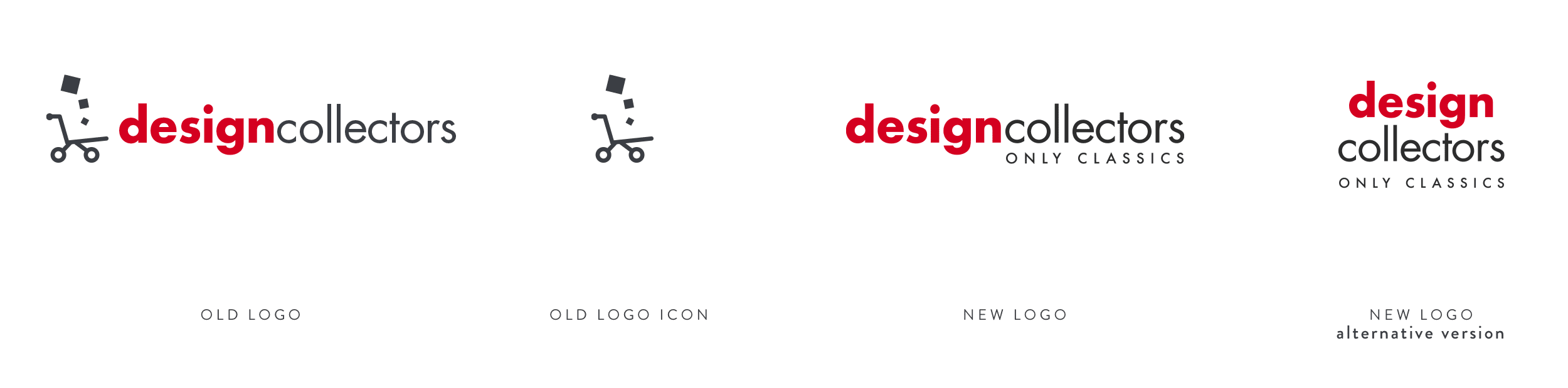
Logo Design Update
During the design process of the homepage, I took the opportunity to give the logo a subtle update. While I appreciated the convenience of having the shopping cart icon for separate use on buttons, favicons, and other elements, I felt that it was somewhat outdated and limited in terms of alignment possibilities. It didn't seamlessly integrate into the new design I had crafted. As a result, I proposed a small revision to my client, and together, we engaged in a brainstorming session. Eventually, we arrived at a fresh logo design that incorporated the "only classics" tagline, perfectly aligning with the updated aesthetic and vision of the website.
Topbar Navigation
When considering the placement of the logo on the site, I had a strong preference for placing it in the center of the top bar. This positioning felt ideal to me, despite knowing that it would present some challenges by limiting space for other crucial elements such as the search bar, navigation to different sections, shopping cart, account options, and the language switcher. However, I was determined to make it work.
To accommodate these considerations, I carefully managed to find a solution that maintained the integrity of the central logo placement while still ensuring usability and functionality. In the mobile view, the menu transforms into a more typical hamburger icon, with the logo positioned to the left alongside other essential items such as the account and shopping cart. This responsive adaptation allows for a streamlined and intuitive user experience on smaller screens.
By making thoughtful design decisions and balancing aesthetic preferences with practicality, I successfully integrated the logo placement I envisioned while addressing the navigation and functionality requirements of the website.
Subtle Animations and Interactions
I also had the idea of incorporating subtle animations into the website, specifically when hovering over different elements such as the main section navigation in the top bar, product categories, and highlighted products. One particular animation concept I envisioned was a slight downward arrow movement for the section navigation in the top bar. This effect would serve as a visual cue to indicate that there is a dropdown menu available under that specific item. When you click (or tap) the item the menu opens while the down arrow turns 180 degrees 1. Towards the bottom of each menu there are 3 special links with an arrow, 2 which also moves a little to the right when you hover.
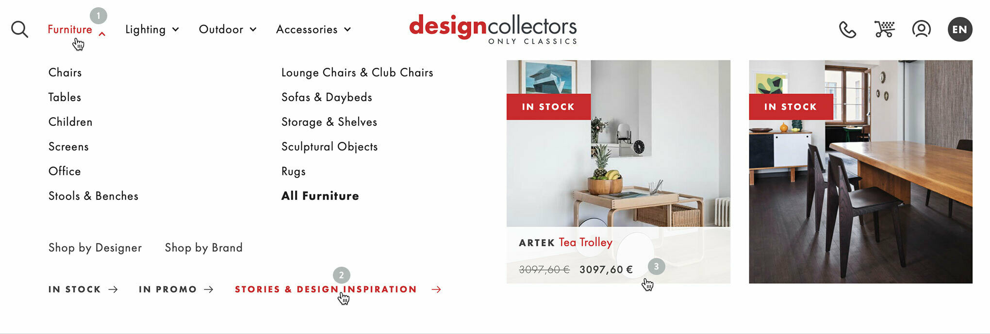
Designcollectors topbar navigation with subtle hover interaction animations
To the right there are 2 featured products, also with a special hover effect 3 that reveals the price info in a semi transparent white box sliding up from the bottom.
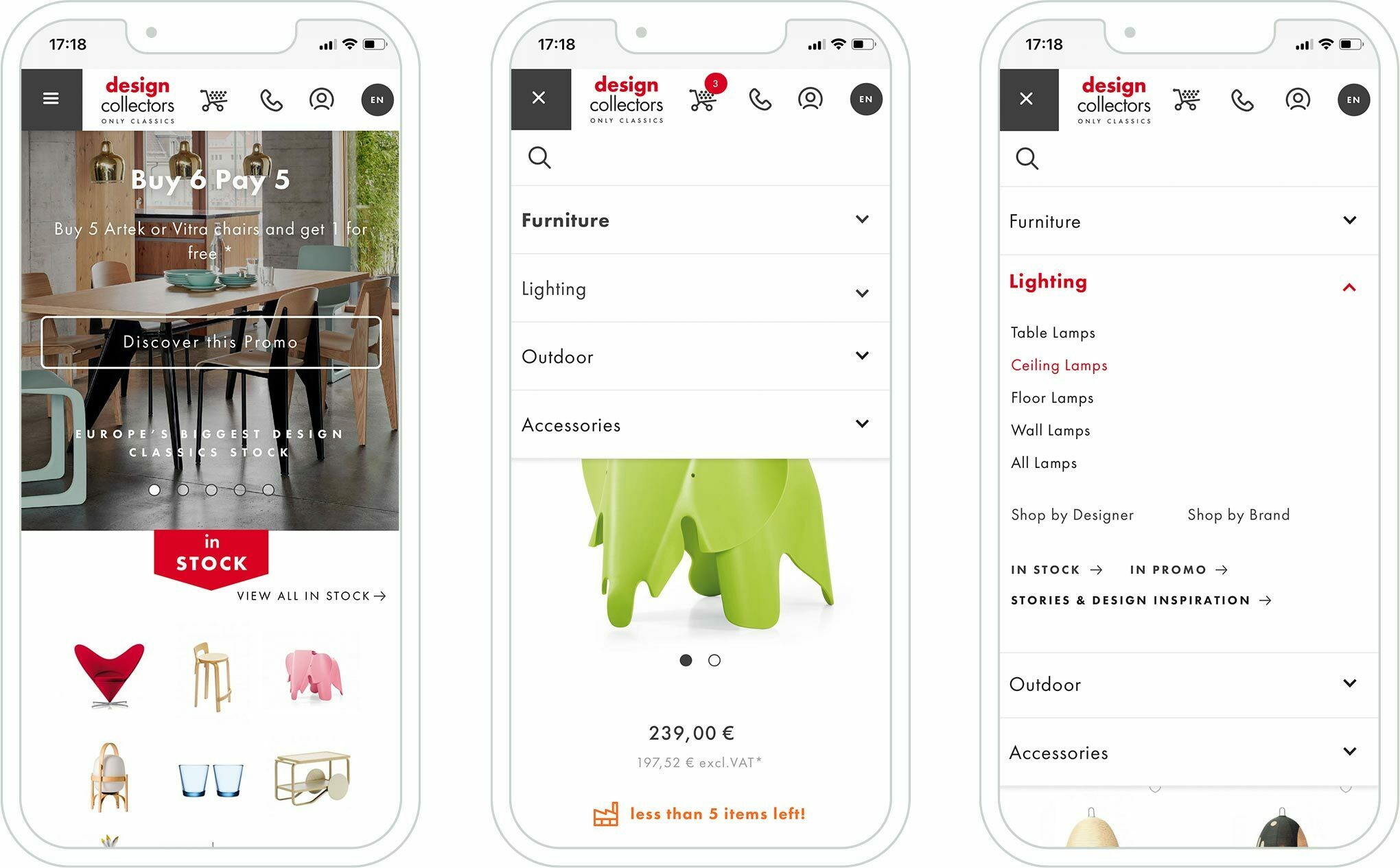
Designcollectors navigation mobile version
On smaller mobile devices, the featured products were initially included in my design. However, I ultimately made the decision to remove them due to space constraints. Although they didn't make the final cut, they were present in the initial version.
As for other subtle animations, most of them are visible through hover interactions. For example, when hovering over product photos or brand logos, there is a subtle enlargement effect applied to enhance the user experience and draw attention to these elements.
Horizontal Sliders
Given the abundance of categories, subcategories, and products that needed to be visually presented to entice visitors to explore further, I came up with a cool idea. I decided to keep them all on a single line and make use of horizontal scroll or swipe functionality for items that exceed the screen width. I believed that stacking everything vertically would make the layout overly crowded and heavy. Additionally, on mobile devices, swiping gestures are commonly used, making this an ideal solution.
By implementing this approach, I ensured that the photos remained at a significant size, avoiding the risk of them becoming too small like thumbnails. This way, their impact and visual appeal are preserved, capturing the attention of users without compromising on the overall browsing experience.
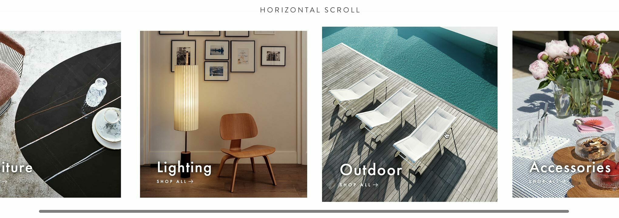
Horizontal scrolling area of the product categories on Designcollectors website
By maintaining a horizontal orientation for the content while providing a subtle peek into what lies beyond, I believed this would be an effective approach. This not only creates an engaging visual experience but also ensures flexibility for future expansion. I applied a similar concept to the design brand logos, revealing all of them on mobile devices and arranging them in multiple lines on narrower screens. This strategy allows for optimal visibility and organization while adapting to smaller screen widths.
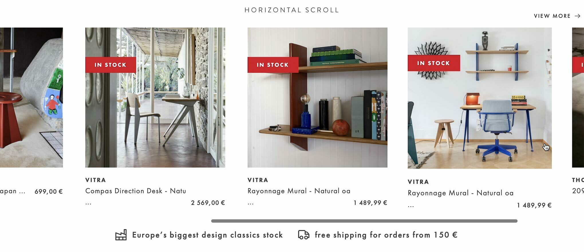
Horizontal scrolling area of featured products on Designcollectors website
Hide Lengthy Content
An integral aspect of the website is highlighting the value of these esteemed high-end design brands. Conveying the story behind each product is important, including details such as the designer, the brand, and more. Recognizing the significance of every brand and designer, all of them are featured on the homepage with a link to their respective pages, showcasing the products they have created for each brand.
However, with the number of brands ±14, displaying them all at once would be visually overwhelming. To address this concern, I implemented a solution: showcasing only a curated selection on the homepage and incorporating a "show all" link. By clicking or tapping on this link, visitors can reveal the complete list of brands, ensuring accessibility and preventing visual clutter.
Showing and hiding content on the Designcollectors website
Similarly, I applied the same approach to the brand information on each design brand's page. I incorporated a "continue reading" link to expand the content. Once clicked, the additional information is revealed. To enhance user experience, I also included a "hide" link with an upward arrow animation that appears when hovering over the expanded content. This interactive feature allows users to easily hide the additional information and maintain a tidy and organized layout.
Improve Shopping Experience
Checkout
An essential aspect of this redesign was enhancing the customer's shopping experience. In the previous version, I introduced checkout steps with numbered pages at the top, creating a light, simple, and clear process. However, during implementation, certain design proposals were compromised due to technical limitations of the system or other factors that may have influenced the outcome. Nonetheless, recognizing the critical nature of the checkout procedure, there is always room for improvement. I remain committed to refining and optimizing the checkout experience to ensure a seamless and hassle-free process for customers.
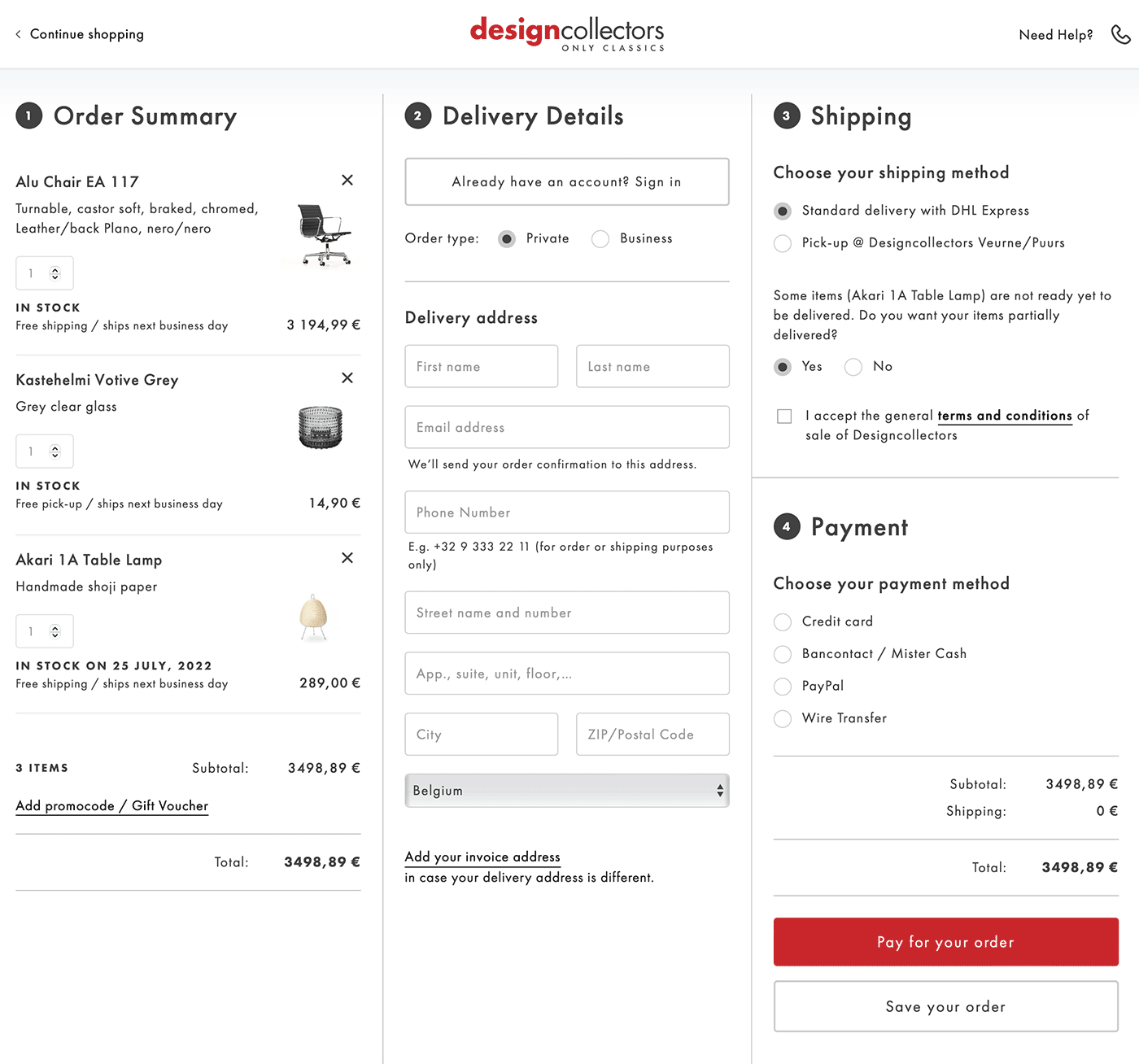
Designcollectors checkout template page design
The checkout process was condensed into a single page to simplify the user experience. To avoid overwhelming the page, interactive show and hide techniques were employed. This ensured that nonessential content, such as account information, company details, or promotion codes, remained hidden until needed or requested by the user. By selectively revealing relevant information, the checkout page maintained a clean and organized layout, enhancing the overall usability for customers.
Filtering
To enhance the browsing experience, I focused on improving product filtering. In the previous design, the filtering option was somewhat hidden at the top, requiring users to click to reveal the filters. However, in this redesign, I aimed to make the filtering process more accessible and intuitive. By repositioning the filters and ensuring they are readily visible, users can easily refine their product searches without any extra clicks. This streamlined approach simplifies the browsing experience and empowers users to find their desired products more efficiently.
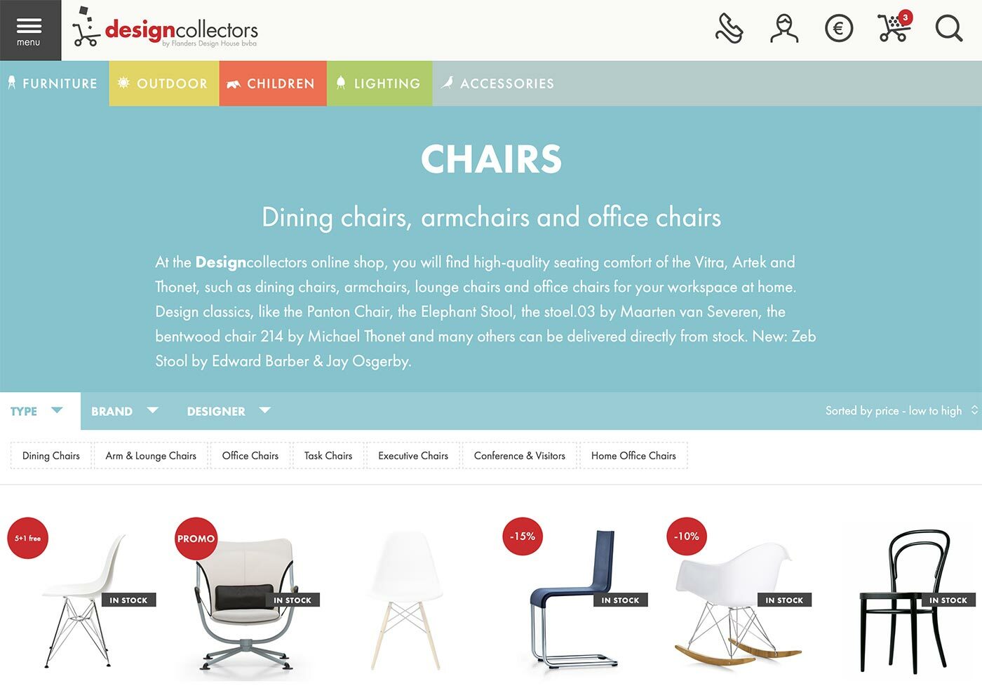
Fragment of the old design of the Designcollectors product list page design
In the example above the amount of filters is not that much, but in most cases this list is rather long and takes up more than one line.
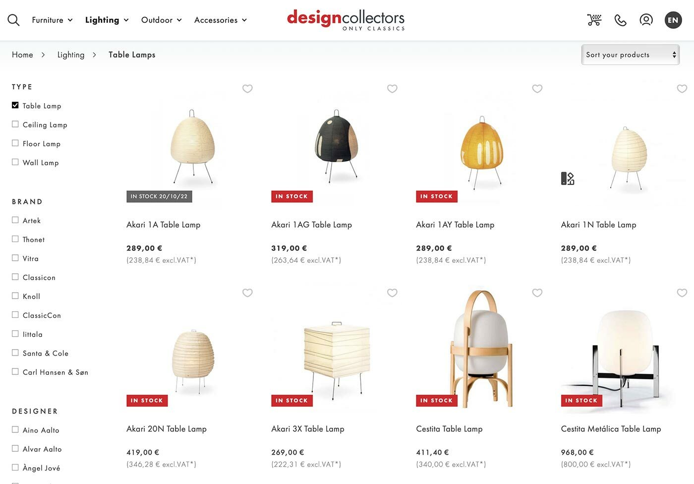
Fragment of the Designcollectors product list page with filtering on the left side
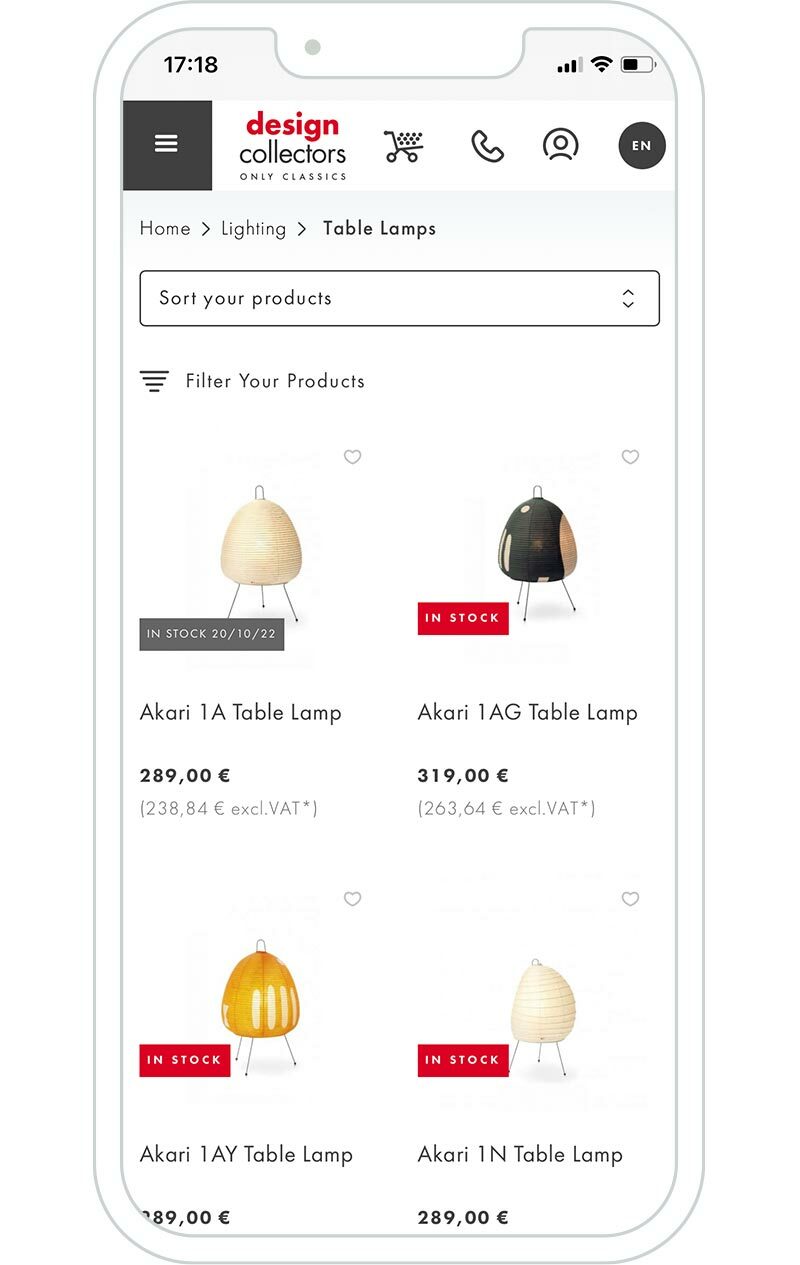
In the new design, I opted to position the sorting and filtering options vertically on the left side. In the mobile version, they are collapsed at the top for a more compact layout. On tablets, both the sorting and filtering options are displayed on a single line, ensuring optimal use of screen space. However, on smartphones, they are placed on separate lines to maintain clarity and ease of use. The sorting functionality remains a simple dropdown, similar to the previous design, while the filtering feature is presented as a clean, custom-designed checklist. This layout and design approach promotes efficient product browsing and enables users to conveniently sort and filter their search results.
Zoom in on Details
A suggestion I also made was the idea of incorporating a zoom feature for the main product photo on the product detail page, allowing users to examine the product in greater detail. However, as of now, this option has not been implemented.
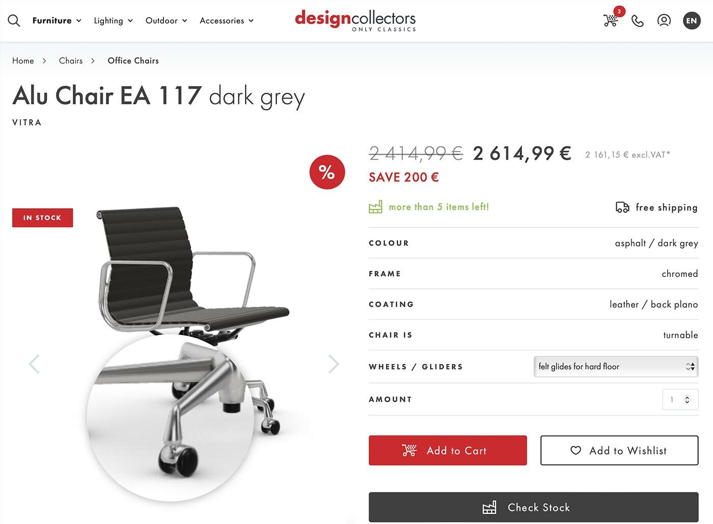
Zooming in option on product photos on Designcollectors product detail page
There is much more I could discuss regarding this project. Designing a website of this magnitude entails a significant amount of work, and the front-end coding portion is even more time-consuming. However, I must mention that I was able to save a considerable number of hours by utilizing Webflow for the front-end coding. I may delve into further details about this aspect in a subsequent article. In the meantime, I hope you have already enjoyed this one.
PS: If you share my passion for design, I highly recommend exploring their blog. It offers a wealth of content on designers, inspiring interiors, and more. It's a treasure trove waiting to be discovered.
