RocketBase & ProductSpace Logo Identity Design
My Design Process
Article written on Friday, 21 Oct 2022
Logo design and illustration projects have always been my favorite kind of things to work on. That's why I'd love to share some insights with you about one of the recent fun projects I've worked on. This wasn't a huge project with a big budget or anything, but it was definitely a very challenging creative one that I really enjoyed taking on.
About RocketBase and the Project
RocketBase is a small IT company based in Hamburg, Germany, with a couple of decades of experience and know-how in the development of SaaS based software solutions, offering a tailored-made package of services from consulting to design and hosting.
For this project, both the company RocketBase, and their main software solution product called ProductSpace were in need of a new identity design.
The Briefing
The first task was to redesign the ProductSpace logo together with an illustration suited for the website landing page. This illustration had to go hand-in-hand with the logo for RocketBase and the landing page design. Due to the naming, these creations had to stay within the topic of space.
My client preferred a logo consisting of an icon + word mark that is easy to adapt to different situations or usages. He was looking for a logo brand that exists in a couple of different variations:
- a full-colored "painted" version as my client called it
- a flat color version
- a small icon version
ProductSpace Logo Design
First Sketches & Concept Exploration
At first I decided to test the waters a bit, so I started with a lot of little doodles in a couple of different directions. Many of them included ideas with the letter P, or the P combined with the letter S, but I quickly found out that I had to drop this direction just to avoid any possible similarities with Pinterest.
‘Maybe a satellite with some products flying around would be a better fit’, was the reaction. To me this actually sounded more like a description for an illustration instead of a logo icon... I thought I'll try the ‘planet’ concept, but I knew that this direction could also end up in something too obvious and stereotype, fearing to end up with a concept that has already been done before.
Since I couldn't get my head around creating a simple icon based on the idea of ‘flying products’, I decided to just experiment with shapes and lines, but still with the concept of ‘space’ in the back of my head.
I fired up Illustrator and tried out the ones in black & white in that I felt had some potential. Because the ones at the bottom row (see image below) are so simple, you can resize them to a tiny size. The 2 half circles are based on the idea of a satellite, but very much simplified and reduced to basic shapes so it looks abstract and more iconic. You could also see planets in it.
Sketches & concept exploration for the ProductSpace logo design
As for the hexagons, I was thinking of going into the direction of spaces with openings that serve as a hub where products go in and out. The top right one is also based on the idea of space, but more like the universe in general, with the circle dots symbolising the products.
The versions that triggered me the most were the ones that resembled a satellite (the 2 bottom right sketches). Very simple and minimal.
Client Feedback
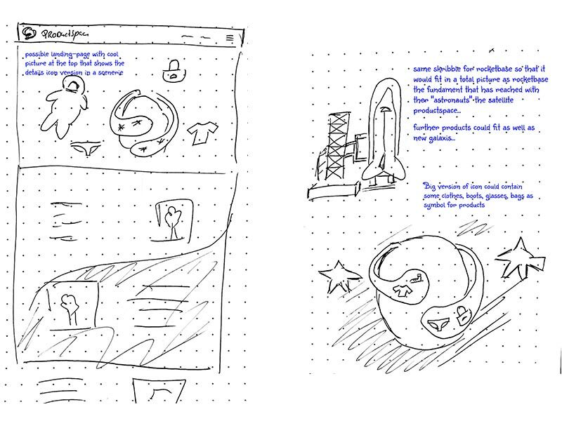
Unfortunately, the abstract logos I worked out in Illustrator didn't really fit into my client's imagination. However, he did like the ones at the top right that resembled an astronaut and the planet looking one to the right in the middle. He also shared 2 scribbles with some ideas for the landing page for both sites which were very helpful. I'm always grateful when clients take the time to do this. Even if they are just scribbles, they do reveal a lot of the direction I have to think, and it also gives me some confidence that my client knows what he wants. I prefer clients who have a vision of what they want, even if it could mean more work to get something just right.
Believe me, a client that doesn't know what he wants can be a nightmare. If there is one thing I dislike, it's that a client says "I don't know. You're the designer. So just create me something". In essence this sounds like a dream, because you just do your thing and that's it, but in reality it doesn't work this way of course. It's not a piece of art you create for yourself. It could only work, if you know the client through and through, and so you also know exactly what he or she wants or likes. In other words you already know the design direction and it's not a big question mark.
For very longterm clients this can work, because they know you and your capabilities, and so they fully trust you. With new clients however, this is a risk in my experience, because chances are high that you create something and all of a sudden they say "Oh this is totally not what I had in mind"... Uh? So now it appears they did have something in mind after all then?
Don't get me wrong here, I don't expect my client to pre-design things for me. This scribble is already a lot, it doesn't need to be that much. If so, that's no problem, but much less is also good. I often ask to share a couple of graphics with me (logos, sites, whatever, depending on the project) that they like, and why they like it, and refer them to sites like dribbble in case they need some help.
First Logo Design Proposal
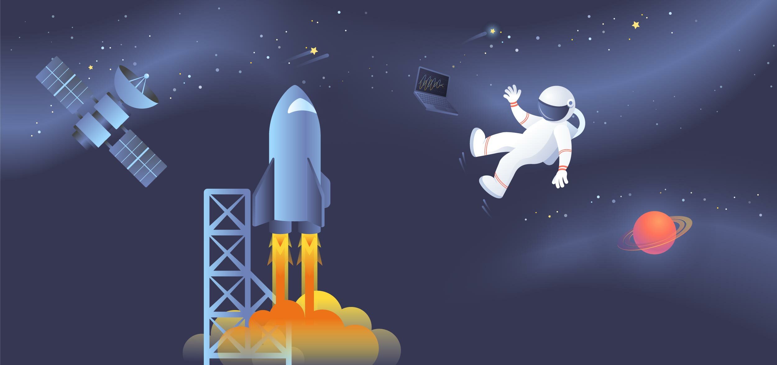
After a video call in combination with the scribbles it became clear that the preferred logo icon needed to be a planet. This icon would also exist in an illustrative version that would serve as the eye-catcher for the landing page. We both envisioned a galaxy scenery with the logo icon in it together with the flying products whirling around it.
First logo design proposal for ProductSpace
I decided to work out an icon concept based on the planet doodle that I know my client liked. While working on this I already envisioned the illustration style and scenery based on the sketch I received from my client.
Updated Logo Design Proposal After Feedback
My client did like this concept, but the first impression was that it had some similarities to the MS Internet Explorer logo. They suggested me to use a different angle for the orbit, and for the detailed version they requested me to add some 'flying' products to the detailed version.
Updated logo design proposal for ProductSpace after client feedback
I also decided to tweak the color palette a bit to create more difference with the Internet Explorer icon.
ProductSpace icon illustration proposal
In this proposal I worked out an illustration version of the icon and placed it on a dark background as I envision it will live into space. The flying product illustrations all use an illustration style that has some 3D depth that I thought fits the brand well.
The feedback of the whole team on this version was very positive. They liked my changes, the overal illustration style and color tweaks. At this point it was clear I was on the right track and my client gave me a go to get started on the RocketBase logo.
RocketBase Logo Design
Since both logos needed to go hand-in-hand using the same design style and variations of the icon, and I also had the scribble from my client, I immediately dived into a specific direction and started to draw rocket shapes.
First Logo Design Proposal
Together with the above icon concepts I presented the one I thought had good potential in the same variations using the same style, colors and typography.
First logo design proposal for RocketBase
Feedback
The feedback from my client was very positive as they really liked how this logo fitted so well with the ProductSpace one. There were a couple of remarks. They felt that the detailed illustration icon missed windows and also the connection to a base.
Since single rockets are used in a wide range of company logos, a missile start base or a new version of our planet with a flag would be good.
Another remark was that my client preferred to also have a detailed lined version of the icon. This version would be used especially for merchandise where the logo is printed in a big enough size. So far I only presented the icon either in full-color illustration style or flat fill.
Second Logo Design Proposals
In my second proposal I worked on this line version for both logos and presented them the versions below.
ProductSpace and RocketBase final full logo
As for the ProductSpace icon, a full illustration line version was also worked out. Starting from the full-colored illustration, I stylised each flying product into a simplified line version. This way it could be easily used for printing, especially for screen printing. Ideal to put on t-shirts or mugs etc.
ProductSpace line illustration icon
In this flat line version I made sure the lines were thick enough so the icon illustration can be used up to a certain small size. As soon as these lines are becoming too thin, the simple planet line icon version can be used, and at tiny sizes the fill version. Same for RocketBase, only here I don't have an extra line version without the missile base. Here the missile base is always there. It is only in the filled version that the rocket icon exists without the missile base. The filled versions are only used in very small sizes, like for instance as favicon for the website, or just as a small logo whether it's digital or print.
Delivering the Logo Files Packages
Once the logos were approved, a logo file package was saved and created for each logo, together with a PDF colorsheet file. Since there were so many versions, this took some extra work, and so I thought I share a little insight on this part of the project as well.
One thing I always keep in mind when creating such files package is making sure my client will be able to find the file he wants. You can only do this by keeping things well organised in a logical way. In this particular case I decided to split things up first into these 2 main folders : full logo and logo icon. Next I've created a folder that states the versions of each. For both the full logo I then have line version and fill version, and for the logo icon, line version, fill version, and illustration version. Then for the illustration version I spit things up again into flat color and full color.
I felt it was best to keep the flying products versions within the same folder instead of moving the illustrated line version into the line version folder 1 level up. To me this made more sense.
The RocketBase folder structure was also set up the same way, with a separate illustration version.
Once I had this folder hierarchy structure set up it was a matter of exporting and saving files in different file formats and different color modes. Especially the color modes are important at this level. To make it more accessible for my client I usually just split things up into a 'for print' and 'for digital' folder and put all my different files into these 2 appropriate folders. In this case however, I decided to create a separate folder for each color mode like this:
- CMYK - for print
- PANTONE - for print
- RGB - for digital
Then I also made sure that the naming of each file contained the necessary info of the file format, color mode and logo version. The file naming is basically split up into these parts:
- the name: RocketBase or ProductSpace
- the version/type: logo, logo-icon or logo-illu-icon
- the style: line, or fill
- the color mode: CMYK, RGB or Pantone
I also added white versions and black versions for both print and digital. So after the color mode the word BLACK or WHITE is extended in the naming. Last of course is the extension that reveals the file format of each. For digital in RGB mode I include Ai (Adobe Illustrator), EPS, SVG, PNG-24 (with a transparent background), Photoshop (using shape layers) and JPEG. For print in CMYK, there're a bit less files since you don't have SVG or PNG, and for Pantone I supply Ai and EPS.
As you can see this is a huge list of files and I haven't even covered all of them. What I also include is social media profile images and a bunch of website favicons.
SVG Export Issue
The only issue I came across was when I wanted to export the full illustration icon of ProductSpace to SVG. Your see, I've used an additional special freeform gradient on the circle of the planet icon which resulted in a separate extra bitmap file at SVG export. In the end I decided to leave out this subtle effect for the SVG file because you actually hardly noticed the difference. It also seemed that in file size the PNG-24 was actually lighter than the SVG. That's probably due to the many gradients used in this illustration. So in this respect the PNG version would be the better choice for the website anyhow.
2 versions side by side with on the left icon without the freeform gradient and on the right with the freeform gradient applied
Above are the 2 versions side by side, showing the icon to the right with the freeform gradient, and on the left without the freeform gradient applied.
Hope you enjoyed this write-up. Next up I'll talk about the website template design work I did, together with all the illustration work that was involved to complete this fun project.