My Design Process for Adobe Hidden Treasures Challenge #1
Paribeer Logo Design
Article written on Friday, 08 Feb 2019
Somewhere before the Summer of last year I was invited by Adobe to join the 'Adobe Hidden Treasures' design challenge where I was asked to create a serie of 5 different types of designs using 5 new Bauhaus fonts which are part of the 'lost typography' from famous Bauhaus masters. These five beautiful alphabets were completed and digitized by an international team of students guided by renowned type designer Erik Spiekermann.
The first challenge was to create a logo design with the Joschmi typeface originally designed by Joost Schmidt but re-created by Flavia Zimbardi, and Xants designed by Xanti Schawinsky, and now re-created by Luca Pellegrini. These fonts are available exclusively to Adobe Creative Cloud members.
The full package design of the Paribeer can
Here's a quick overview of my design process, and beyond...
Brainstorming
Like with any other project I start by doing some brainstorming and a bit of research. However, this situation was totally different. This time I had to think about the brand myself, or the company for that matter. Nothing was defined and it was up to me to come up with something. There was this total freedom which was only limited by the typeface(s) I had to use: Xants and/or Joschmi.
Reverse Thinking
What looked like an easy job because I could do my own thing, turned out to be not so obvious for me. You see, my mind is used to work the other way around receiving a briefing from the client, with the name, the background what it stands for, maybe even some sort of direction. Now I could fill in all those parts myself, while I also had to think about the name.
Defining my Own Briefing
While brainstorming on the subject, I already thought I would either go for a product brand, and most likely for either a coffee brand, or beer brand. One of the reasons why was that I've always wanted to design a logo for such brand. Plus, I knew it would give me some great opportunities for the presentation. During my time in design school I envisioned myself ending up in product packaging design. That never happened, luckily because now I have a broader area to explore my creativity and imagination.
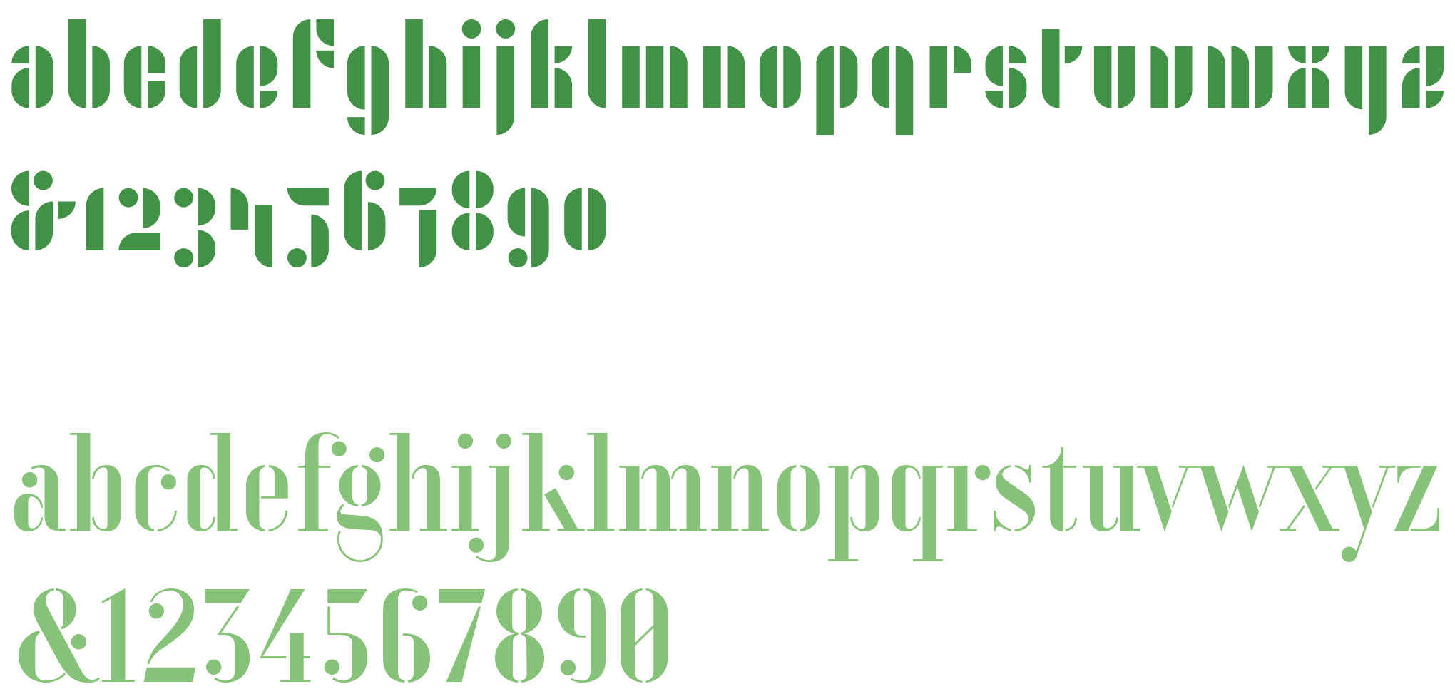
Top image is Joschmi and the bottom one is Xants.
Finding a Perfect Name
Next up was figuring out the name of the brand. Looking back at this project now, this seemed to be the hardest part somehow. With each idea for a name —and I had many— I did a search on the web, and 9 times out of 10 it was either already taken, or could not be used for some reason.
Then I started to translate a bunch of Dutch words into Swedish, Italian, Spanish etc. until I ended up with the word pari, a translation from the word peer (pear). I thought maybe I could create a typical Belgian lambic beer that was brewed with a taste of pear. Though, I have to admit now —as I wasn't aware of this at that time— that somewhere down the line I made a mistake. You see I wasn't translating the word pear anymore. I was translating the word peer instead which is the Dutch word for pear, but instead of translating this word from Dutch to Italian, I was translating it from English to Italian. So in fact, the word 'pari' has no link with the fruit. I just had no idea, and just realised it later on.
After I've typed out the alphabet to see what I could work with, I literally searched a four letter word that sounded good, and had the perfect characters to work with.
Designing the Logo
Due to the total freedom and the fact that the typeface was already defined, I already envisioned a clear idea of how the logo should look, placing the word pari on top of the word beer, having both r's lined up, and the other letters also perfectly lined up with each other.
The letters are also ideal to apply to color in a creative way. Applying 2 different colors for each letter gives it some sort of depth. In terms of color palette I envisioned different shades of green. I definitely wanted to give the logo an icon using the exact same line of the letters to accentuate this beautiful Bauhaus style. That's how I ended up with a pear shape divided into 2 parts using the exact same space in between, so it matched the letters perfectly.
Incorporating the complete pear shape didn't seem to be as easy as I thought. Only when I tried using one half of the pear it looked I was getting somewhere. After trying out a couple of things I ended up with the icon behind the letter 'b'. The few other versions I tried out that were coming close to a final result didn't give a balanced result. To finish things off I added a tagline using the Xants typeface, which is a prefect match for this combination.
Final result of the Paribeer logo
Since I wanted to present the logo at its best, I created the design for a beer bottle label. This was an ideal purpose for the Xants typeface where I had the text aligned around a full pear shape using the pear logo icon, with the right part of the pear as a blank space. This gave the whole composition an extra dynamic touch.
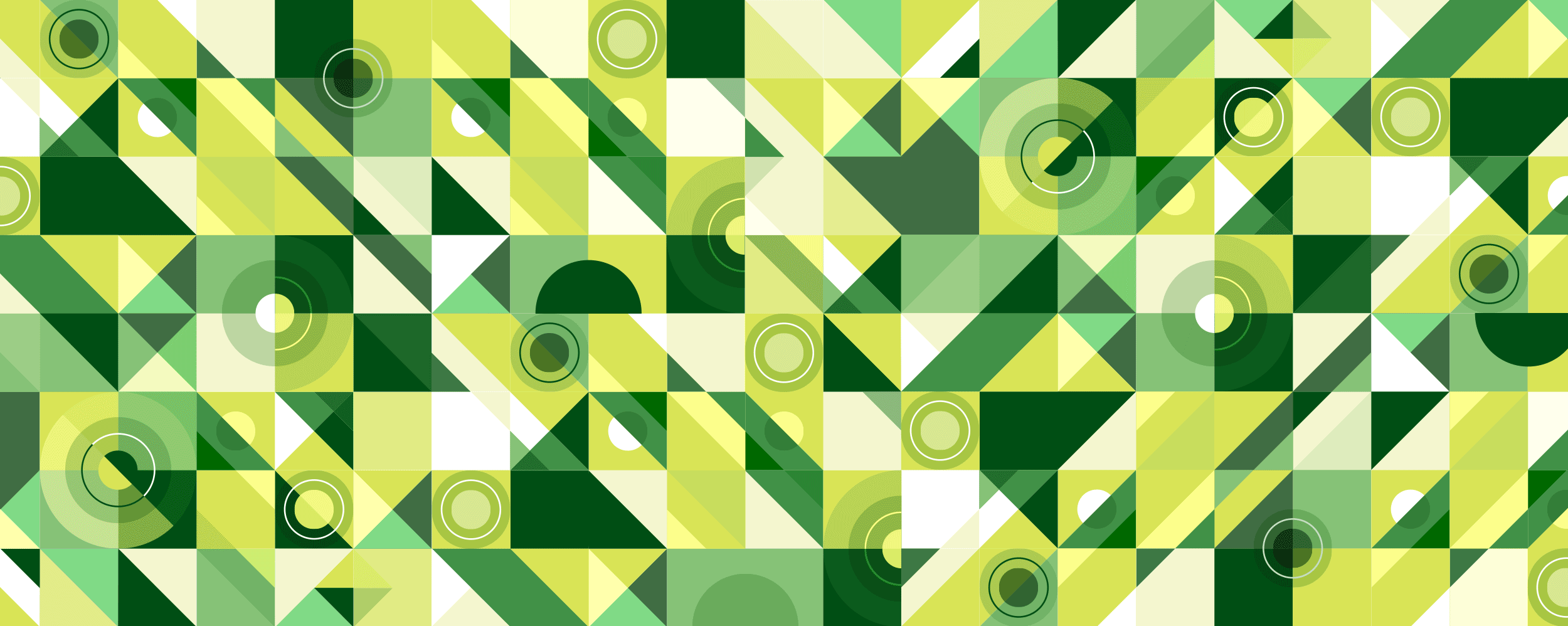
Apart from a bear bottle I also wanted to present the logo on a beer can, and give it an extra modern look. So I came up with this geometrical background pattern that would be wrapped around the can.
I created this fictional beer brewing brand named Paribeer, presented in 2 different ways: on a beer can and the traditional bottled way.
Hopefully you’ve found this design process insightful as I struggled a bit writing it. This all made me think of that 80’s song by FR David - “Words don’t come easy to me”. Brains are weird :)