How the Design of My New Blog Came to Live
My Design Process and the Struggles Along the Way
Article written on Friday, 22 Feb 2019
I felt a huge sense of relief when the new version of my blog went live. You’d think after releasing the fourth version now, redesigning my own site would become a little easier. Unfortunately, that wasn’t the case and I don’t think it ever will be. As a designer, designing for yourself is always way harder than for a client—it’s difficult to be 100% satisfied with what we create to represent ourselves.
Designing for Your Own is the Hardest
I think it's because it's just hard being 100% satisfied with your own creations. We are our own most picky client and often ask ourselves “Is this good enough? Will I still like this tomorrow and the day after?”
Maybe the trick is to look at our work with a fresh pair of eyes and from a good distance. For me, this only works when I give myself enough time to create something. When I redesigned my blog, I certainly did—in fact, it took me way too long. But I’m thrilled to say I can now bury the frustration I felt for such a long time.
Below is an overview of what my blog redesign process looked like—what worked, what didn’t, and everything in between. I hope being transparent about my process is helpful for anyone thinking about a personal redesign. Let’s get started!
Logo Icon Design
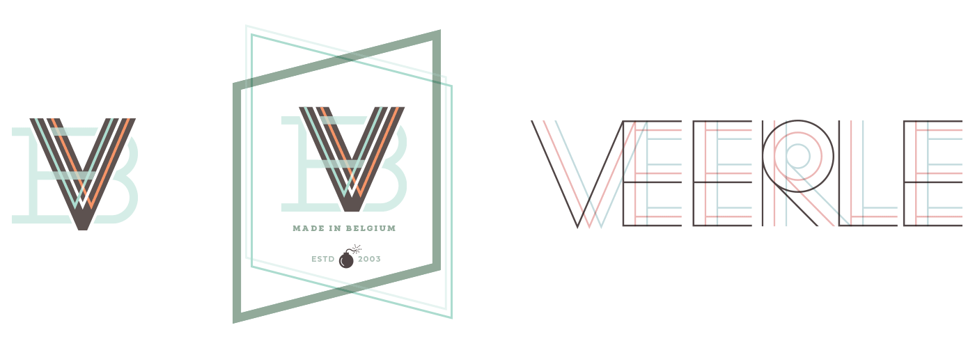
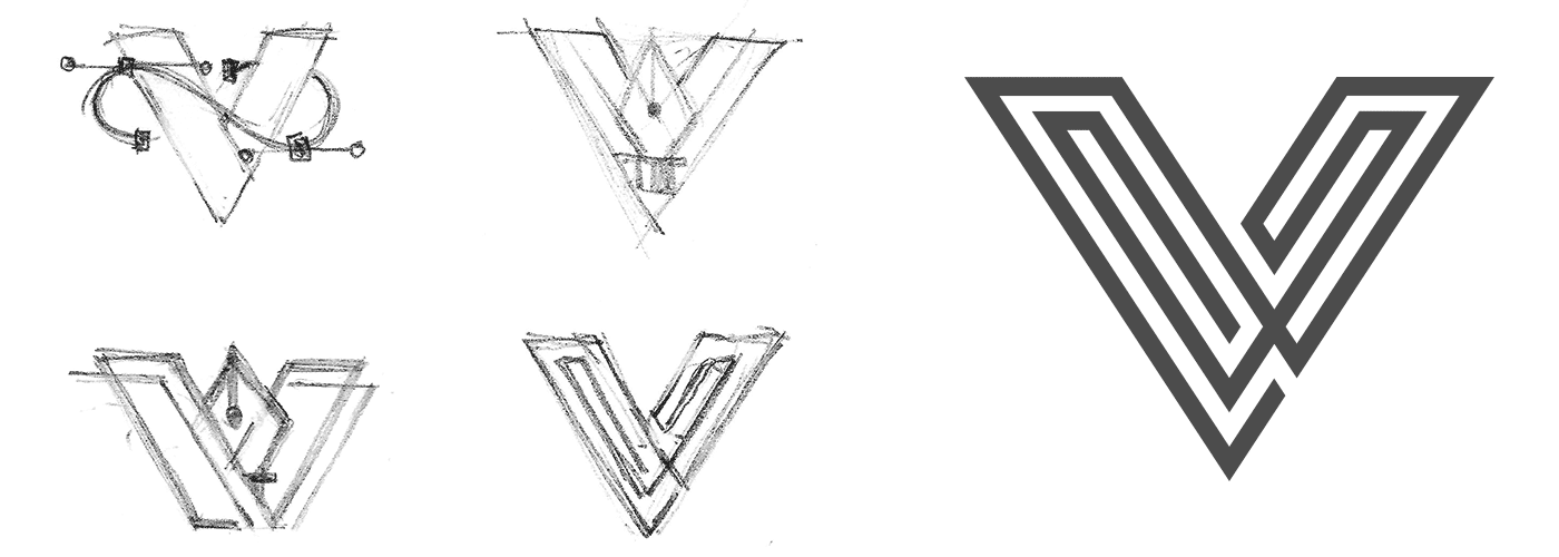
Back in 2016 I took the very first steps by designing myself a logo. I thought maybe something with the letter V. The idea of having a logo mark played already for a long time. Towards the end of 2015 I gave it a go, but I just didn't succeed.
The experimental phase is most important and the heart of the creative process—often leading to unexpected results.
I tried out many things though, including a couple with my first name, but all the concepts I experimented with just weren't strong enough. They either looked like an illustration or more like a packaging label.
At first I was thinking of incorporating the pen tool icon, a link to vector illustration. Again, I couldn't convert this idea into a strong result. I wanted something much more simple, clean, and modern.
I decided to focus just on the shape of the letter V and then finally I reached this eureka moment of inspiration. I was 100% convinced this was it. That spark always hits me at an unexpected moment.
Typography
Brandon Grotesque
In terms of typography I didn't need much time to decide which typeface would be used. I already had my eye on Brandon Grotesque for quite a while and I liked that it had a certain similarity as Neutraface which I used previously. Even though a bit later after my decision was made, I noticed that this typeface was used quite regularly, but I didn't really care about that. I just felt it was the perfect choice for my site, so I decided to stick with it.
Native
Apart from Brandon Grotesque, I also use Native as secondary typeface, because I need a monospace typeface in case I want to share HTML or CSS markup in my blog posts. After being inspired by Bethany Heck's creations for the specimen of this typeface, I really wanted to use Native not only for markup, but also for the creation of a label that shows the date of the blog post. During the phase I created this, I played with the idea of using the triangular shape a lot. The idea was to reuse the lines of the V icon throughout my design. You'll notice this in the header illustration for one of the 1st homepage designs further down the article. In the final design I use Native also for the numbers in the steps of my tutorials, and the five 'Recommended Articles' overview on the homepage.
Embracing the Experimental Phase
The first step I took in the overall design of my blog was actually a couple of years ago when I experimented with creating a colorful and catchy background illustration for my header.
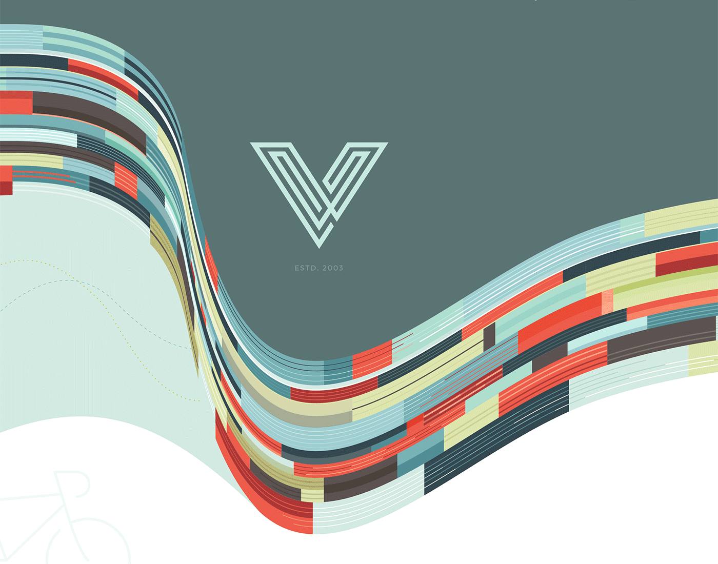
I was looking for a catchy background, but I didn't think this through. I simply had too much fun creating this.
I was fascinated by a photo of a building I found with amazing patterns, shapes, and colors. In the back of my head, I knew it was a bit crazy to use the photo as inspiration for a website considering all of the wavy lines. Regardless, I had to try this out and worry about the execution later, because to me it was just an extra challenge. Adding in the V icon created this extra contrast with the wavy complex curves.
Looking back at this now, I'm not sure what actually went into my head at that time. You see, I did spend a lot of time drawing this illustration. It was not curved like that using some sort of quick smart effect. No, I drew this line by line, but because I had so much fun I didn't mind the extra effort.
Ironically enough, I ended up dropping this whole concept. But looking back now, even though I spent a lot of time on the illustration, I had so much fun working on it and knew I could repurpose it in the future. What I’ve learned over the years is you shouldn’t always trust the rational part of your brain. Instead, see where your ideas lead you and embrace that part of the process. The experimental phase is most important and the heart of the creative process—often leading to unexpected results.
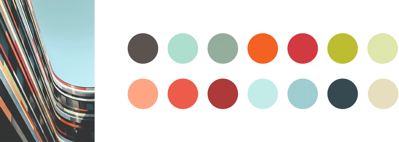
Colors inspired from the photo of the building, which was also my inspiration for my initial attempt for my header illustration.
Defining the Color Palette
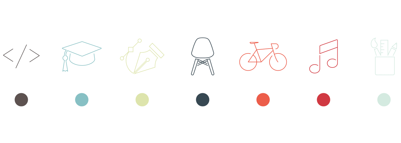
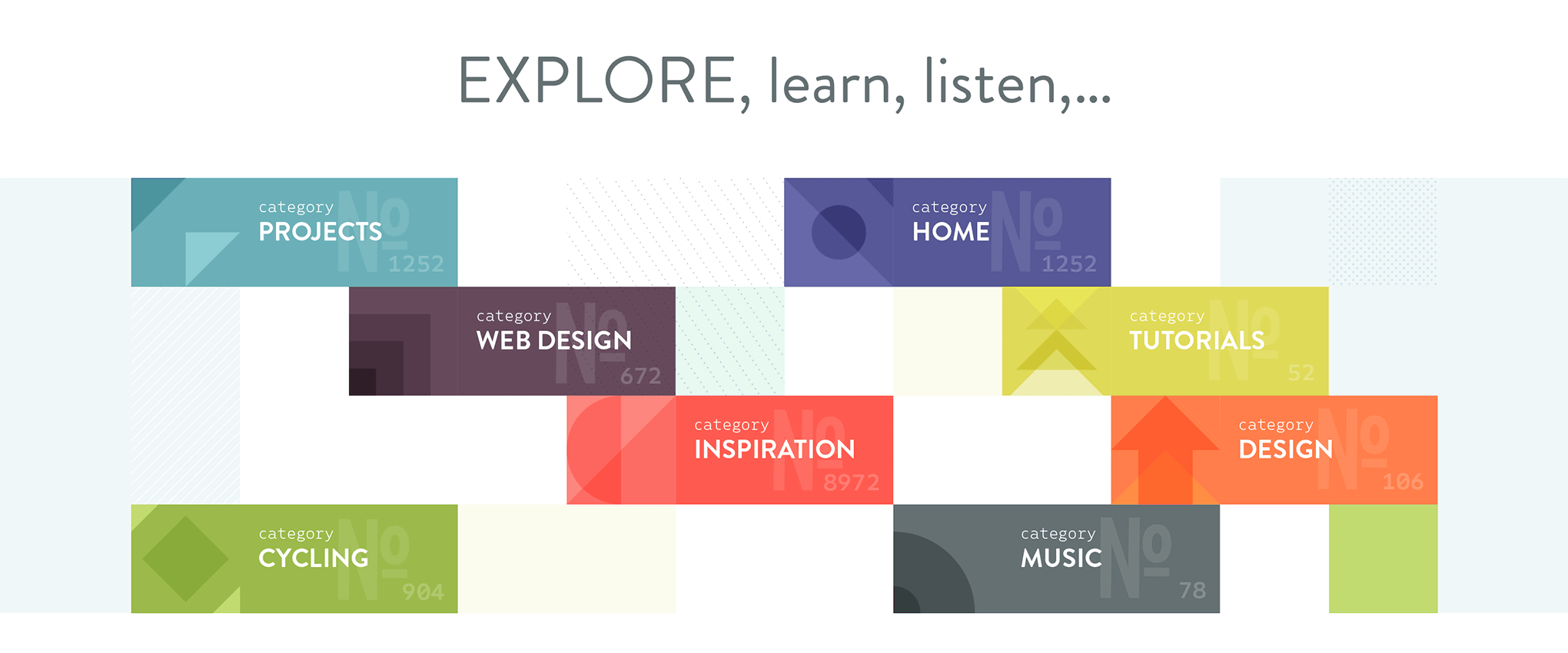
First, I started by defining a color palette. As for the content of my blog, the only thing I was really 100% sure of was to keep my Inspiration Stream. During this initial design phase I assumed I would continue writing about more than just graphic & web design, keeping things very broad by including my other passions besides graphic design: modern home design, cycling, and music. I envisioned to have a color and icon to identify each section as you see below.
The initial color palette and the icons I had in mind
A New Design Direction
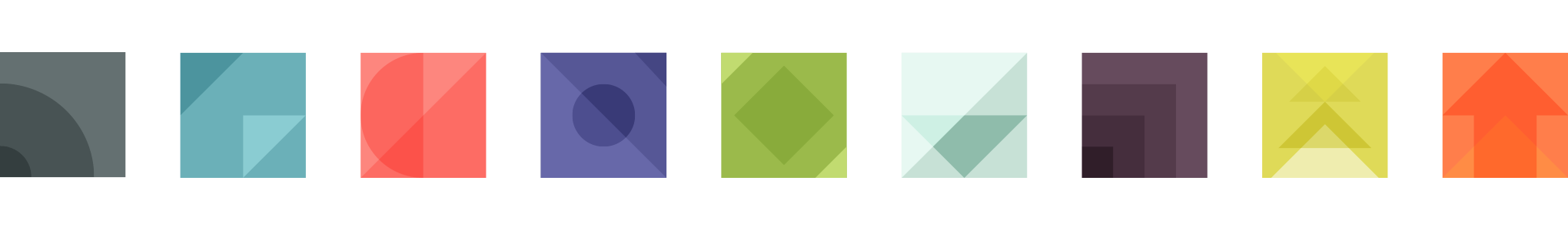
Back to the drawing board, I decided to go into a totally different direction. After being inspired by some interior wall decorations on Pinterest, I decided this was definitely a direction I wanted to proceed with. Geometric shapes and patterns have always been my thing so I created the following set of geometric pictograms that I could use to define my blog’s different categories:
This would serve as a navigation 'block' on my homepage. The numbers would be the amount of posts in this section. I'm using Native for the word categories and the numbers.
After I designed a new header inspired by the line-work in my logo, the basic concept for the homepage design was to show a simple stream of blog posts. Each post would be styled in the color of the section it belongs to and I would also have the Inspiration Stream posts mixed into it. Only I wasn't sure at that time whether I would show them 1 by 1 or in series of 2 or 4. So I was still thinking on how I would implement this part...
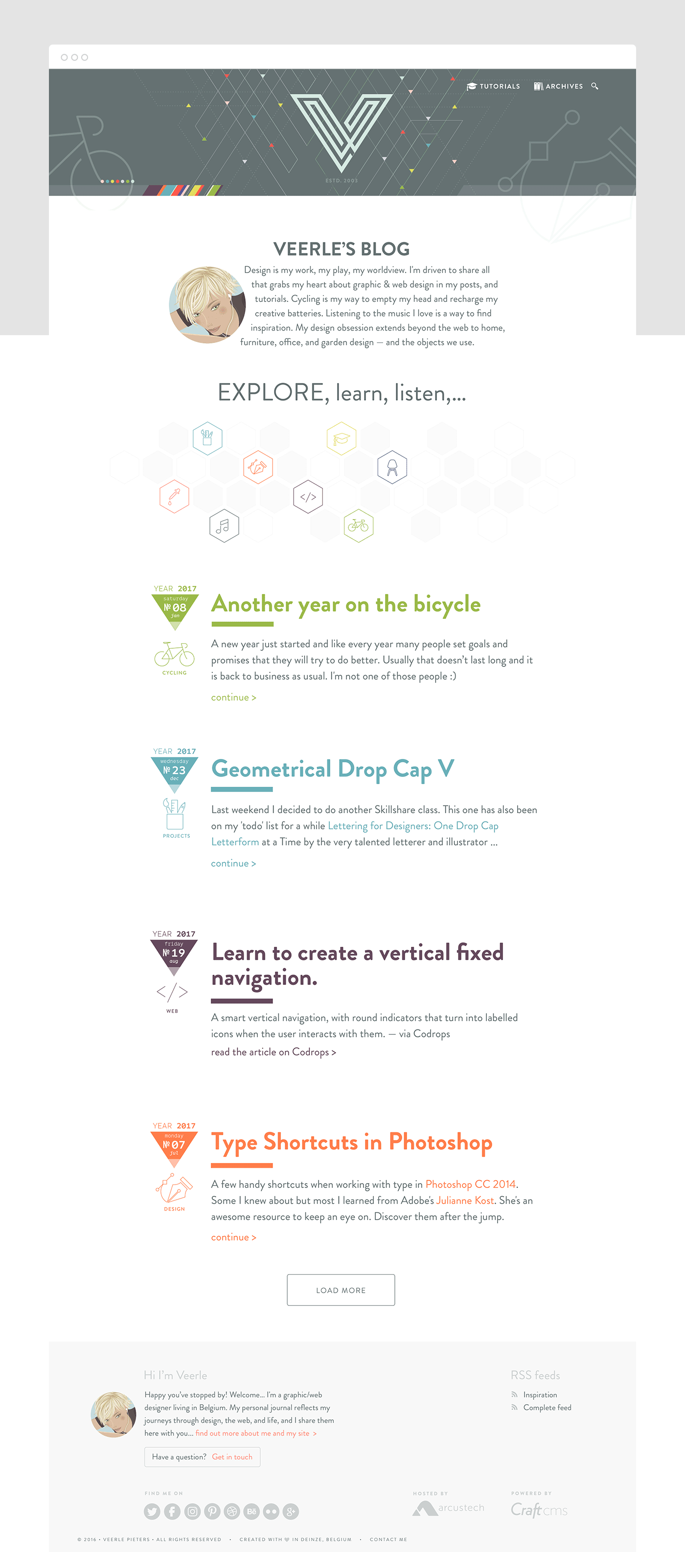
One of the 1st homepage designs with a blog stream approach, but with my initial design concept for the 'Explore, learn, listen...' section.
For the article pages, I thought of using a header in the color of whatever section it belonged, with the option to replace the flat color background with a hero image. As for the overall layout of the article pages, I wanted something very flexible that would enable me to display my content in different layout blocks—a bit like the feel of a magazine. I wanted to keep the option open to do something totally different if I wanted to, for example being able to use a split hero header or having the option to use custom HTML and CSS.
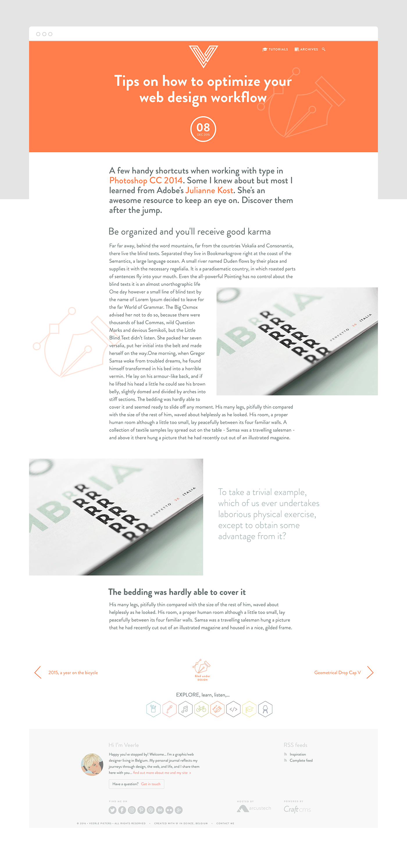
Design of the blog article page in one of the layouts
Back to the Drawing Board
After some time focusing a good deal on client work, I looked back at my redesign work and realized I didn’t like what I had created. I wasn’t happy with the overall design, especially the way my blog posts were being displayed. I decided to rethink everything and place the Inspiration Stream on top of my posts in a visually attractive way. The Inspiration Stream is equally important to the rest of my blog posts as a whole so it definitely needed some attention. After some brainstorming for my blog content, I was convinced I should reduce the number of topics and focus purely on graphic design, web design, and inspiration.
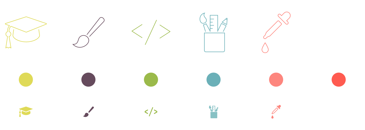
That’s when I decided to use these new icons and colors. The icons are heavily inspired by and based on the fantastic Streamline icons created by Vincent Le Moign aka Webalys.
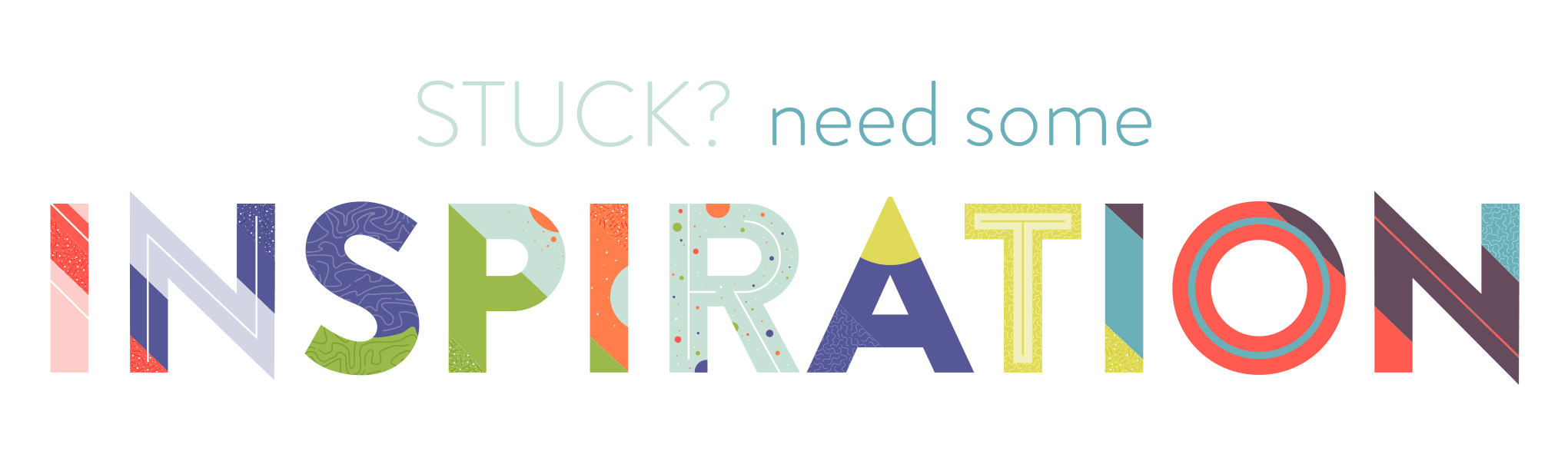
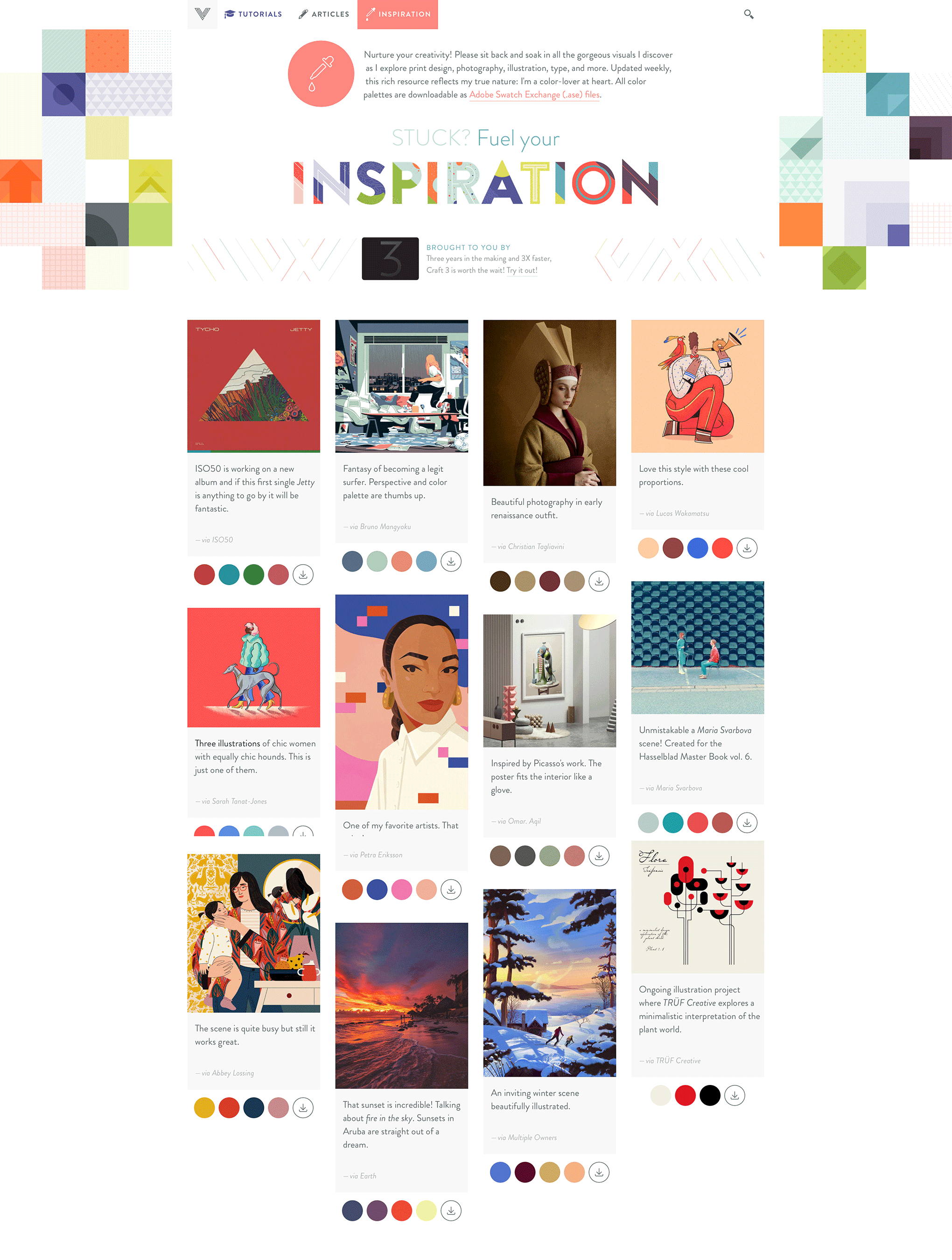
Inspiration Header
When I’m in need of inspiration, I usually go through my own Inspiration Stream, Pinterest, and Dribbble. I remember being really inspired by cool letter designs I saw that looked like illustrations on their own. These inspired me to create the following header for my Inspiration Stream:
Keeping up With the Momentum
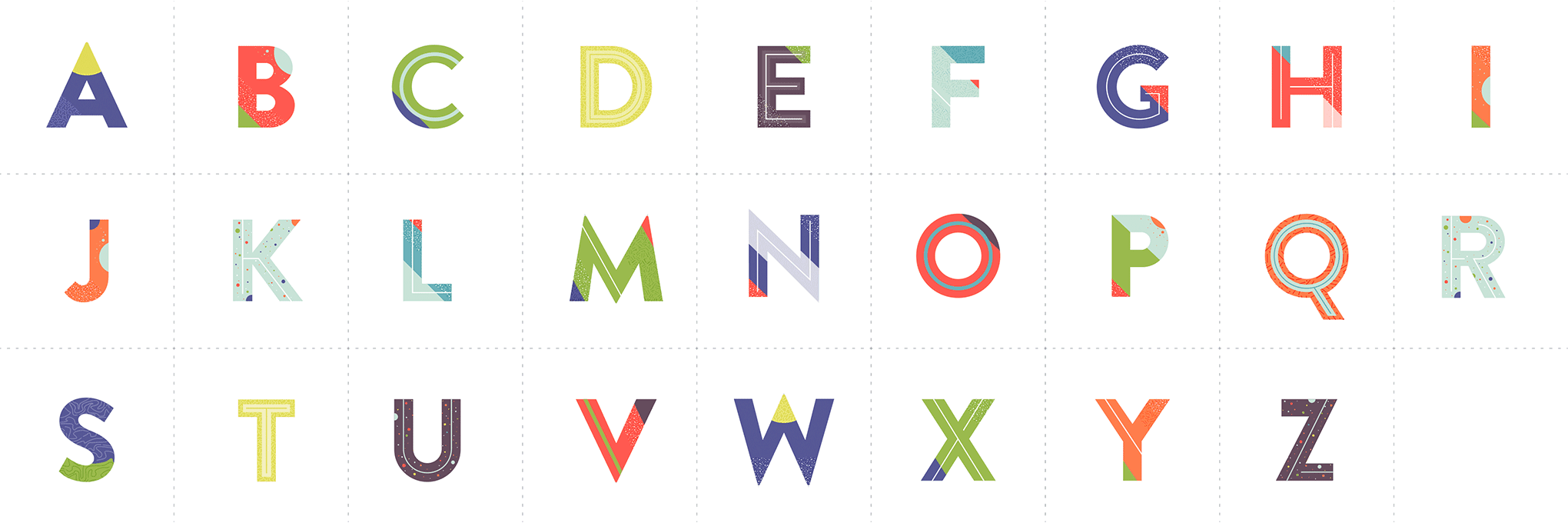
After designing the new header, it felt good to be inspired again and finally feel like I was back on track. I had a good feeling the header would be something I’d look back on after some time and still love it. Wanting to hold on to the momentum, I created an entire alphabet to use as drop caps for my articles.
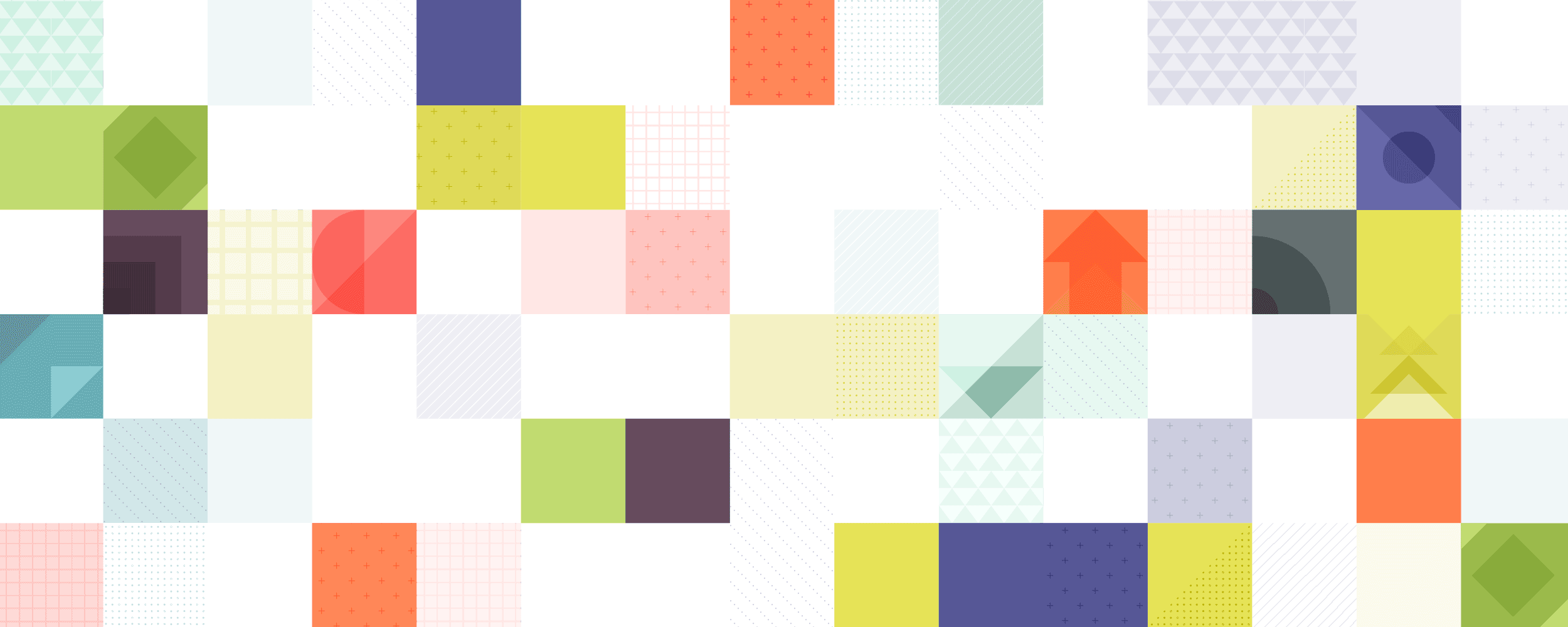
Even though I felt inspired, I still had to improve the header design and think about the entire design of my homepage. I created a patchwork kind of background illustration using a mix of simple square patterns and the colorful geometric pictograms I had previously designed. At first, I made a bunch of different square patterns, then I used them as pieces of a puzzle to end up with this result:
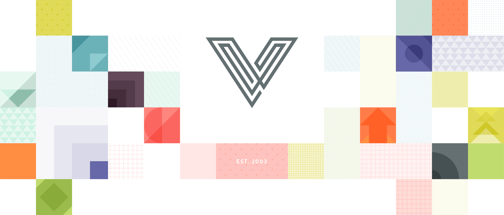
I left enough room empty to place my V icon at the top center. The idea was to use this as my homepage header.
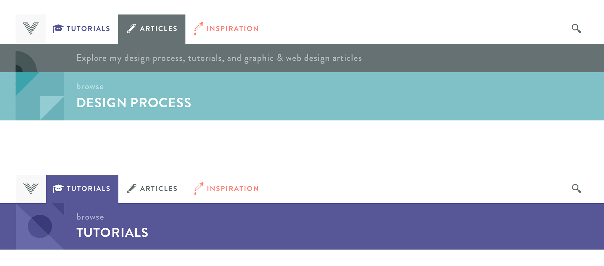
On the Right Track: The Final Design
Just a bit later in the process, I decided to use this patchwork illustration as a background image instead, because using it as a background next to my animated logo was a bit overwhelming.
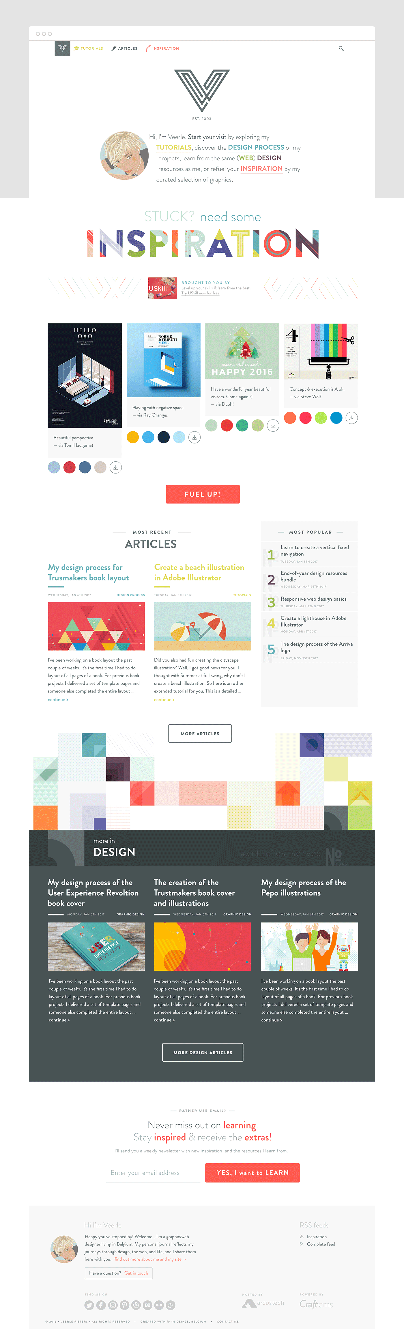
I also restructured the different sections of my blog so navigating it would be as simple as possible. There are only two sections now: articles and inspiration. Within the articles section there are sub-categories like web design, graphic design, and design process—each with a designated color like I had previously planned. Since tutorials is a very important category of articles I decided to add it into my menu bar. In the last phase I also changed the color from mustard yellow to purple. The mustard yellow was just a bit too light to be readable.
I decided to place the square pattern illustration as a 'fixed background' on the Inspiration Gallery homepage.
Later when I was already coding the static HTML template pages I added the bounce (CSS) animation. This way I could keep the background in with the V icon, but without taking up so much vertical space and with the addition of this nice gimmick. Funny thing about animating simple stuff like this in CSS is that you don't need Javascript, and in case the browser doesn't support this CSS, the page will just remain as is.
Designing While Already Coding
Not sure which process other graphic designers, who are also web designers like me follow when they work on the design of their own web site, but in my case I didn't create all template pages in Adobe Photoshop (or Adobe XD, my current choice). Instead I've only created the fragments or parts of pages, the rest I directly created with CSS. For me this was the most flexible and productive way to finalise the design.
While coding I only returned to Photoshop to define the look of a few components such as the different section bars.
Finetuning
During this coding phase I still tweaked a lot of details, and a lot of finetuning. If you look at the homepage design above and compare it to what's online, you'll notice the typography is not exactly the same. You view everything in the browser, so it's all more real with interactions and everything.
Mobile Version
It's also during this phase that I actually thought about scaling the layout to mobile. Maybe some will disapprove to wait so long, but I did have the basic resizing scenario in my mind all the time since the overal layout is also rather straightforward. There was only the main navigation that needed some actual thinking for the smallest screens.
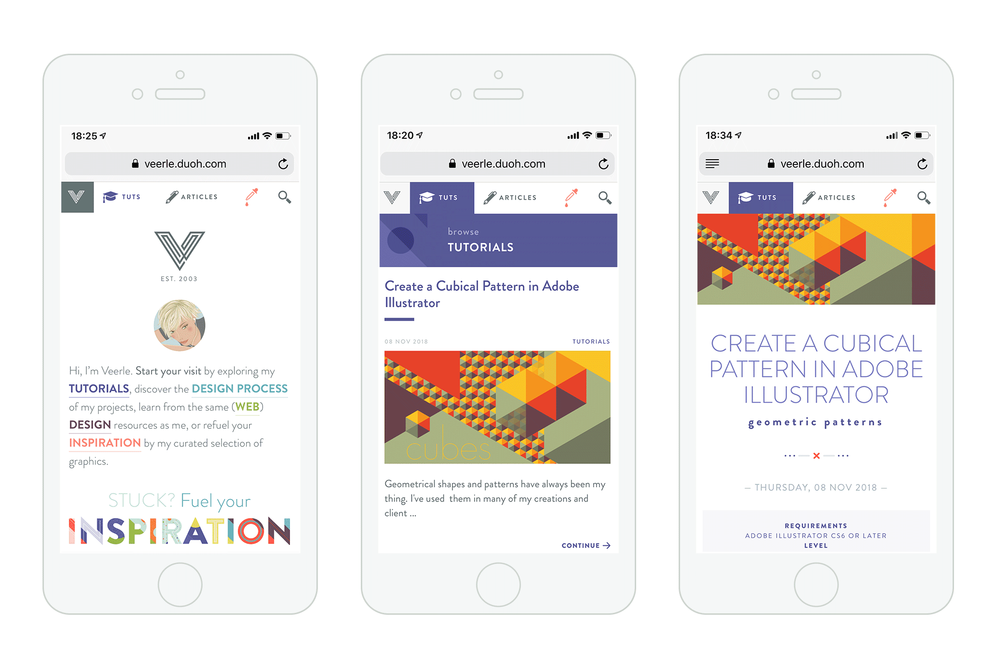
I wanted to avoid using a hidden menu. I decided I could use 'tuts' as abbreviation for my tutorials, and just the eye dropper icon for the inspiration section while still keeping things obvious enough. After all, the homepage also mentions these sections straight away, with color coding etc.
There you have it—my entire design process in short. From what you’ve just read, I’m sure you can tell this was certainly not a straightforward design process. It was actually quite chaotic and didn’t play out like a checklist I could simply follow and complete. For me, this design process was more like a maze or puzzle in which I tried to piece everything to together as best I could.
My advice to anyone thinking about a personal brand redesign is to be patient with the process. You’ll likely flesh out tons of concepts that don’t make the final cut, but that doesn’t mean that trying them out was useless. They might inspire other ideas that you end up loving, or you might even be able to implement them in other ways you didn’t expect. Try to enjoy the process and embrace the chaos!