Graphic Design Link Picks
resources from newsletter #0120 #0121 #0122 & #123
Article written on Tuesday, 17 Mar 2020
Organising is pretty important, especially if others also work on your files. Luckily there's a great article that tackles this subject on how to organise files in a design agency. Since many people our at home at the moment it's the ideal time to learn something new. What do you think about creating a vintage design card. We also analyse the design of the Apple credit card. Like always some interesting logo articles as well. Always wanted to create your own Bounty package? There's an Illustrator to create a coconut text effect. I've also included if you have questions about design systems in your team. There's plenty more to keep you occupied and learn. Enjoy!

How To Organize Files In A Design Agency
I've written about this topic too and I am always curious to how other agencies organize their workflow. Here the design agency Clay shares how they do it in detail. This is not just organizing files, it's also a design process.
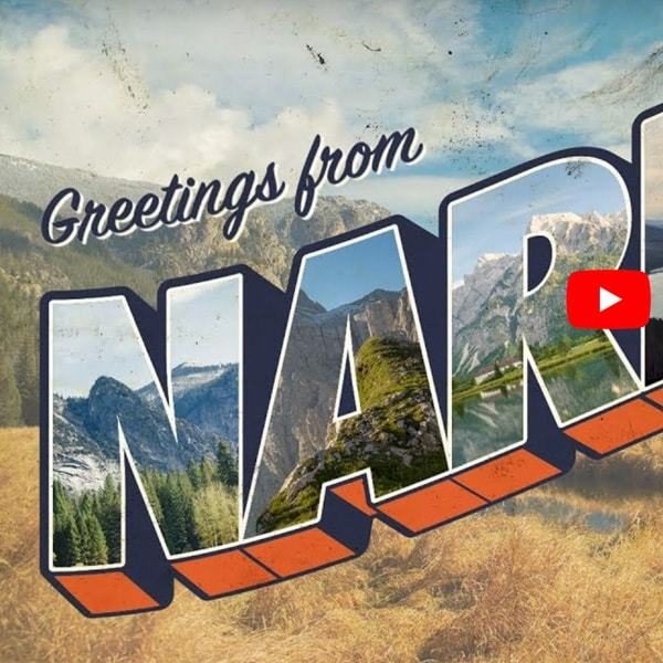
How To Create a Vintage Postcard Design
In this Illustrator and Photoshop video tutorial you'll go through the design process for creating a vintage postcard design, based on the postcard design style known as “large letter”, which was popular throughout the mid-20th century.
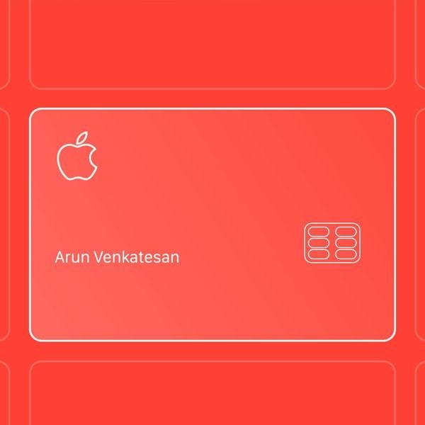
The Design of Apple's Credit Card
Interesting in-depth look into the design of Apple's just announced Credit Card. This article shows the level of obsession with the details.
Pulpo typeface Pulpo Typeface
Beautiful letter forms and the style makes me think of the Blue Note label covers. Great to get some insights in the process behind the creation of it.

How to Create a Coconut Text Effect in Adobe Illustrator
At the beginning of this tutorial you will make a few adjustments to the text; next you will continue with the coconut flesh, for which you'll use effects and brushes to make it look quite realistic.
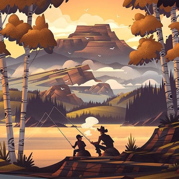
Design Process of The Popgun Summers Print
A beautiful illustration created by Brian Edward Miller that I featured in my Inspiration Stream. Here's a lengthy writeup on how it was created, going from a rough sketch to the little details. Interesting it was first created in black & white.
Bokiño New Logo & Identity Design
Clever concept behind the new logo & identity design for this digital platform for children's books. The icon is constructed by the six letters in the word mark. Like always don't miss the animations, especially the one when the letters regroup.
A Month of Type
Speaking about animation… A London based motion design studio called Mr. Kaplin has created this rather gloriously animated alphabet. The animation for each letter is a experiment that was completed in a single day. ONE DAY! Go watch it!
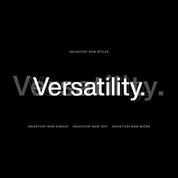
Behind the Process of Helvetica’s 21st Century Facelift
The famous typeface has been re-drawn for the modern era. It’s a tremendous overhaul that saw Monotype redraw every single one of Helvetica’s nearly 40,000 characters. Interesting read.

Motion Graphics: Google's Design Language for Hardware
Regular followers know that I like to study animation and one of the better ones is this visual language based on simplicity and abstraction. Go admire it, you'll love it.
Crossover Health Logo Redesign
Another great analysis about this new logo redesign. Love this overly simple switch icon, which is a link to their tech-forward clients such as Apple and Facebook. Make sure to check out the graphics and the neath animations.
We Refreshed Figma's UI: An Inside Look at Our Process
Personally I haven't used Figma yet but the app just got a UI refresh. Get a deep dive into their research, planning, and problem solving process.
Designing For Systems
Daniel Eden answers some of the questions your team may face while working on design systems.
The Story Behind Art Direction for the Web
I have Andy Clarke's 4th book on my desk ready to read but I'm too busy fighting deadlines. Here's the design story of how it all happened.
Ikea Logo Optimization
Ikea's logo has been redrawn to increase legibility. Find the differences between the old and new one, or watch the before and after images. Subtle changes that make me see the mistakes in the old one now.