Graphic Design Link Picks
resources from newsletter #0091 #0092
Article written on Wednesday, 19 Sep 2018
You may have noticed that there are so many wordless logos out there and wondered why is that? You'll find the answer in here by Kalle Oskari Mattila. We also take a closer look at the rebrand of Uber. Maybe the best link of all is this ultimate guide to proper use of animation in UX. I've also learned something new from Andy Clarke. There's more in here so be ready. Enjoy!
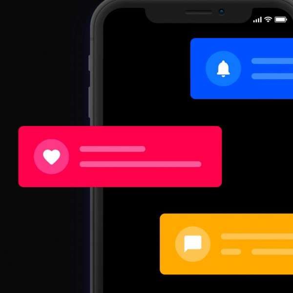
Designing Notifications for Apps
Explore different notification models and when to use which. Nice article, it makes the distinction between the different models very clear, and the graphics support the content well.
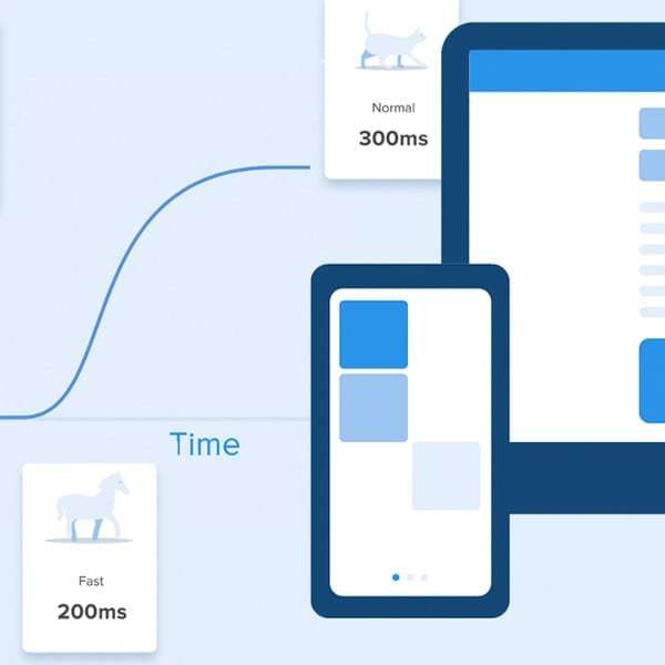
The Ultimate Guide to Proper Use of Animation in UX
Normally you have to search information at different resources. This article collects all the main principles & rules for animation in UX in one place.

The Surprising Inspiration Behind Monument Valley’s Most Beautiful Levels
I've always been an admirer of M. C. Escher. Monument Valley revolves around solving puzzles by exploring isometric monuments filled with impossible geometry and optical illusions.
The Age of the Wordless Logo
Kalle Oskari Mattila asks: Why are so many of today's logos wordless? Interesting read on something I've noticed too. "Nameless logos can evoke more personal and immediate reactions".
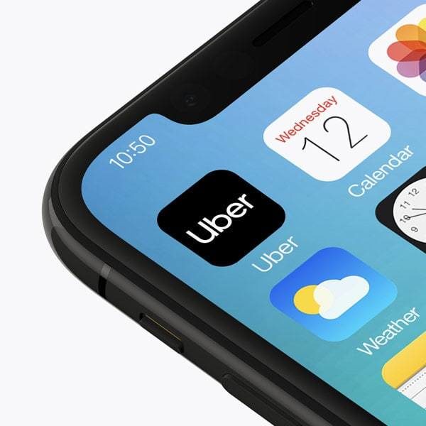
Rebrand 2018 - Uber
It's always fascinating to read a case study behind the motives of a rebrand. This time it's the tech startup Uber. Good execution but I personally find that the tone is a bit pretentious.
A Portfolio Hiring Managers Can’t Deny
Some seriously good advice from Dan Mall on portfolios and using them to help get the job you really want.
Redesigning Chrome: An interview with Chrome’s Lead Designer
You may have noticed the redesigned Chrome browser for its 10th birthday. This goes deeper into that fresh look.
Art Direction for the Web: Taking the Lede
Learned something new in this article by Andy Clarke.