Graphic Design Link Picks
resources from newsletter #0089 & #0090
Article written on Wednesday, 05 Sep 2018
If you ever thought that combining fonts was hard you are in luck as there is some guidance in my graphic design resources this week. There's more of course such as an interesting read about creating illustrations for smaller screens, a deeper look into Adobe Live's visual identity, a visual search engine for colors and Jared Spoon's tips on what Goes into a well-done critique. Enjoy!
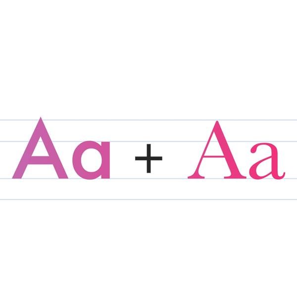
A Guide to Combining Fonts
Combining fonts is one of the trickiest parts of typography. Here’s a guide, combined with an example to help you get font combinations right. This guide is based on chapter 5 from the book Better Web Typography for a Better Web.

Designing Illustrations for Small Screens
Interesting read by Meg Robichaud who works at Lyft as an illustrator. This article touches on drawing illustrations for smaller screens. She explains it succinctly by giving an analogy to typography.

Chris Kelly on Designing an Award-Winning Brand for Adobe Live
Read the inspiring background story behind Adobe Live's visual identity for the show by Chris Kelly. Adobe Live is a streaming video series where top creatives share their process.
Picular
For the bookmarks. A search engine for colors. It's a tool for getting color inspiration by searching for key words like 'spring' or 'forest'.
What Goes into a Well-Done Critique
Critique is an essential part of the design process, but it's not something most UX professionals are taught. Like many important skills, it's hard to do well and easy to do poorly. Jared Spool shares what goes into a successful critique.
The Inter UI font family
I'm certainly gonna try out Inter UI in some project. A typeface specially designed for user interfaces with focus on high legibility of small-to-medium sized text on computer screens. It's open source and free for all. Nice work @rsms, thank you!