Duoh! Logo Design Evolution
My Business Logo Design From 1992 to 2025
Article written on Wednesday, 19 Feb 2025
Since the beginning of this year, my business, Duoh!, has a new logo. However, the website design update is still very much in progress. I felt it was long overdue to refresh the look and feel.
While developing the new design concept, I explored the idea of creating a logo animation, much like I did for my V icon here on the blog. The new design was a perfect fit to illustrate the meaning behind the name—an amalgamation of “duo” (a pair) and “oh!” However, as I worked on the animation, I decided to take a more playful approach and went with “uh oh!” instead. 😃
Once I finalized the animation, it got me thinking about all the different logos Duoh! has had since its inception in August 1992—33 years ago, in a pre-internet era that feels like a lifetime ago. I started digging up my old logos, but unfortunately, some of the digital files from the early ’90s were inaccessible due to outdated storage formats like unreadable DVDs.
Going back in time, 1992
Reflecting on how time has passed and looking back at all these old logos, I decided to create an animation (in Adobe After Effects) showcasing the evolution of the Duoh! logo—from 1992 to today. I included every design except one: a variation of the 2000 version featuring a similar desert-like landscape but with a floating 3D cube displaying the original 1992 logo. As I mentioned before, that early design was more of an illustration than a proper logo. Eventually, I let go of the cube and opted for the orange “D” with an exclamation mark as the icon instead. As for the original 1992 logo, all I remember is a rough pencil sketch that I later digitized. Back then, textured recycled paper and a grungy, weathered aesthetic were all the rage. To me, at the time, that logo felt like the perfect fit.
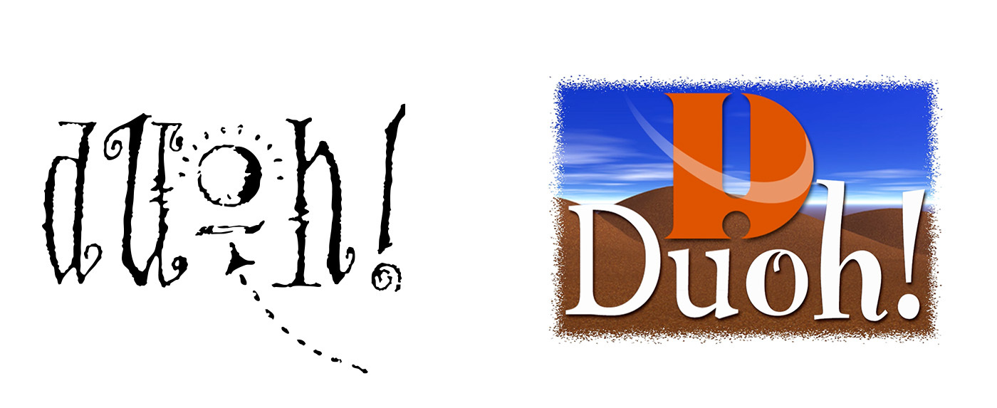
the first Duoh! logo created in 1992 and the logo created in 2000
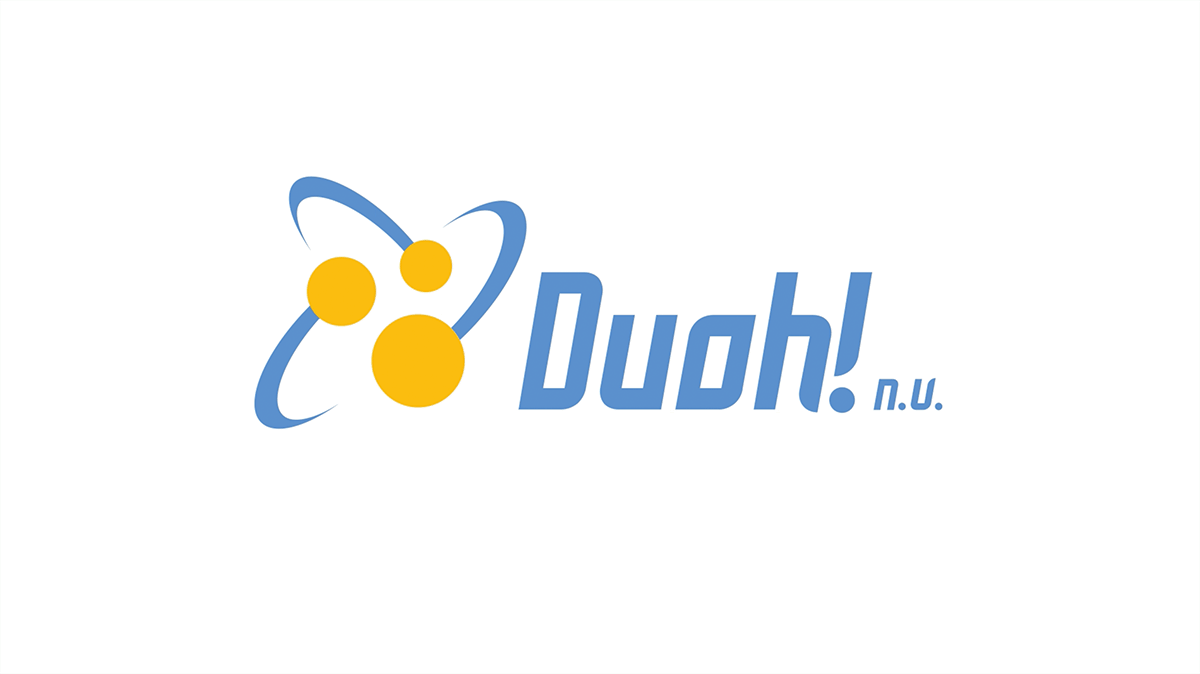
2003
Another recurring element I’m sure you’ve noticed, was the swoosh line—you’ll notice it in the 2000 logo and even more prominently in the 2003 version. That was the era of swooshes! 😂 The style back then was completely different—no more playfulness. Looking back, I find this one the least appealing of all, but at the time, we wanted to present ourselves as a bit more “serious.”
2007
That phase lasted about four years until 2007, when I completely changed direction. The new look reflected our personal approach as an inseparable duo, complete with the fun tagline “beauty & brains.” It often sparked the inevitable question: “So, who’s beauty and who’s brains?”—which, of course, was exactly the reaction we hoped for. 😂 And we loved it!
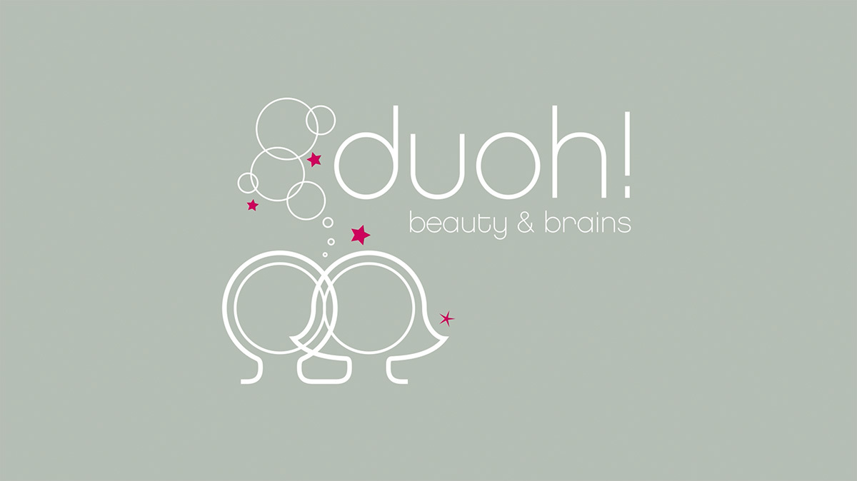
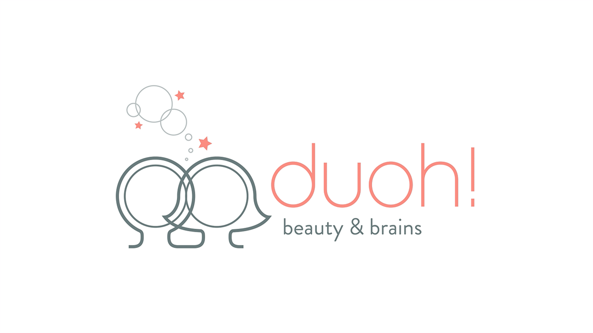
2015
In 2015, this logo received a small update—I adjusted the colors, repositioned the wordmark, and simplified the icon by removing a few bubbles and stars. At the time, we were using Brandon Grotesque as our typeface, so the tagline also got a subtle refresh to match. I just realized that this logo lasted for 10 years, which, compared to the other periods, is the longest of all.
2025
The idea of combining the exclamation mark with the letter “d” stuck in my mind for a while, making the actual design process for the new logo quite brief. Once I started sketching, I quickly arrived at the desired result. The subtle detail in the letter “o” was Geert’s idea and was added later while I was already working on the animation.
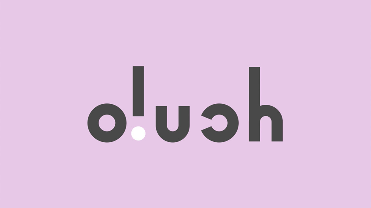
Let’s hope this logo lasts another 10 years, just like the last one, and that I can make good progress on the new design of the business site. For now, I’ve only updated the logo, colors, and typeface. Our portfolio showcase is a bit behind—isn’t it always the case that your own projects are the last to get attention?


