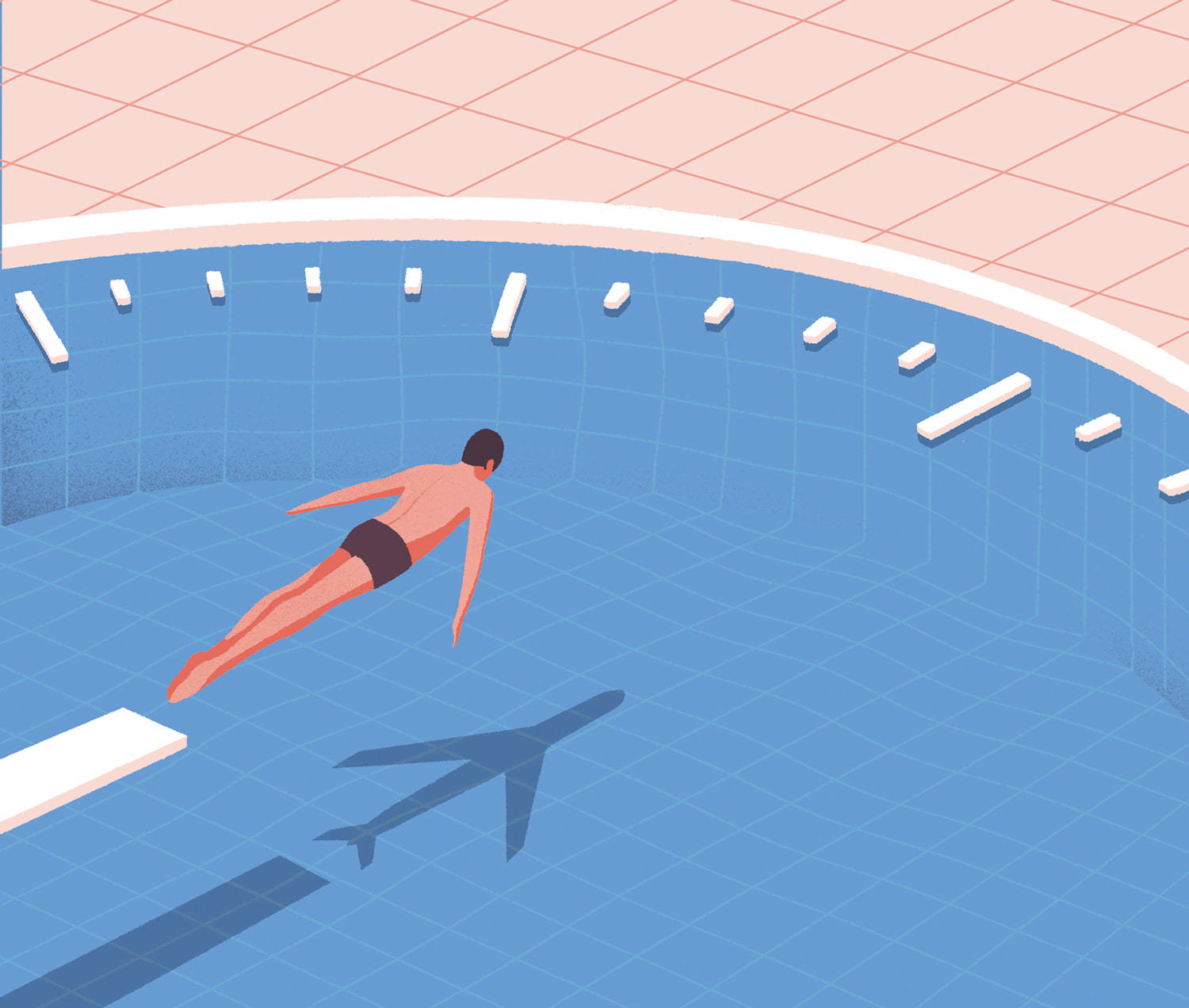
Air France Pool

Illustration for Air France magazine. Simple but super effective idea. The distortion in the grid is a nice touch.
— via Sébastien Plassard
- #679cd2
- #f8dad2
- #f1aba1
- #5c3d4d
- download these colors as an ASE file

